About
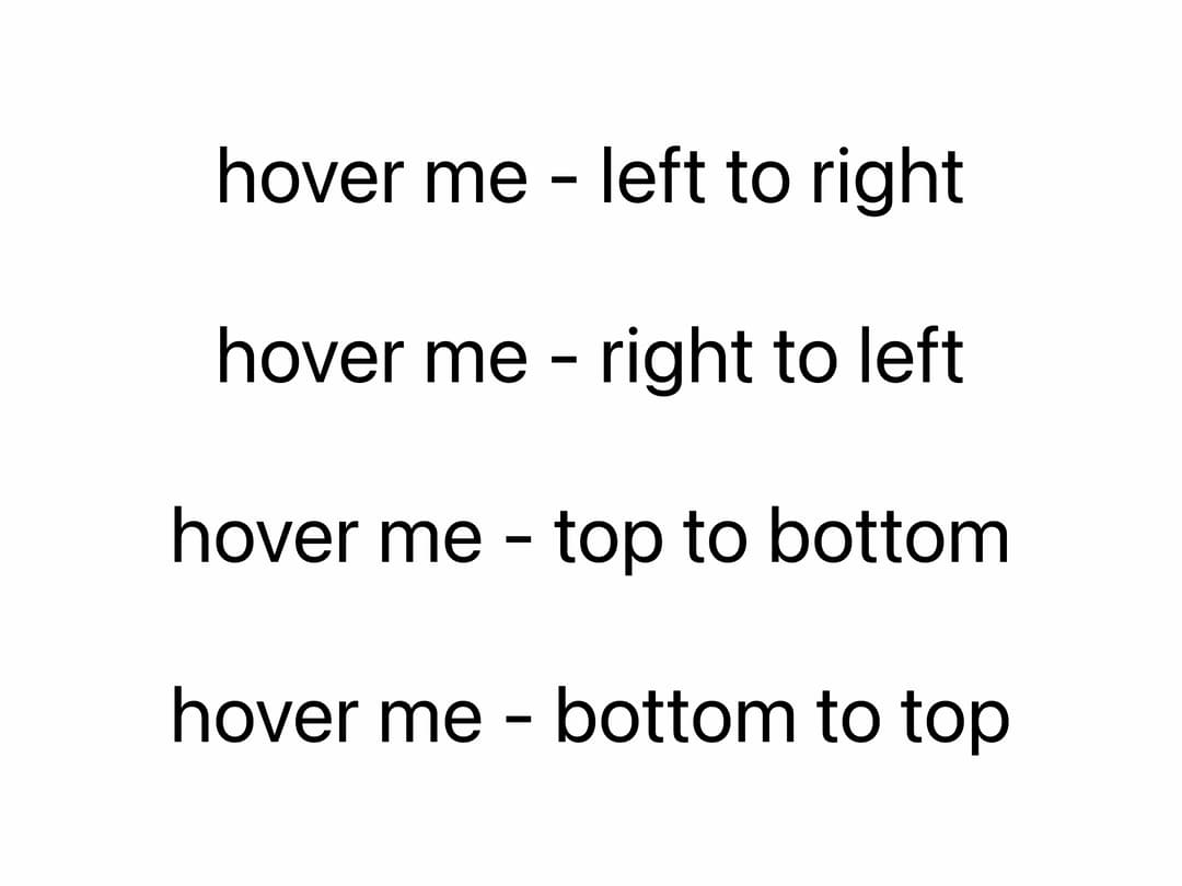
Animated text highlighter that sweeps a marker-style background behind inline text, triggered on hover, scroll into view, or imperatively via ref, with configurable direction and color.
Built with React and Tailwind. Copy the prompt and paste it into Claude Code, Cursor or Lovable: your agent adds Text Highlighter to your project and fits it to your theme.
Code
How Text Highlighter is used: the demo's code. The component's own source comes with a free account.
Usage.tsx
"use client"

import { TextHighlighter } from "@/components/ui/text-highlighter"

export default function TextHighlighterHoverDemo() {
  return (
    <div className="w-dvw h-dvh bg-[#fefefe] flex items-center justify-center">
      <div className="max-w-sm md:max-w-md lg:max-w-lg xl:max-w-xl mx-auto px-4 text-black">
        <div className="flex flex-col gap-8 text-lg sm:text-xl md:text-2xl lg:text-3xl text-center">
          <TextHighlighter
            triggerType="hover"
            direction="ltr"
            className="px-2 py-1 cursor-pointer"
            highlightColor="#BBC2E2"
            transition={{ type: "spring", duration: 0.68, bounce: 0 }}
          >
            hover me - left to right
          </TextHighlighter>

          <TextHighlighter
            triggerType="hover"
            direction="rtl"
            className="px-2 py-1 cursor-pointer"
            highlightColor="#BBC2E2"
            transition={{ type: "spring", duration: 0.8, bounce: 0 }}
          >
            hover me - right to left
          </TextHighlighter>

          <TextHighlighter
            triggerType="hover"
            direction="ttb"
            className="px-2 py-1 cursor-pointer"
            highlightColor="#BBC2E2"
            transition={{ type: "spring", duration: 0.8, bounce: 0 }}
          >
            hover me - top to bottom
          </TextHighlighter>

          <TextHighlighter
            triggerType="hover"
            direction="btt"
            className="px-2 py-1 cursor-pointer"
            highlightColor="#BBC2E2"
            transition={{ type: "spring", duration: 0.8, bounce: 0 }}
          >
            hover me - bottom to top
          </TextHighlighter>
        </div>
      </div>
    </div>
  )
}
Dependencies
More by Daniel Petho
View all
Parallax Floating
2.2K
Text Rotate
2.1K
Typewriter
1.9K
Marquee Along SVG Path
1.4K
Image Trail
1.4K
Animated Gradient With SVG
884
Text Cursor Proximity
779
Pixel Trail
645
More in Text
View all

Vertical Cut Reveal Characters
103
Motion Blur Text
34

Rainbow Text Effect
46
Text Reveal
316

Blur Reveal
296

NeonRGBTextEffect
144
Glow
40
Apple Hello Effect
606
