
About
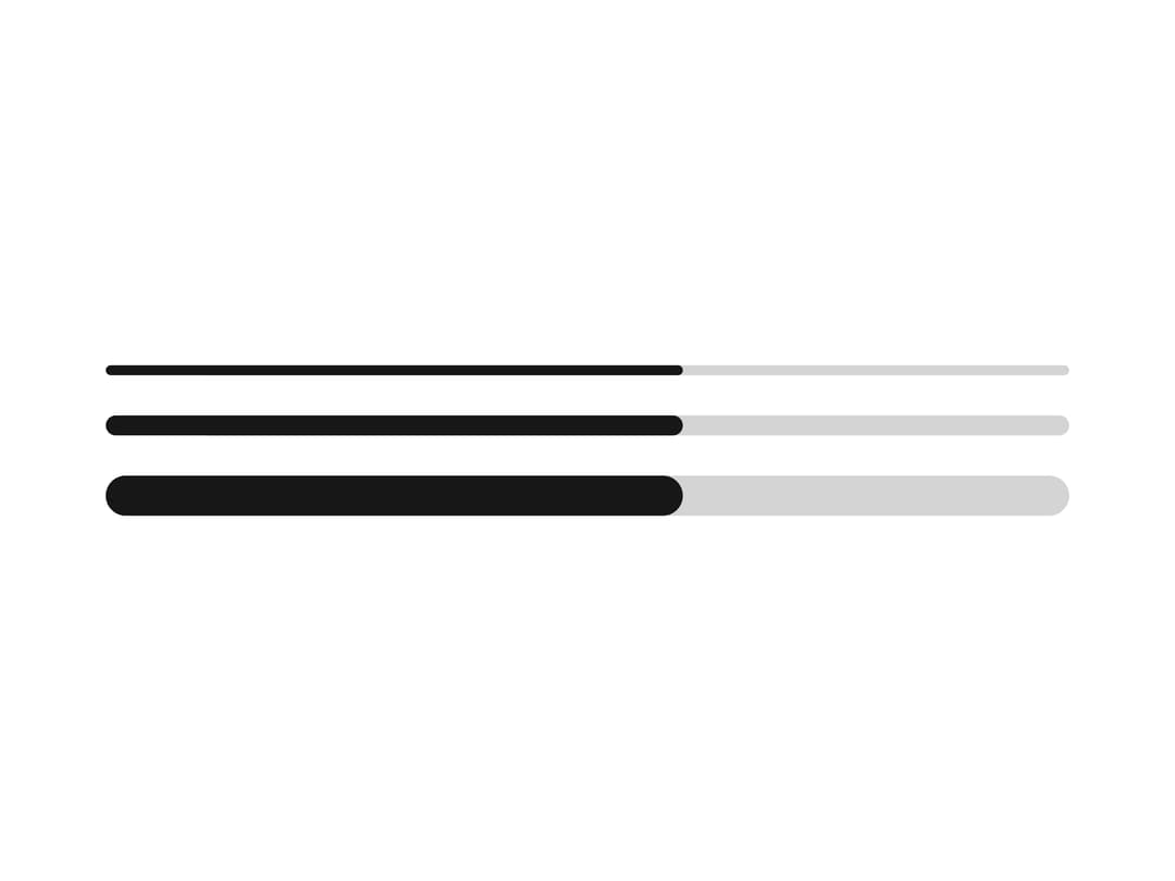
A horizontal progress bar that fills from a min to a max value, with configurable color and size, ported from the RockSolid UI library's SolidJS component to React.
Built with React and Tailwind. Copy the prompt and paste it into Claude Code, Cursor or Lovable: your agent adds Progress Bar to your project and fits it to your theme.
Code
How Progress Bar is used: the demo's code. The component's own source comes with a free account.
Usage.tsx
import Progress from "@/components/ui/progress";

export default function ProgressSizesDemo() {
  return (
    <div className="w-full max-w-sm space-y-4">
      <Progress value={60} size="small" />
      <Progress value={60} size="medium" />
      <Progress value={60} size="large" />
    </div>
  );
}
Dependencies
More by darshan-rajadhyaksha
View all
Backdrop
1
Switch

Avatar

Chip
Accessible Dialog
Input
Card Content
Breadcrumbs