
About
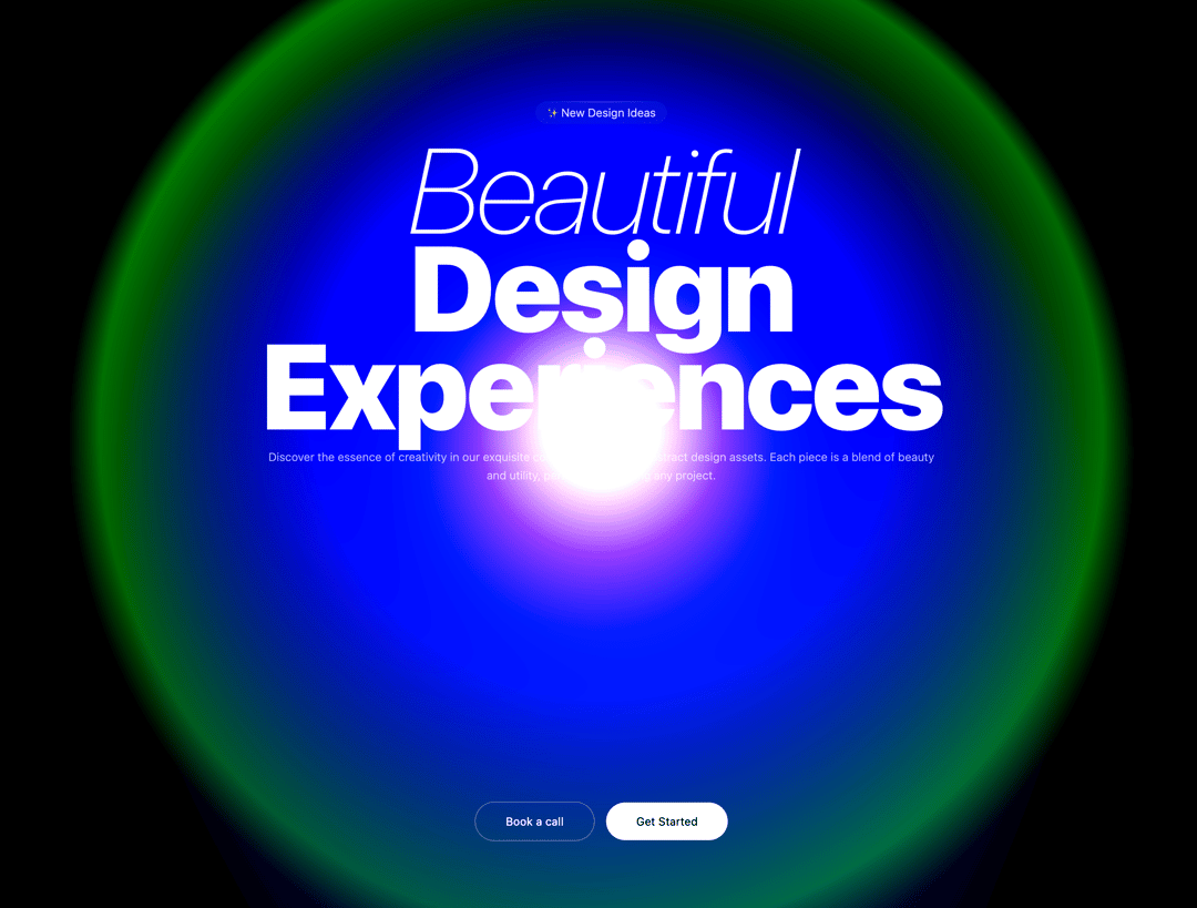
The component creates a full-screen animated shader effect with beautiful morphing light patterns in pink and cyan colors
Built with React and Tailwind. Copy the prompt and paste it into Claude Code, Cursor or Lovable: your agent adds Morphing Light to your project and fits it to your theme.
Code
How Morphing Light is used: the demo's code. The component's own source comes with a free account.
Usage.tsx
import { MorphingLight } from "@/components/ui/morphing-light";

export default function DemoOne() {
  return (
    <div className=" w-full h-screen ">
      <MorphingLight/>

      <main className="absolute top-40 left-1/2 -translate-x-1/2 z-20 ">

      <div className="text-center">
        <div
          className="inline-flex items-center px-3 py-1 rounded-full bg-white/5 backdrop-blur-sm mb-4 relative"
        >
          <div className="absolute top-0 left-1 right-1 h-px bg-gradient-to-r from-transparent via-white/20 to-transparent rounded-full" />
          <span className="text-white/90 text-xs font-light relative z-10">✨ New Design Ideas</span>
        </div>

        {/* Main Heading */}
        <h1 className="text-5xl md:text-9xl leading-26 tracking-tight text-white mb-4">
          <span className="italic font-thin">Beautiful</span>
          <br/>
          <span className="tracking-tight text-white font-black">Design Experiences</span>
        </h1>

        {/* Description */}
        <p className="text-xs font-light text-white/70 my-4 leading-relaxed">
          Discover the essence of creativity in our exquisite collection of top-tier abstract design assets. Each piece is a blend of beauty and utility, perfect for elevating any project.
        </p>

        {/* Buttons */}

      </div>
    </main>
    <div className="flex absolute bottom-20 left-1/2 -translate-x-1/2 justify-center items-center gap-3 flex-wrap">
          <button className="px-8 py-3 rounded-full bg-transparent border border-white/30 text-white font-normal text-xs transition-all duration-200 hover:bg-white/10 hover:border-white/50 cursor-pointer">
            Book a call
          </button>
          <button className="px-8 py-3 rounded-full bg-white text-black font-normal text-xs transition-all duration-200 hover:bg-white/90 cursor-pointer">
            Get Started
          </button>
        </div>
    </div>
  )
}
Dependencies
More by Ali Imam
View all

Liquid Glass Button
6.7K
Shader Animation
3.7K
WebGL Shader
2.6K
Shader Lines
2.3K
Shiny Button
2.2K
GLSL Hills
2.1K
Canvas
1.8K
Gallery
1.5K