
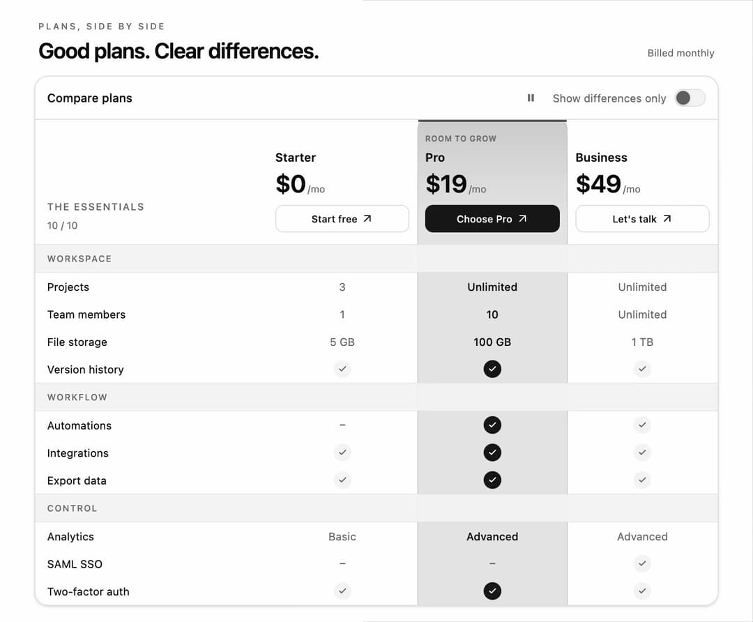
Spotlight Pricing Comparison Table for React and Tailwind CSS (shadcn/ui) with a moving column highlight and a show-differences filter. It is built to help visitors compare plans at a glance and focus on the features that matter. Shared rows fold away with FLIP animation and hidden-feature counts; selected checks light up in sequence. Includes responsive plan tabs, keyboard controls, reduced-motion support, controlled state, custom plan data, and an optional demo loop. Use it for SaaS pricing pages, hosting plans, memberships, or product specifications.
Built with React and Tailwind. Copy the prompt and paste it into Claude Code, Cursor or Lovable: your agent adds Spotlight Pricing Comparison Table to your project and fits it to your theme.
Code
How Spotlight Pricing Comparison Table is used: the demo's code. The component's own source comes with a free account.
Usage.tsx
"use client";

import * as React from "react";
import { SpotlightComparisonTable } from "@/components/ui/spotlight-comparison-table";
import type { ComparisonGroup, ComparisonPlan } from "@/components/ui/spotlight-comparison-table";

export const COMPARISON_PLANS: ComparisonPlan[] = [
  { id: "starter", name: "Starter", price: "$0", interval: "/mo", actionLabel: "Start free" },
  { id: "pro", name: "Pro", price: "$19", interval: "/mo", badge: "Room to grow", actionLabel: "Choose Pro" },
  { id: "business", name: "Business", price: "$49", interval: "/mo", actionLabel: "Let's talk" },
];

export const COMPARISON_GROUPS: ComparisonGroup[] = [
  { id: "workspace", label: "Workspace", features: [
    { id: "projects", label: "Projects", values: { starter: "3", pro: "Unlimited", business: "Unlimited" } },
    { id: "members", label: "Team members", values: { starter: "1", pro: "10", business: "Unlimited" } },
    { id: "storage", label: "File storage", values: { starter: "5 GB", pro: "100 GB", business: "1 TB" } },
    { id: "history", label: "Version history", values: { starter: true, pro: true, business: true } },
  ] },
  { id: "workflow", label: "Workflow", features: [
    { id: "automations", label: "Automations", values: { starter: false, pro: true, business: true } },
    { id: "integrations", label: "Integrations", values: { starter: true, pro: true, business: true } },
    { id: "export", label: "Export data", values: { starter: true, pro: true, business: true } },
  ] },
  { id: "control", label: "Control", features: [
    { id: "analytics", label: "Analytics", values: { starter: "Basic", pro: "Advanced", business: "Advanced" } },
    { id: "sso", label: "SAML SSO", values: { starter: false, pro: false, business: true } },
    { id: "two-factor", label: "Two-factor auth", values: { starter: true, pro: true, business: true } },
  ] },
];

type ComparisonDemoProps = {
  autoplay?: boolean;
  bare?: boolean;
  controlled?: boolean;
  initialPlan?: string;
  initialDifferences?: boolean;
};

export default function ComparisonDemo({ autoplay, bare = false, controlled = false, initialPlan = "starter", initialDifferences = false }: ComparisonDemoProps) {
  const [selected, setSelected] = React.useState(initialPlan);
  const [differences, setDifferences] = React.useState(initialDifferences);
  const [choice, setChoice] = React.useState("");
  return (
    <main className="flex min-h-svh w-full items-center justify-center bg-background p-3 text-foreground">
      <div className="w-full max-w-[696px]">
        {!bare && <header className="mb-3 flex items-end justify-between gap-2 px-1">
          <div><p className="mb-1 text-[9px] font-medium uppercase tracking-[0.2em] text-muted-foreground">Plans, side by side</p><h1 className="text-[22px] font-semibold leading-7 tracking-tight">Good plans. Clear differences.</h1></div>
          <span className="mb-1 hidden text-[10px] text-muted-foreground sm:block">Billed monthly</span>
        </header>}
        <SpotlightComparisonTable
          plans={COMPARISON_PLANS}
          groups={COMPARISON_GROUPS}
          {...(bare && autoplay === undefined ? {} : { autoplay: autoplay ?? true })}
          defaultSelectedPlanId={initialPlan}
          defaultDifferencesOnly={initialDifferences}
          {...(controlled ? { selectedPlanId: selected, onSelectedPlanChange: setSelected, differencesOnly: differences, onDifferencesOnlyChange: setDifferences } : {})}
          onChoosePlan={(plan) => setChoice(plan.name)}
        />
        {choice && <p role="status" data-demo-choice className="sr-only">{choice} selected.</p>}
      </div>
    </main>
  );
}
More by DHxWhy
View all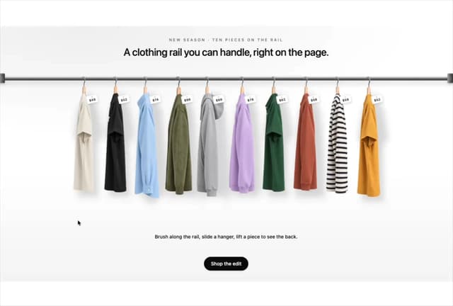

Product Rail Gallery – Fashion Store Hero Section
1.4K
Sushi Conveyor Belt Menu – Restaurant Hero Section
393
Sun Moon Dark Mode Theme Toggle
281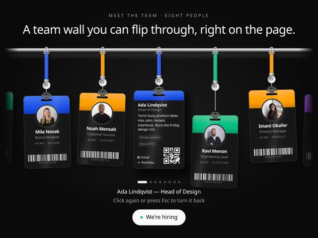
Team Lanyard Rail – Meet the Team Section with Flip Badges
249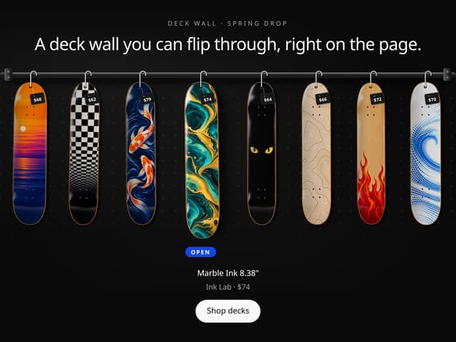
Skateboard Deck Rail Gallery – Skate Shop Hero Section
164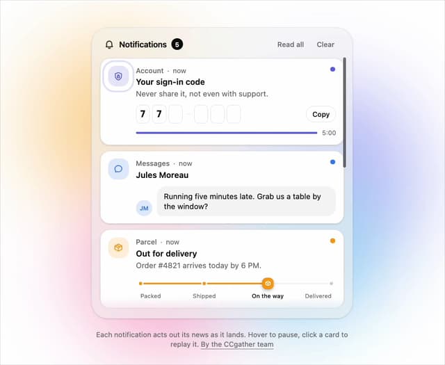
Live Notification Feed
151
Country Flags Globe
135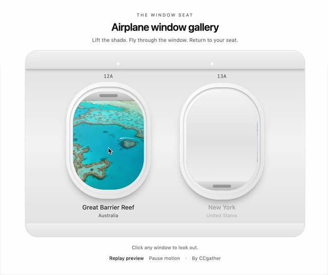
Airplane Window Gallery
125
More in Pricing
View all
Pricing Section
611

Pricing Card
542

Pricing Section
183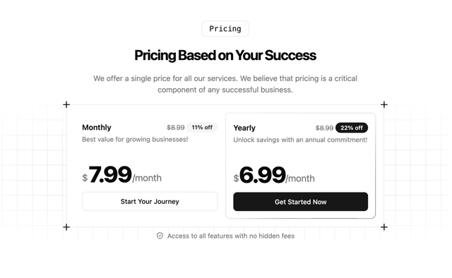
Single Pricing Card
799

RuixenPricing05
103
Pricing Card With Features
176

Pricing Cards
17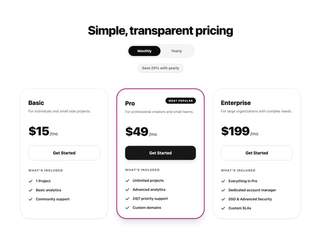
Glowing Pricing Tiers
65


