
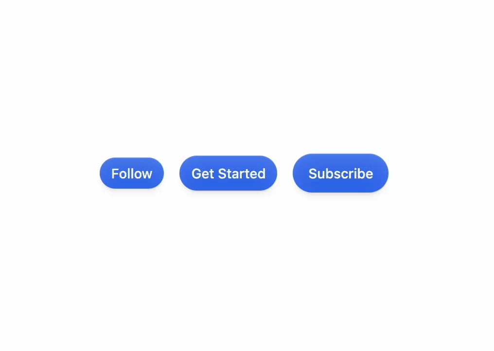
About
A rounded, glossy pill-shaped button built on Base UI with size variants for primary actions and icon buttons.
Built with React and Tailwind. Copy the prompt and paste it into Claude Code, Cursor or Lovable: your agent adds Pill Button to your project and fits it to your theme.
Code
How Pill Button is used: the demo's code. The component's own source comes with a free account.
Usage.tsx
import { PillButton } from "@/components/ui/pill-button";

export default function PillButtonDemo() {
  return (
    <div className="flex min-h-[200px] w-full items-center justify-center gap-4 p-10">
      <PillButton size="sm">Follow</PillButton>
      <PillButton>Get Started</PillButton>
      <PillButton size="lg">Subscribe</PillButton>
    </div>
  );
}
Dependencies
More by Diar Muradi
View all

Toggleable Add-on Pricing
190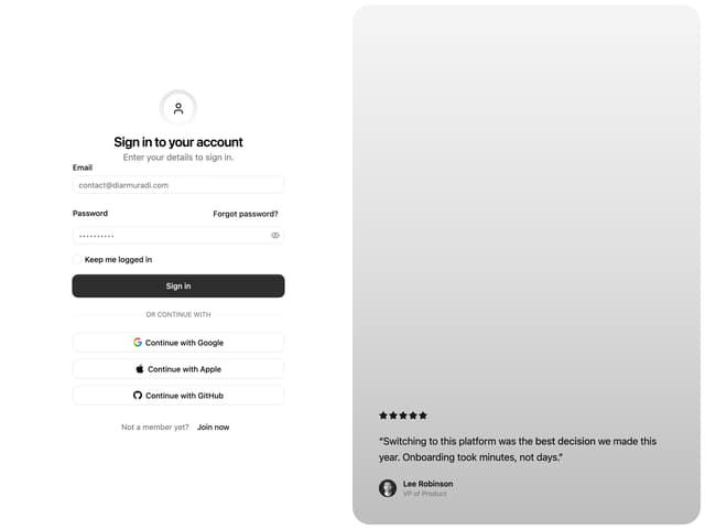
Split Sign In Form
105
Toggle Pricing Cards
86
ROI Pricing Calculator
60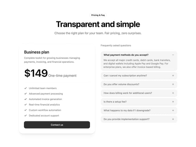
Pricing With FAQ
54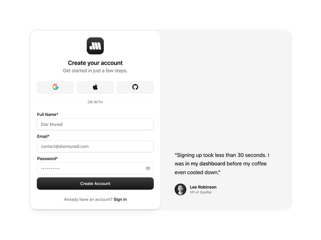
Sign Up Split Panel
50
Logo Orbit
48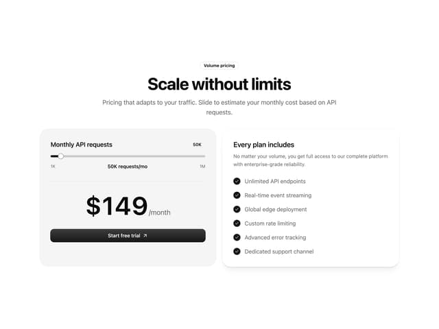
Volume Pricing Card
36
More in Buttons
View all
Button
9

Button
1
Texture Button
101

Eclipse Button
3

App Store Button
472
Native Button
12

Button Group
3

HeroUI Button Group
1


