About
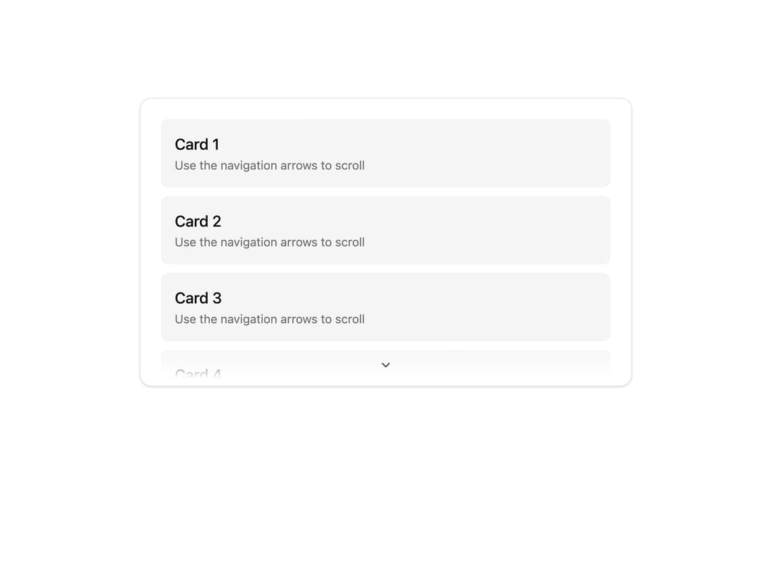
A scrollable container with fading edge shadows, optional hidden scrollbar, and navigation arrows for vertical or horizontal overflow.
Built with React and Tailwind. Copy the prompt and paste it into Claude Code, Cursor or Lovable: your agent adds Scroller to your project and fits it to your theme.
Code
How Scroller is used: the demo's code. The component's own source comes with a free account.
Usage.tsx
import { Scroller } from "@/components/ui/scroller";

export default function ScrollerNavigationDemo() {
  return (
    <Scroller
      hideScrollbar
      withNavigation
      scrollTriggerMode="press"
      className="flex h-80 w-full flex-col gap-2.5 p-4"
    >
      {Array.from({ length: 10 }).map((_, index) => (
        <div key={index} className="flex flex-col rounded-md bg-accent p-4">
          <div className="font-medium text-lg">Card {index + 1}</div>
          <span className="text-muted-foreground text-sm">
            Use the navigation arrows to scroll
          </span>
        </div>
      ))}
    </Scroller>
  );
}
Dependencies
More by Dice UI
View all

Compare Slider
75
Sortable
49
Circular Progress
41
Status
29
Pending
27
Banner
18
Stack
7
Mention
4
More in Cards
View all
Stats cards with links
120

Course Design Cards
1.1K

Statistics Card 2
258
Card
55

Card Studio
9
Statistics Card 7
288
The Item one
3

Weather Card
52
