
About
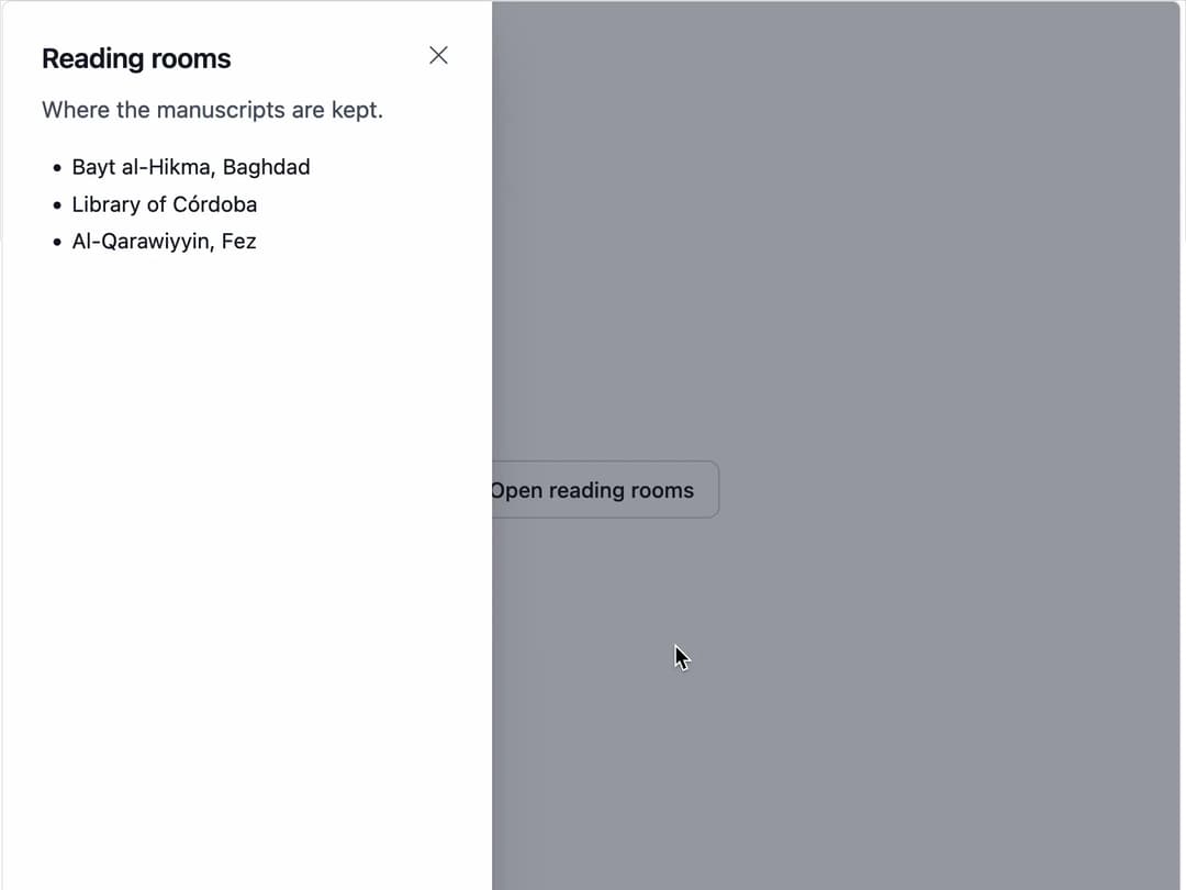
A modal dialog built on the native HTML dialog element, with a centered variant and a full-height sheet variant that slides in from either edge.
Built with React and Tailwind. Copy the prompt and paste it into Claude Code, Cursor or Lovable: your agent adds Dialog to your project and fits it to your theme.
Code
How Dialog is used: the demo's code. The component's own source comes with a free account.
Usage.tsx
"use client";

import * as React from "react";
import Dialog from "@/components/ui/dialog";

export default function DialogSheetDemo() {
  const [open, setOpen] = React.useState(false);

  return (
    <div className="flex min-h-[320px] w-full items-center justify-center p-8">
      <button
        type="button"
        className="inline-flex items-center justify-center rounded-md border border-neutral-300 bg-white px-4 py-2 text-sm font-medium text-neutral-900 hover:bg-neutral-50 dark:border-neutral-700 dark:bg-neutral-900 dark:text-neutral-100 dark:hover:bg-neutral-800"
        onClick={() => setOpen(true)}
      >
        Open reading rooms
      </button>
      <Dialog
        open={open}
        onOpenChange={setOpen}
        side="start"
        title="Reading rooms"
        description="Where the manuscripts are kept."
      >
        <ul className="list-disc space-y-1 pl-5 text-sm">
          <li>Bayt al-Hikma, Baghdad</li>
          <li>Library of Córdoba</li>
          <li>Al-Qarawiyyin, Fez</li>
        </ul>
      </Dialog>
    </div>
  );
}
Dependencies
More by ebnsina
View all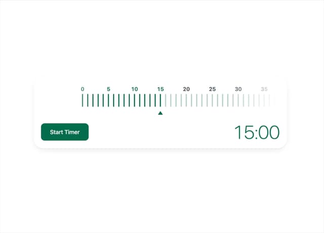
Countdown Timer
30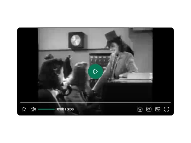
Video Player
22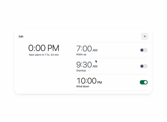
Alarm Clock
21
Voice Note
16
Hourglass Timer
14
Sortable List
13
Split Button
12
Sign In Auth Card
10