
About
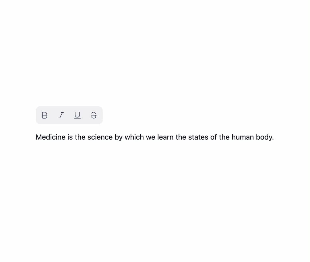
A multi-select group of toggle buttons for a toolbar (like text-style controls) with roving-tabindex arrow-key navigation and automatic tooltips on icon-only buttons; ported to React from the Sina UI Svelte component library by ebnsina.
Built with React and Tailwind. Copy the prompt and paste it into Claude Code, Cursor or Lovable: your agent adds Toggle Group to your project and fits it to your theme.
Code
How Toggle Group is used: the demo's code. The component's own source comes with a free account.
Usage.tsx
"use client";

import ToggleGroup from "@/components/ui/toggle-group";
import { useState } from "react";
import {
  TextBoldIcon,
  TextItalicIcon,
  TextStrikethroughIcon,
  TextUnderlineIcon,
} from "@hugeicons/core-free-icons";

export default function ToggleGroupIconsDemo() {
  const [style, setStyle] = useState<string[]>(["bold"]);

  return (
    <div style={{ display: "grid", gap: "1rem" }}>
      <ToggleGroup
        label="Text style"
        value={style}
        onValueChange={setStyle}
        items={[
          { value: "bold", label: "Bold", icon: TextBoldIcon },
          { value: "italic", label: "Italic", icon: TextItalicIcon },
          { value: "underline", label: "Underline", icon: TextUnderlineIcon },
          {
            value: "strike",
            label: "Strikethrough",
            icon: TextStrikethroughIcon,
          },
        ]}
      />
      <p
        style={{
          margin: 0,
          color: "var(--ui-fg, inherit)",
          fontWeight: style.includes("bold") ? 600 : undefined,
          fontStyle: style.includes("italic") ? "italic" : undefined,
          textDecoration:
            [
              style.includes("underline") && "underline",
              style.includes("strike") && "line-through",
            ]
              .filter(Boolean)
              .join(" ") || undefined,
        }}
      >
        Medicine is the science by which we learn the states of the human body.
      </p>
    </div>
  );
}
Dependencies
More by ebnsina
View all
Countdown Timer
30
Video Player
22
Alarm Clock
21
Voice Note
16
Hourglass Timer
14
Sortable List
13
Split Button
12
Sign In Auth Card
9