
About
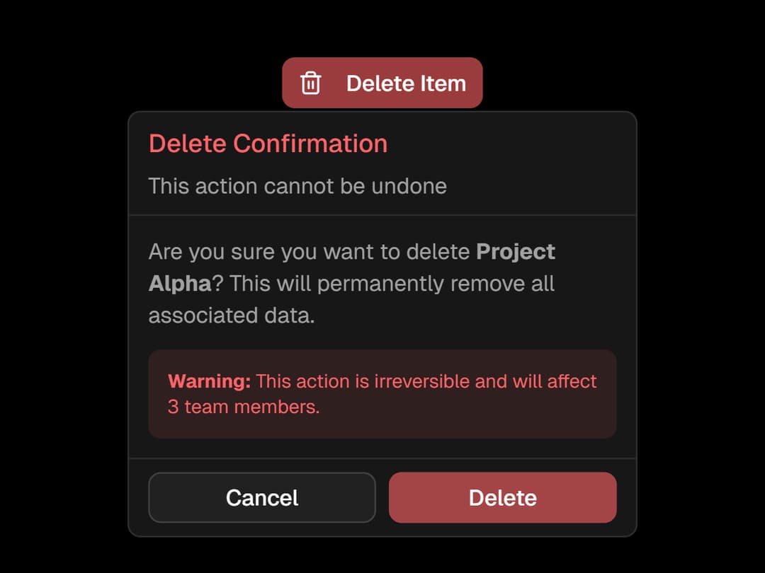
A beautifully wrapped Radix Popover with custom slots, animations, and sections like header, body, and footer — all styled for seamless integration. Easily build interactive popups with consistent UI and flexible layout support.
Built with React and Tailwind. Copy the prompt and paste it into Claude Code, Cursor or Lovable: your agent adds Popover to your project and fits it to your theme.
Code
How Popover is used: the demo's code. The component's own source comes with a free account.
Usage.tsx
'use client';
import React from 'react';
import {
	Popover,
	PopoverBody,
	PopoverContent,
	PopoverDescription,
	PopoverHeader,
	PopoverTitle,
	PopoverTrigger,
    PopoverClose,
	PopoverFooter,
} from '@/components/ui/popover';
import { Button } from '@/components/ui/button';
import { Trash2 } from 'lucide-react';

export default function ConfirmationDemo() {
	return (
		<Popover>
			<PopoverTrigger asChild>
				<Button variant="destructive" size="sm">
					<Trash2 className="mr-2 h-4 w-4" />
					Delete Item
				</Button>
			</PopoverTrigger>
			<PopoverContent className="w-80">
				<PopoverHeader>
					<PopoverTitle className="text-destructive">
						Delete Confirmation
					</PopoverTitle>
					<PopoverDescription>This action cannot be undone</PopoverDescription>
				</PopoverHeader>
				<PopoverBody>
					<div className="space-y-3">
						<p className="text-sm text-muted-foreground">
							Are you sure you want to delete <strong>{'Project Alpha'}</strong>
							? This will permanently remove all associated data.
						</p>
						<div className="rounded-md bg-destructive/10 p-3">
							<p className="text-xs text-destructive">
								<strong>Warning:</strong> This action is irreversible and will
								affect 3 team members.
							</p>
						</div>
					</div>
				</PopoverBody>
				<PopoverFooter className="grid-cols-2">
					<PopoverClose asChild>
						<Button variant="outline" size="sm">
							Cancel
						</Button>
					</PopoverClose>
					<Button variant="destructive" size="sm">
						Delete
					</Button>
				</PopoverFooter>
			</PopoverContent>
		</Popover>
	);
}
Dependencies
More by Efferd
View all

Testimonials Columns
7.1K
Zoom Parallax
5.4K
Dotted Surface
3.6K
Footer Section
2.7K
Grid Feature Cards
1.9K
Logo Cloud 2
1.8K
Header 3
1.6K
Logo Cloud 3
1.5K
More in Buttons
View all
Button
16
Texture Button
110

Astryx Button Group
27

Button
135

Button
36

HeroUI Button Group
2

Eclipse Button
9
HeroUI Toggle Button
2

