
About
A confirm/cancel modal dialog for irreversible actions like deleting an item, with destructive styling, Escape/backdrop dismissal, and optional entrance animation.
Built with React and Tailwind. Copy the prompt and paste it into Claude Code, Cursor or Lovable: your agent adds Alert Dialog to your project and fits it to your theme.
Code
How Alert Dialog is used: the demo's code. The component's own source comes with a free account.
Usage.tsx
"use client";

import * as React from "react";
import { AlertDialog } from "@/components/ui/alert-dialog";

export default function AlertDialogDemo() {
  const [open, setOpen] = React.useState(false);

  return (
    <div className="flex min-h-[400px] w-full items-center justify-center bg-background text-foreground">
      <button
        onClick={() => setOpen(true)}
        className="rounded-md border border-input bg-background px-4 py-2 text-sm font-medium hover:bg-muted focus-visible:outline-none focus-visible:ring-2 focus-visible:ring-ring focus-visible:ring-offset-2 transition-colors"
      >
        Delete item
      </button>
      <AlertDialog
        open={open}
        onOpenChange={setOpen}
        title="Delete item"
        description="This cannot be undone."
        destructive
        confirmLabel="Delete"
        cancelLabel="Cancel"
        onConfirm={() => setOpen(false)}
        onCancel={() => setOpen(false)}
      />
    </div>
  );
}
More by f0rextasy
View all
Newsletter Signup Card
5
Board Checklist
3
Time Input
3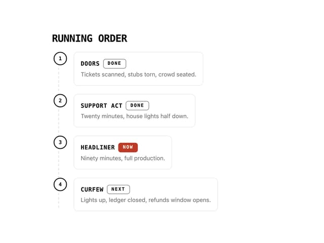
Running Order Timeline
2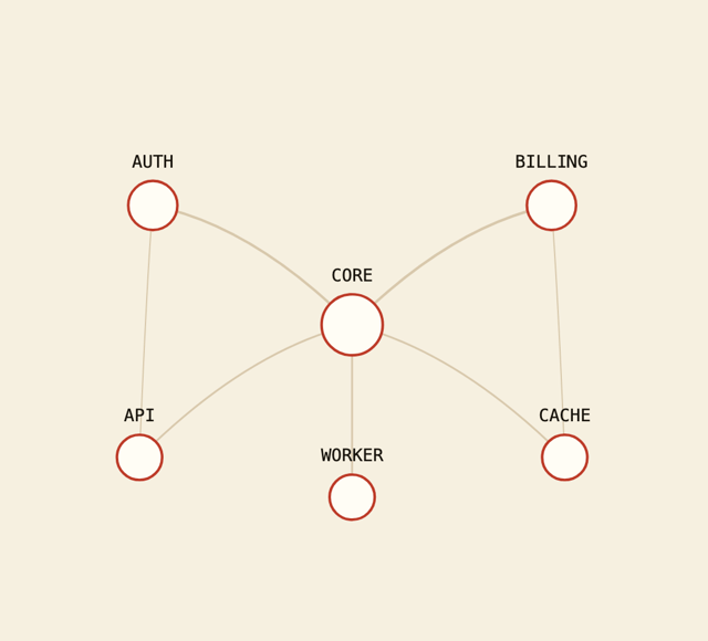
Network Graph
2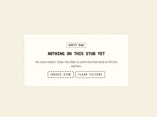
Empty State Card
1
Invite Modal
1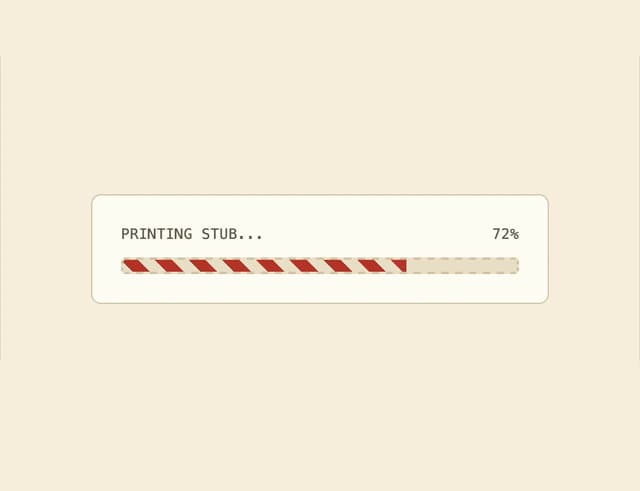
Striped Progress Bar
1