
About
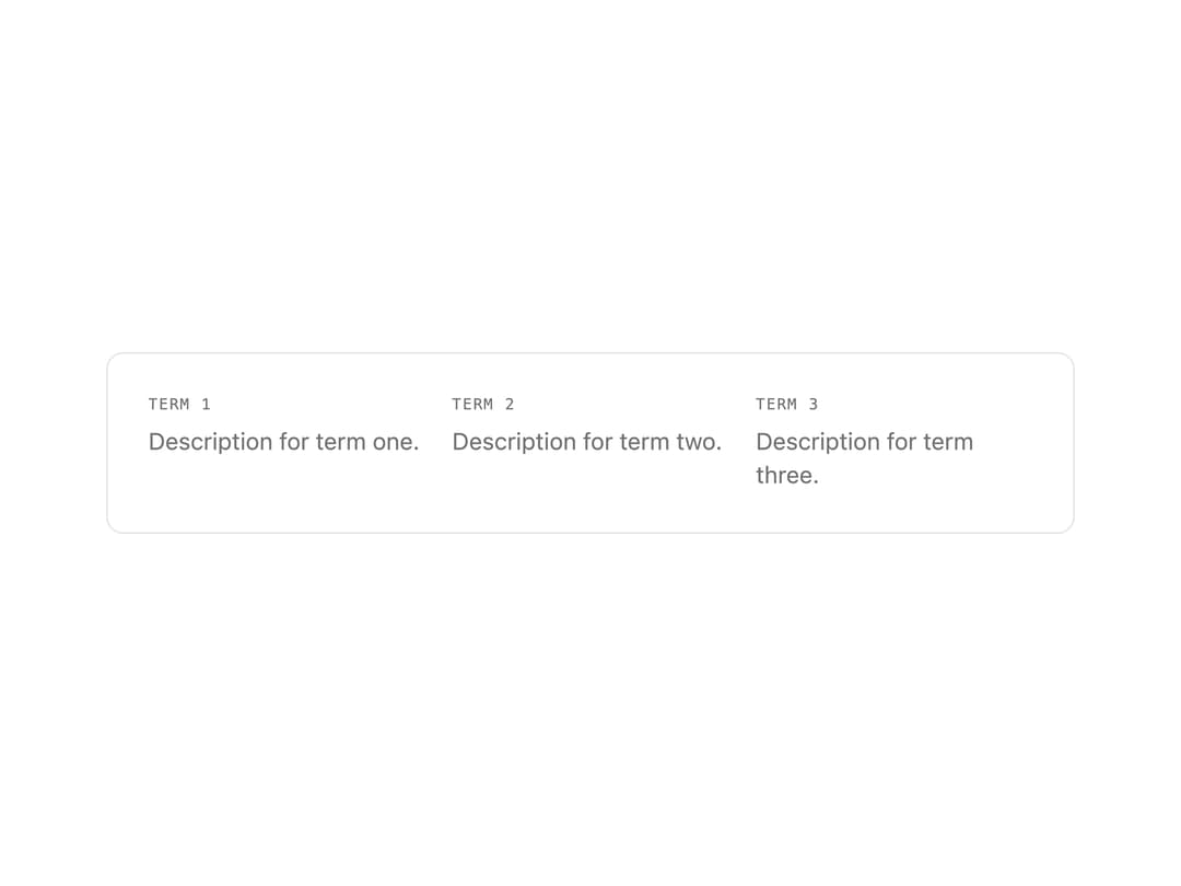
A term/description grid for displaying key-value style metadata pairs, such as ticket or receipt details, with mono uppercase labels and muted values.
Built with React and Tailwind. Copy the prompt and paste it into Claude Code, Cursor or Lovable: your agent adds Description List to your project and fits it to your theme.
Code
How Description List is used: the demo's code. The component's own source comes with a free account.
Usage.tsx
import { DescriptionList } from "@/components/ui/description-list";

export default function DescriptionListDemo() {
  return (
    <div className="w-full max-w-xl rounded-lg border border-border bg-card p-6 text-card-foreground">
      <DescriptionList
        items={[
          { term: "Term 1", description: "Description for term one." },
          { term: "Term 2", description: "Description for term two." },
          { term: "Term 3", description: "Description for term three." },
        ]}
      />
    </div>
  );
}
More by f0rextasy
View all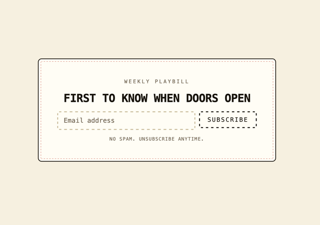
Newsletter Signup Card
19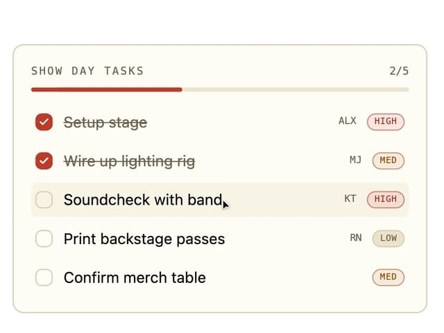
Board Checklist
15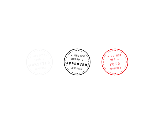
Stamp Seal
15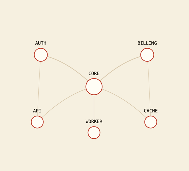
Network Graph
14
Navbar
12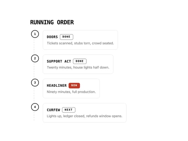
Running Order Timeline
11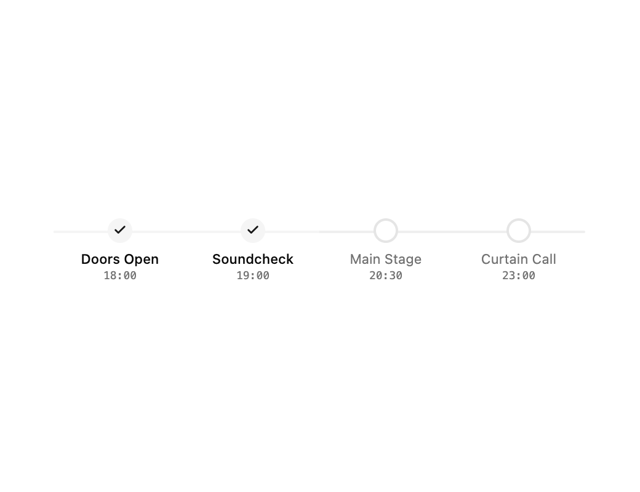
Milestone Chart
10
Empty State Card
7