
About
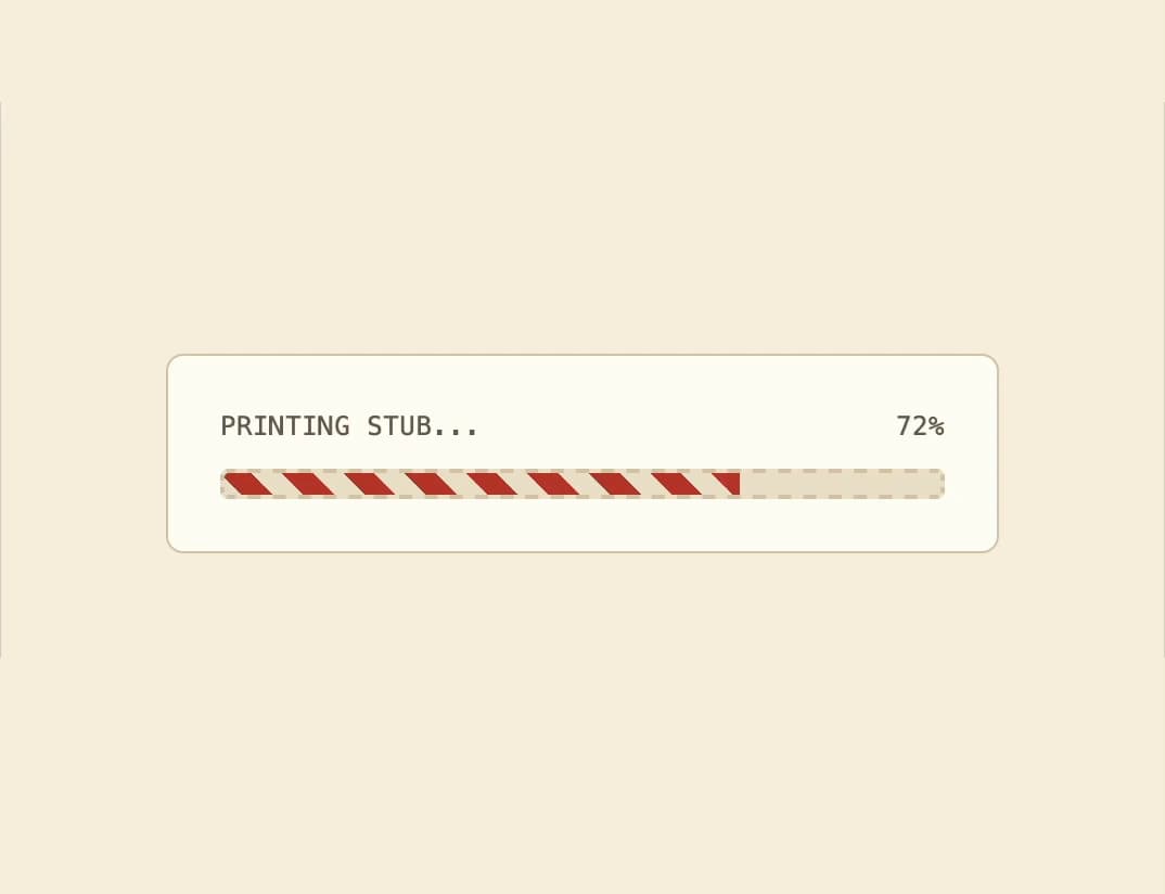
A progress bar with a dashed border and an animated diagonal-striped fill that shows how far a task has completed.
Built with React and Tailwind. Copy the prompt and paste it into Claude Code, Cursor or Lovable: your agent adds Striped Progress Bar to your project and fits it to your theme.
Code
How Striped Progress Bar is used: the demo's code. The component's own source comes with a free account.
Usage.tsx
import Progress from "@/components/ui/progress";

export default function ProgressDemo() {
  return (
    <div className="flex w-full max-w-sm flex-col gap-3 rounded-lg border border-border bg-card p-6 text-card-foreground">
      <div className="flex items-center justify-between text-xs font-mono uppercase tracking-wide text-muted-foreground">
        <span>Printing stub...</span>
        <span>72%</span>
      </div>
      <Progress value={72} label="Printing stub" />
    </div>
  );
}
More by f0rextasy
View all
Newsletter Signup Card
4
Board Checklist
3
Time Input
3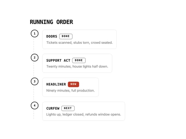
Running Order Timeline
2
Invite Modal
1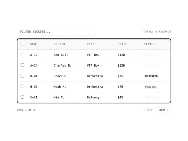
Data Table
1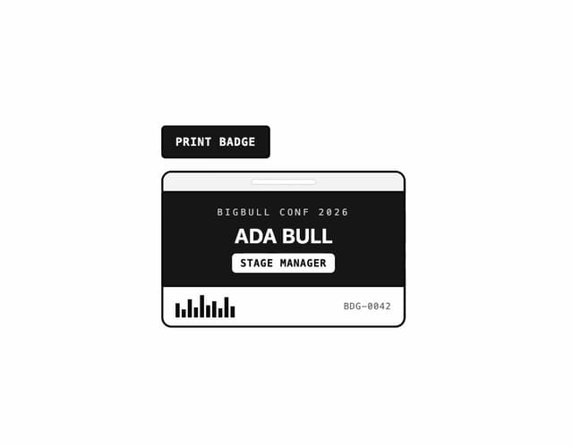
Badge Printer Template
1
Stamp Seal
1