
About
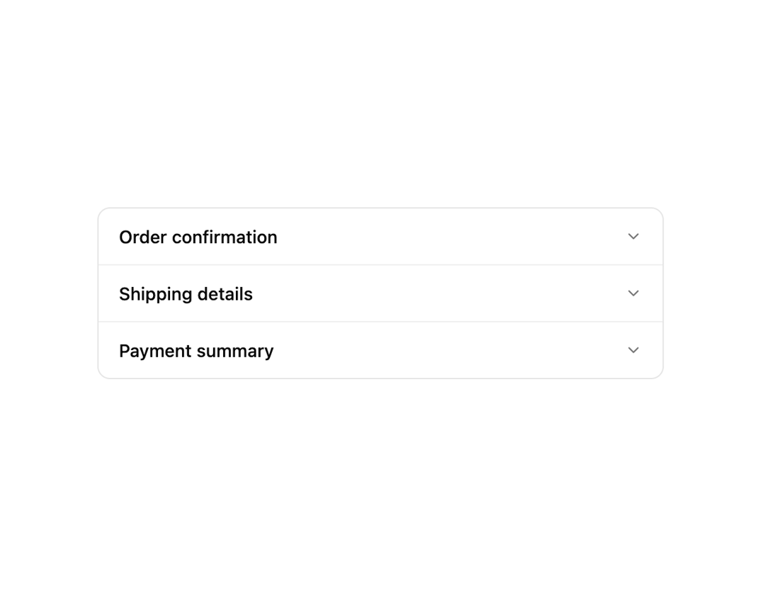
An accordion-style list of rows that expand in place to reveal detail content, with a smooth height animation and staggered entrance.
Built with React and Tailwind. Copy the prompt and paste it into Claude Code, Cursor or Lovable: your agent adds Row Expand to your project and fits it to your theme.
Code
How Row Expand is used: the demo's code. The component's own source comes with a free account.
Usage.tsx
"use client";

import RowExpand from "@/components/ui/row-expand";

export default function RowExpandDemo() {
  const items = [
    {
      id: "1",
      label: "Order confirmation",
      detail:
        "Your order #1042 has been confirmed and is being prepared for shipment.",
    },
    {
      id: "2",
      label: "Shipping details",
      detail: "Estimated delivery: 3-5 business days via standard shipping.",
    },
    {
      id: "3",
      label: "Payment summary",
      detail: "Visa ending in 4242 — $128.50 charged on checkout.",
    },
  ];

  return (
    <div className="flex min-h-[400px] w-full items-center justify-center bg-background p-8 text-foreground">
      <RowExpand items={items} />
    </div>
  );
}
More by f0rextasy
View all
Newsletter Signup Card
16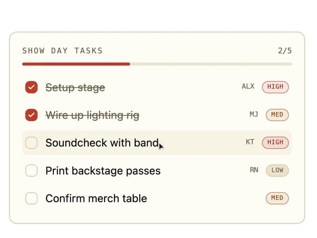
Board Checklist
15
Stamp Seal
12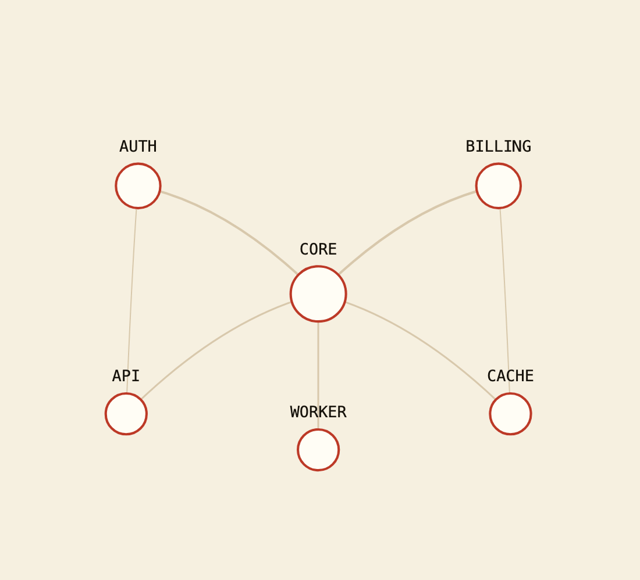
Network Graph
12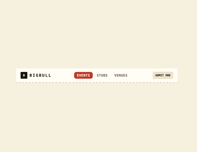
Navbar
8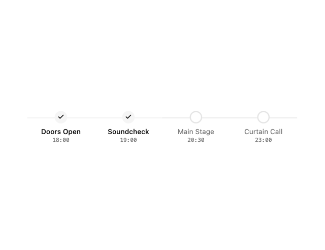
Milestone Chart
7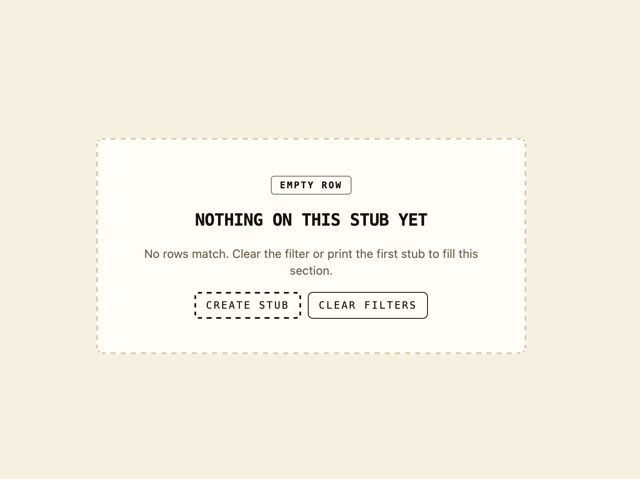
Empty State Card
6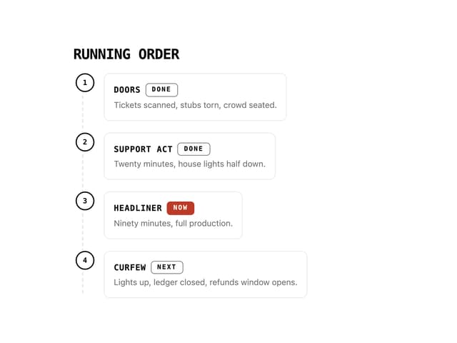
Running Order Timeline
6