About
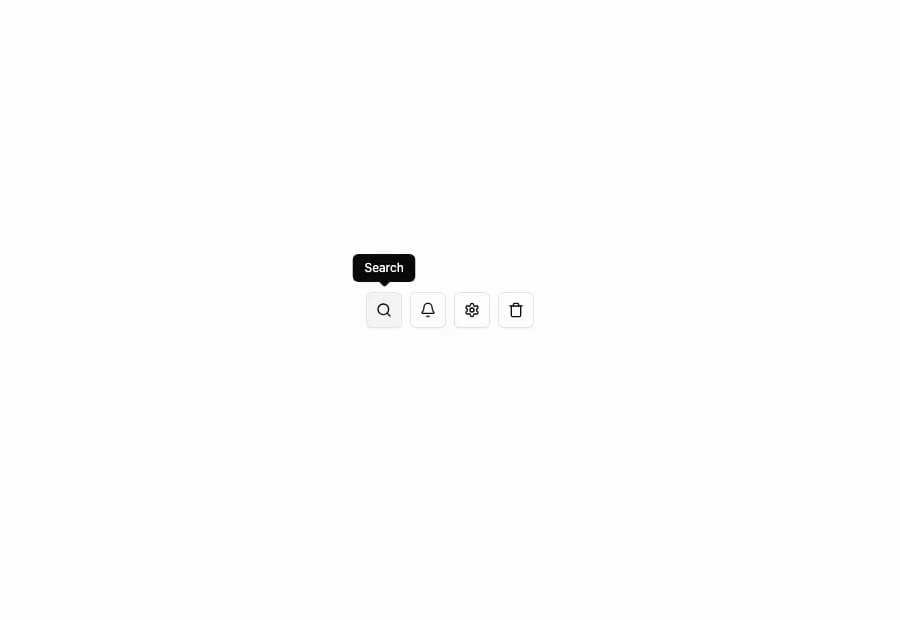
A Tooltip from the Flexnative UI registry with 10 variants: basic hover, four-side positioning, keyboard shortcut hint, icon-button trigger, custom open delay, rich multi-line content, light-on-dark theming, colored variants, arrow-less, and adjustable side offset. Built on Radix Tooltip.
Built with React and Tailwind. Copy the prompt and paste it into Claude Code, Cursor or Lovable: your agent adds Flexnative Tooltip to your project and fits it to your theme.
Code
How Flexnative Tooltip is used: the demo's code. The component's own source comes with a free account.
Usage.tsx
'use client'

import { TooltipProvider } from '@/components/ui/flexnative-tooltip'
import { BellIcon, SearchIcon, SettingsIcon, TrashIcon } from 'lucide-react'

import { Button } from '@/components/ui/button'
import {
  Tooltip,
  TooltipContent,
  TooltipTrigger,
} from '@/components/ui/flexnative-tooltip'

const actions = [
  { icon: SearchIcon, label: 'Search' },
  { icon: BellIcon, label: 'Notifications' },
  { icon: SettingsIcon, label: 'Settings' },
  { icon: TrashIcon, label: 'Delete' },
]

export function Tooltip04() {
  return (
    <div className="flex items-center gap-2">
      {actions.map(({ icon: Icon, label }) => (
        <Tooltip key={label}>
          <TooltipTrigger asChild>
            <Button variant="outline" size="icon" aria-label={label}>
              <Icon />
            </Button>
          </TooltipTrigger>
          <TooltipContent>{label}</TooltipContent>
        </Tooltip>
      ))}
    </div>
  )
}

export default function Default() {
  return (
    <TooltipProvider>
      <div className="flex min-h-screen w-full items-center justify-center bg-background p-10">
        <Tooltip04 />
      </div>
    </TooltipProvider>
  )
}
Dependencies
More by felipemenezes098
View all
Centered Hero with Image Fan
1K
Editorial Collage Hero
485
Split Hero With Image Cards
439
Editorial Image Hero
407
Scroll 01
393
Real Estate Search Hero
210
Editorial Hero
193
Hero with Dashboard Mockup
140
More in Buttons
View all
Texture Button
102
Button
10

Button
4
Native Button
12

Button Group
38
Button
76

HeroUI Button Group
11
Split Button
36


