About
Here is Dialog components
Built with React and Tailwind. Copy the prompt and paste it into Claude Code, Cursor or Lovable: your agent adds The Dialog to your project and fits it to your theme.
Code
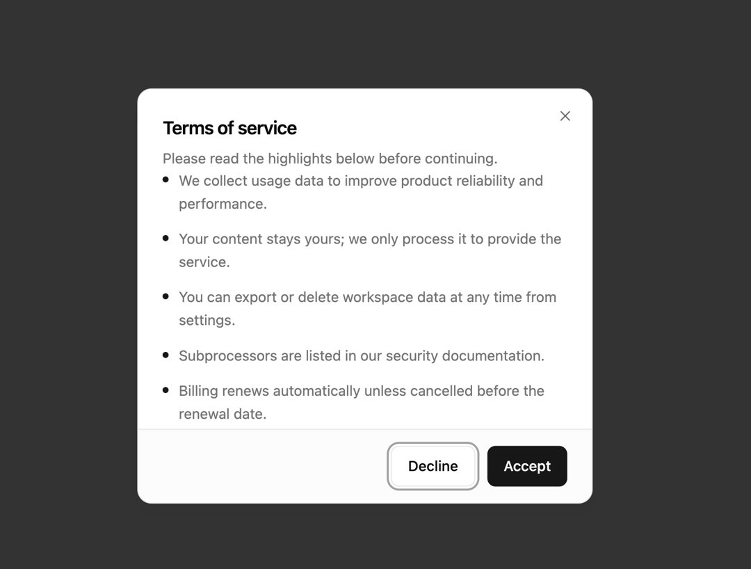
How The Dialog is used: the demo's code. The component's own source comes with a free account.
Usage.tsx
import { Button } from '@/components/ui/button'
import {
  Dialog,
  DialogClose,
  DialogContent,
  DialogDescription,
  DialogFooter,
  DialogHeader,
  DialogTitle,
  DialogTrigger,
} from '@/components/ui/dialog'

const terms = [
  'We collect usage data to improve product reliability and performance.',
  'Your content stays yours; we only process it to provide the service.',
  'You can export or delete workspace data at any time from settings.',
  'Subprocessors are listed in our security documentation.',
  'Billing renews automatically unless cancelled before the renewal date.',
  'Support response times depend on your plan tier.',
  'We may email you about critical security or billing updates.',
  'Continued use after updates means you accept the revised terms.',
]

export default function Dialog04() {
  return (
    <Dialog>
      <DialogTrigger asChild>
        <Button variant="outline">Review terms</Button>
      </DialogTrigger>
      <DialogContent className="flex flex-col gap-0 overflow-hidden p-0 sm:max-w-md">
        <DialogHeader className="px-6 pt-6">
          <DialogTitle>Terms of service</DialogTitle>
          <DialogDescription>
            Please read the highlights below before continuing.
          </DialogDescription>
        </DialogHeader>
        <div className="-mx-0 max-h-[min(50vh,16rem)] overflow-y-auto px-6 pb-4">
          <ul className="flex flex-col gap-3">
            {terms.map((item) => (
              <li
                key={item}
                className="text-muted-foreground flex gap-2.5 text-sm leading-relaxed"
              >
                <span className="bg-primary mt-2 size-1.5 shrink-0 rounded-full" />
                <span>{item}</span>
              </li>
            ))}
          </ul>
        </div>
        <DialogFooter className="bg-muted/30 border-t px-6 py-4">
          <DialogClose asChild>
            <Button variant="outline">Decline</Button>
          </DialogClose>
          <Button>Accept</Button>
        </DialogFooter>
      </DialogContent>
    </Dialog>
  )
}
Dependencies
More by felipemenezes098
View all
Centered Hero with Image Fan
1K
Editorial Collage Hero
485
Split Hero With Image Cards
439
Editorial Image Hero
407
Scroll 01
393
Real Estate Search Hero
210
Editorial Hero
193
Hero with Dashboard Mockup
140
More in Buttons
View all
Texture Button
102
Button
10

Button
4
Native Button
12

Button Group
38
Button
76

HeroUI Button Group
11
Split Button
36


