"use client";

import { CardDialog } from "@/components/ui/halaska-dialog";
import { useState } from "react";

const ghostBtn: React.CSSProperties = {
  height: 30,
  padding: "0 12px",
  borderRadius: 16,
  border: "none",
  background: "transparent",
  color: "#888888",
  fontSize: 12,
  fontWeight: 500,
  fontFamily: "system-ui, sans-serif",
  cursor: "pointer",
};
const primaryBtn: React.CSSProperties = {
  height: 30,
  padding: "0 12px",
  borderRadius: 16,
  border: "none",
  background: "#3d3d3d",
  color: "#ffffff",
  fontSize: 12,
  fontWeight: 500,
  fontFamily: "system-ui, sans-serif",
  cursor: "pointer",
};
const outlineBtn: React.CSSProperties = {
  height: 30,
  padding: "0 12px",
  borderRadius: 16,
  border: "1.5px solid rgba(0,0,0,0.06)",
  background: "transparent",
  color: "#3d3d3d",
  fontSize: 12,
  fontWeight: 500,
  fontFamily: "system-ui, sans-serif",
  cursor: "pointer",
};

export default function CardDialogDemo() {
  const [open, setOpen] = useState(false);
  return (
    <div className="flex min-h-[320px] w-full items-center justify-center">
      <button style={outlineBtn} onClick={() => setOpen(true)}>
        Card
      </button>
      <CardDialog
        open={open}
        onClose={() => setOpen(false)}
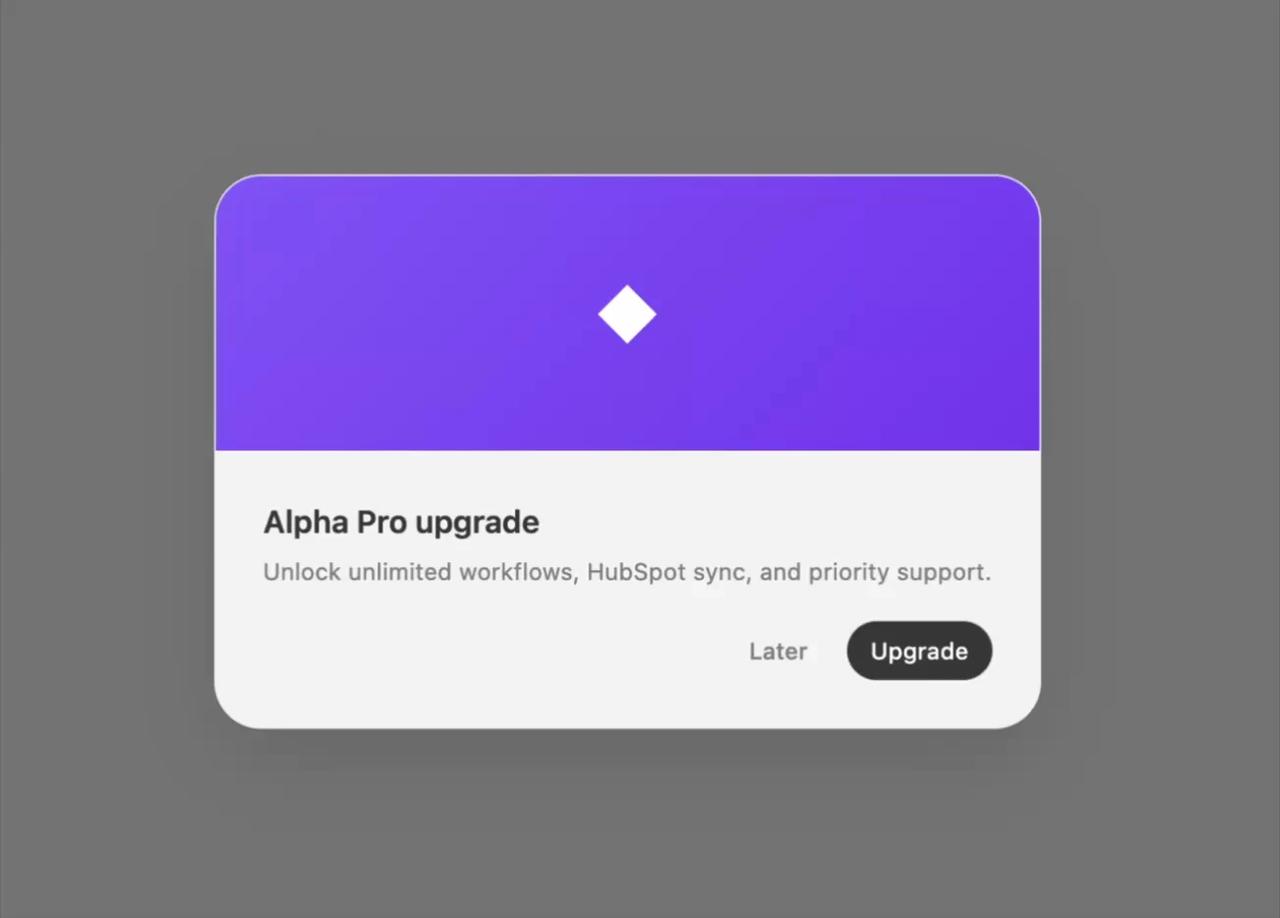
        cover="◆"
        title="Alpha Pro upgrade"
        description="Unlock unlimited workflows, HubSpot sync, and priority support."
        actions={
          <>
            <button style={ghostBtn} onClick={() => setOpen(false)}>
              Later
            </button>
            <button style={primaryBtn} onClick={() => setOpen(false)}>
              Upgrade
            </button>
          </>
        }
      />
    </div>
  );
}