
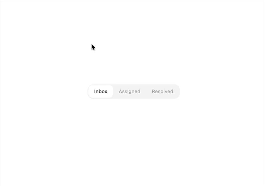
About
An iOS-style segmented control where a sliding thumb animates between options to switch between a small set of views or filters.
Built with React and Tailwind. Copy the prompt and paste it into Claude Code, Cursor or Lovable: your agent adds Segmented Control to your project and fits it to your theme.
Code
How Segmented Control is used: the demo's code. The component's own source comes with a free account.
Usage.tsx
import SegmentedControl from "@/components/ui/segmented-control";
import { useState } from "react";

export default function SegmentedControlDemo() {
  const [view, setView] = useState("Inbox");
  return (
    <SegmentedControl
      options={["Inbox", "Assigned", "Resolved"]}
      value={view}
      onChange={setView}
    />
  );
}
More by halaska-studio
View all
Dot Grid
41
Orb
20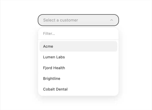
Combobox
9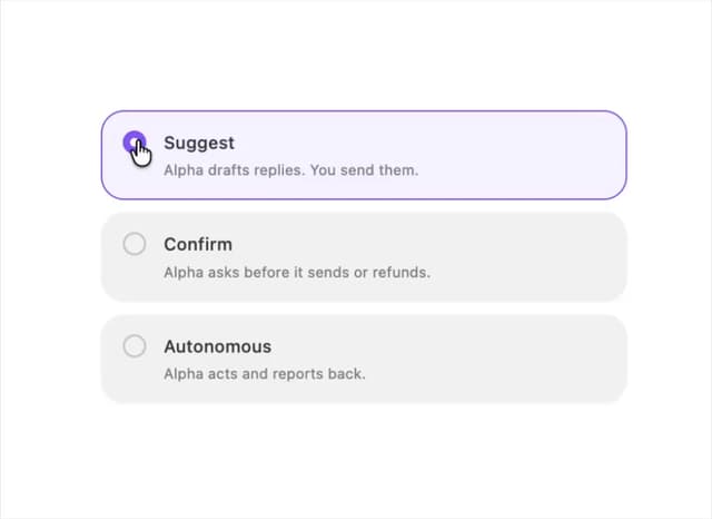
Choicebox
9
Input OTP
5
Switch
4
Dialog
4
Hover Card
4
More in Navigation
View all

Sidebar
349

Oversized 404 Numeral
69
Navbar with Theme Toggle
57
Footer
453
Dorpdown Navigation
235
Tabs like bookmark
75
Pagination Ant
3
Navbar
8


