
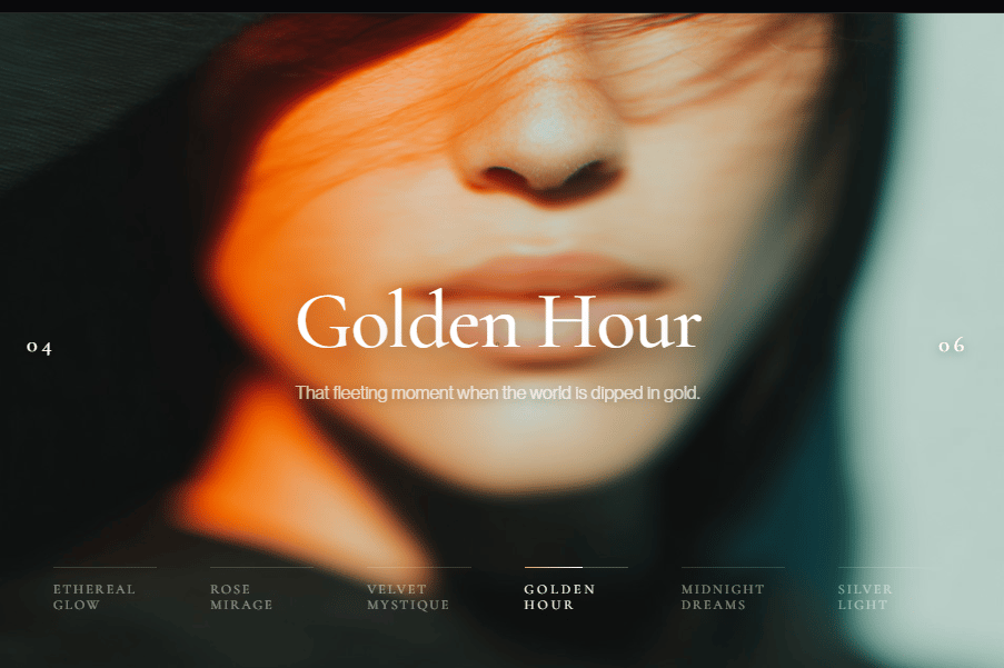
A sophisticated, hover-responsive showcase block designed for high-end creative portfolios and luxury brand websites. This component features a minimalist vertical navigation list (01–06) that dynamically updates a featured image preview. It balances "Quiet Luxury" typography with high-impact visuals, creating a "premium" user experience that feels both authoritative and mysterious. It is optimized for developers who want to display "Featured Creations" with an air of exclusivity and artistic depth.
Built with React and Tailwind. Copy the prompt and paste it into Claude Code, Cursor or Lovable: your agent adds lumina-interactive-list to your project and fits it to your theme.
Code
How lumina-interactive-list is used: the demo's code. The component's own source comes with a free account.
Usage.tsx
import { Component } from "@/components/ui/lumina-interactive-list";

export default function DemoOne() {
  return <Component />;
}
More by Hardik Kasheeyanee
View all
Sterling Gate: Kinetic Navigation
2.5K
Connoisseur Stack Interactor
1.8K
argent-loop-infinite-slider
1K
Experience Hero
804
flow-gradient-heroSection
589
obsidian-gate-loader
3
vanguard-scroll-reveal-reviews
More in Galleries
View all

Scattered About
2

Animated Gallery
1.5K
Thumbnail image viewer
99
Editorial Collage Hero
501

Image Gallery
95

Elastic Gallery
1.1K
Folded Card
38

Hero Section 6
949

