"use client";

import { useState } from "react";
import BlockTransition from "@/components/ui/block-transition";

const settings = {
  rows: 5,
  duration: 1,
  enableContentShift: false,
  color: "#0a0a0a",
};

const PAGES = [
  {
    label: "Page one",
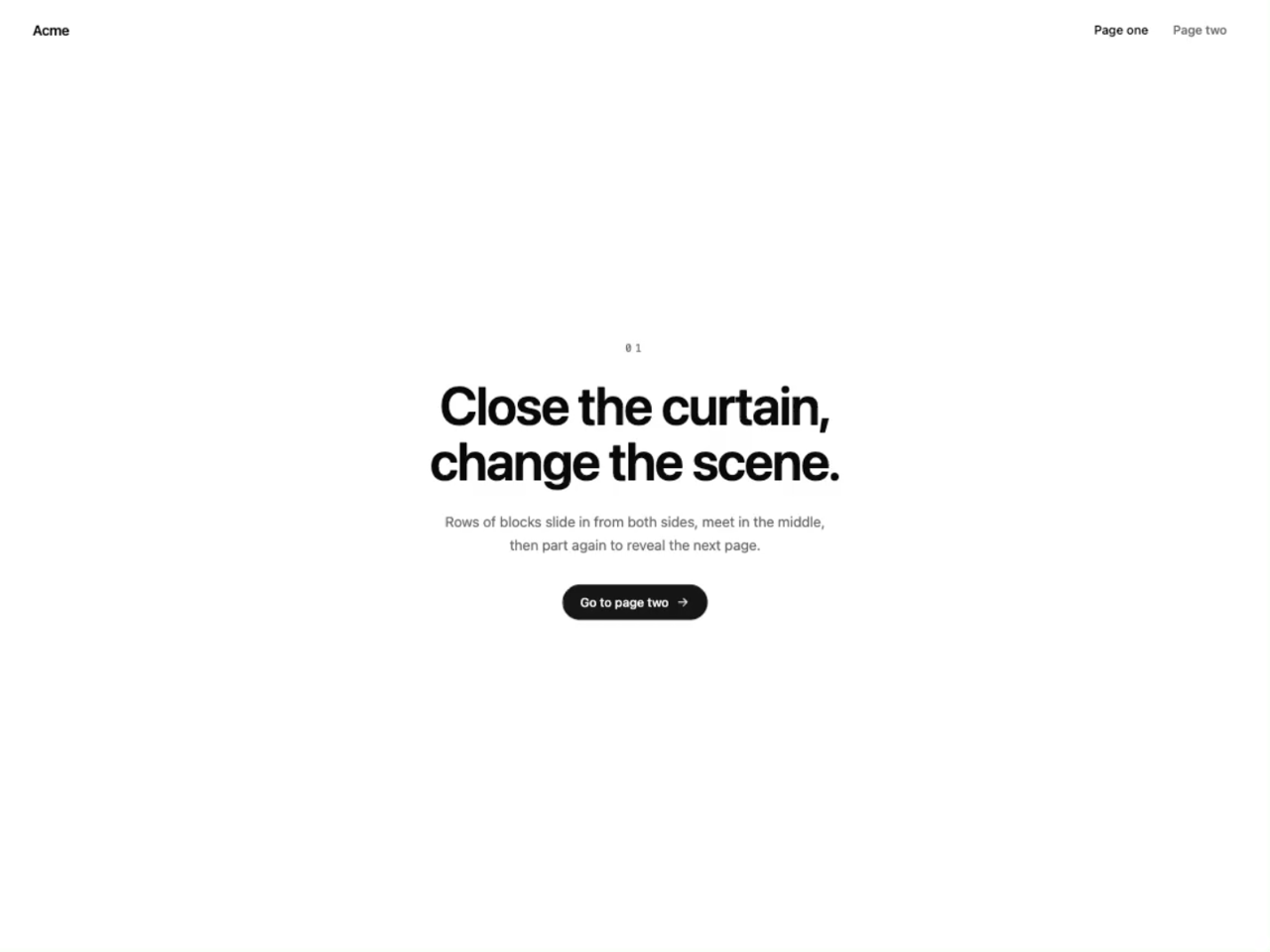
    eyebrow: "01",
    title: "Close the curtain, change the scene.",
    body: "Rows of blocks slide in from both sides, meet in the middle, then part again to reveal the next page.",
    cta: "Go to page two",
  },
  {
    label: "Page two",
    eyebrow: "02",
    title: "Scene two.",
    body: "Turn on Content Shift in the controls to add a soft scale and blur to the page as it changes.",
    cta: "Back to page one",
  },
];

function ArrowIcon() {
  return (
    <svg viewBox="0 0 24 24" fill="none" stroke="currentColor" strokeWidth={2} strokeLinecap="round" strokeLinejoin="round" aria-hidden="true" className="h-4 w-4">
      <path d="M5 12h14M13 6l6 6-6 6" />
    </svg>
  );
}

function Page({ index, onNavigate }: { index: number; onNavigate: (index: number) => void }) {
  const page = PAGES[index];

  return (
    <div
      className={`flex min-h-screen w-full flex-col text-foreground ${
        index === 1 ? "bg-muted" : "bg-background"
      }`}
    >
      <header className="flex items-center justify-between px-6 py-5 sm:px-10">
        <span className="text-base font-semibold tracking-tight">Acme</span>
        <nav aria-label="Pages" className="flex gap-1">
          {PAGES.map((item, itemIndex) => (
            <button
              key={item.label}
              type="button"
              aria-current={itemIndex === index ? "page" : undefined}
              onClick={() => onNavigate(itemIndex)}
              className={`rounded-full px-3 py-1.5 text-sm font-medium outline-none transition-colors focus-visible:ring-2 focus-visible:ring-ring ${
                itemIndex === index ? "text-foreground" : "text-muted-foreground hover:text-foreground"
              }`}
            >
              {item.label}
            </button>
          ))}
        </nav>
      </header>

      <main className="flex flex-1 flex-col items-center justify-center gap-6 px-6 pb-16 text-center">
        <span className="font-mono text-xs tracking-[0.3em] text-muted-foreground">{page.eyebrow}</span>
        <h1 className="max-w-[16ch] text-4xl font-semibold leading-[1.05] tracking-tight sm:text-6xl">
          {page.title}
        </h1>
        <p className="max-w-md text-sm leading-relaxed text-muted-foreground sm:text-base">{page.body}</p>
        <button
          type="button"
          onClick={() => onNavigate(index === 0 ? 1 : 0)}
          className="mt-2 inline-flex items-center gap-2 rounded-full bg-primary px-5 py-2.5 text-sm font-medium text-primary-foreground outline-none transition-transform hover:scale-105 focus-visible:ring-2 focus-visible:ring-ring focus-visible:ring-offset-2 focus-visible:ring-offset-background active:scale-95"
        >
          {page.cta}
          <ArrowIcon />
        </button>
      </main>
    </div>
  );
}

export default function BlockTransitionDemo(props: Partial<typeof settings>) {
  const s = { ...settings, ...props };
  const [page, setPage] = useState(0);

  return (
    <BlockTransition
      transitionKey={page}
      rows={s.rows}
      duration={s.duration}
      enableContentShift={s.enableContentShift}
      // Hex keeps a color picker in the Controls panel; until it's changed, the
      // component's own theme-aware default is used.
      color={s.color === settings.color ? undefined : s.color}
    >
      <Page index={page} onNavigate={setPage} />
    </BlockTransition>
  );
}