
About
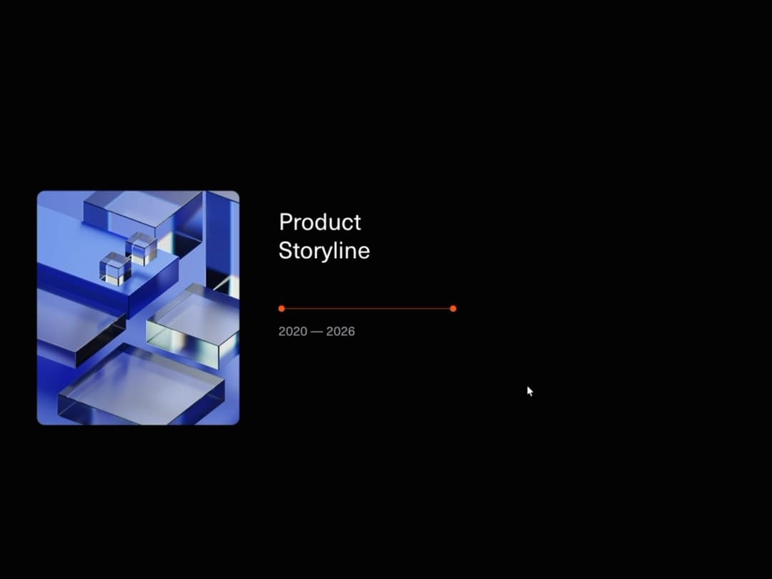
Horizontal scroll timeline with Lenis smoothing, GSAP milestone reveals, dark/light theme support, and reduced-motion support.
Built with React and Tailwind. Copy the prompt and paste it into Claude Code, Cursor or Lovable: your agent adds Product Timeline to your project and fits it to your theme.
Code
How Product Timeline is used: the demo's code. The component's own source comes with a free account.
Usage.tsx
"use client";
import Timeline from "@/components/ui/timeline";
const settings = {
textColor: "var(--color-foreground, #ffffff)",
mutedTextColor: "var(--color-muted-foreground, #a1a1aa)",
activeColor: "#ff5f00",
backgroundColor: "var(--color-background, #0a0a0a)",
duration: 1.4,
};
export default function TimelineDemo(props: Partial<typeof settings>) {
const s = { ...settings, ...props };
return (
<main className="bg-background text-foreground">
{/* Lead-in so the pinned timeline has somewhere to scroll in from. */}
<section className="flex h-screen flex-col items-center justify-center gap-4 px-6 text-center">
<p className="font-mono text-xs uppercase tracking-[0.3em] text-muted-foreground">
Product roadmap
</p>
<h1 className="max-w-[18ch] text-4xl font-semibold leading-tight tracking-tight sm:text-6xl">
Six years, one horizontal scroll.
</h1>
<p className="max-w-md text-sm leading-relaxed text-muted-foreground">
Keep scrolling — the section pins, the track slides sideways, and each
milestone draws its stem and reveals its copy as it reaches centre.
</p>
<span className="mt-2 animate-bounce text-muted-foreground">↓</span>
</section>
{/* Realistic usage: custom copy, a branded accent, tuned reveal speed. */}
<Timeline
title="Product Storyline"
periodLabel="2020 — 2026"
backgroundColor={s.backgroundColor}
textColor={s.textColor}
mutedTextColor={s.mutedTextColor}
activeColor={s.activeColor}
imageUrl="https://cdn.21st.dev/assets/mirror/b0/b0c41784074f76ac5fb6b447da87780c901135841317a096241371f24bc13ddd.jpg"
imageAlt="Team at work in a bright studio"
duration={s.duration}
/>
<section className="flex h-screen items-center justify-center px-6 text-center text-sm text-muted-foreground">
From the first research note to a multi-market launch.
</section>
</main>
);
}
Dependencies
More by Hyperiux Vault
View all

Stack Spread
1.3K
Arrow Fill Button
906
Interactive List Preview
866
Shiny Button
730
Circular Split Roll
631
Zoom Slider
421
Stack Loader
370
Metallic Button
318