
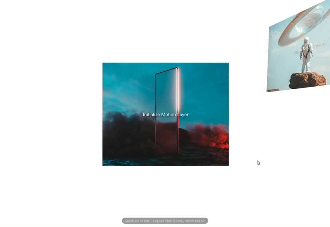
About
Scroll-pinned horizontal track where each card rotates in from depth, settles flat, then tilts back out — GSAP ScrollTrigger with a nested per-card timeline, reduced-motion fallback.
Built with React and Tailwind. Copy the prompt and paste it into Claude Code, Cursor or Lovable: your agent adds Cards Rotate Slider to your project and fits it to your theme.
Code
How Cards Rotate Slider is used: the demo's code. The component's own source comes with a free account.
Usage.tsx
"use client";

import { useEffect } from "react";
import CardsRotateSlider from "@/components/ui/cards-rotate-slider";

export default function CardsRotateSliderDemo() {
  // The pinned track is the first thing on this page, so ScrollTrigger reads
  // its start position relative to page-top. Some embedded-preview
  // environments mount already scrolled (scroll restoration, a stale anchor,
  // or the preview's own cover/video capture pass) — ScrollTrigger then
  // evaluates that stale scroll position on init and jumps straight to a
  // mid-scroll frame instead of starting at card 1. Force back to the top
  // once on mount so the demo always starts clean.
  useEffect(() => {
    if (typeof window === "undefined") return;
    const previousRestoration = "scrollRestoration" in window.history ? window.history.scrollRestoration : undefined;
    if ("scrollRestoration" in window.history) window.history.scrollRestoration = "manual";
    window.scrollTo(0, 0);
    return () => {
      if (previousRestoration && "scrollRestoration" in window.history) {
        window.history.scrollRestoration = previousRestoration;
      }
    };
  }, []);

  return (
    // w-full + min-w-0: 21st's preview mounts demos inside a centering flex
    // wrapper. A block element with no width there sizes to its widest
    // descendant instead of filling the wrapper — this track's cards made
    // that ~7000px wide, which then got centered, shoving roughly half of it
    // off-screen to the left (the "starts mid-scroll" symptom) and made the
    // component's own overflow-x:clip a no-op (nothing left to clip once the
    // box itself had already grown to fit everything). min-w-0 overrides the
    // flex item's default min-width:auto so it can actually shrink back down
    // to the wrapper's width instead of refusing to go narrower than its
    // content.
    <main className="w-full min-w-0 bg-background text-foreground">
      <CardsRotateSlider rotationAmount={1.1} verticalDrift={1.2} perspective={1000} textColor="#f5f5f5" />

      <section className="flex h-screen items-center justify-center px-6 text-center text-sm text-muted-foreground">
        Drop in your own `images` array — captions are optional per card.
      </section>

      <div className="pointer-events-none fixed inset-x-0 bottom-6 z-50 flex justify-center">
        <p className="rounded-full border border-white/10 bg-black/40 px-4 py-1.5 text-xs text-white/70 backdrop-blur-sm">
          Scroll to pan the track — each card rotates in, settles, then tilts back out
        </p>
      </div>
    </main>
  );
}
Dependencies
More by Hyperiux Vault
View all

Product Timeline
2.3K
Stack Spread
1.3K
Arrow Fill Button
910
Interactive List Preview
867
Shiny Button
739
Circular Split Roll
635
Zoom Slider
427
Stack Loader
371