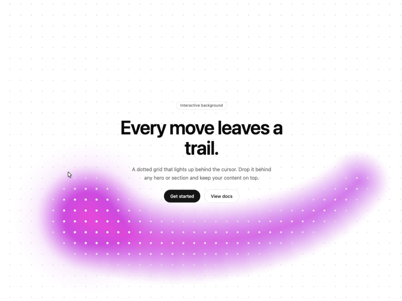
"use client";

import DottedTrailCursor from "@/components/ui/dotted-trail-cursor";

const settings = {
  colorA: "#ff4fd8",
  colorB: "#8b5cf6",
  headRadius: 80,
  glowRadius: 300,
  followSpeed: 0.22,
  trailLength: 18,
  fadeOnIdle: true,
  idleDelay: 100,
  idleFade: 1100,
  backgroundColor: "#ffffff",
  dotColor: "#d1d1d1",
  activeDotColor: "#ffffff",
  dotSpacing: 34,
  dotRadius: 1.2,
  rimInner: 2.1,
  rimOuter: 1.5,
  edgeDesaturate: 0.3,
  edgeDesaturateSpan: 2.1,
  tailTilt: 0.18,
};

export default function DottedTrailCursorDemo(props: Partial<typeof settings>) {
  const s = { ...settings, ...props };
  // Hex keeps a color picker in the Controls panel; until a color is changed,
  // the component's own theme-aware default is used.
  const themed = (key: "backgroundColor" | "dotColor" | "activeDotColor") =>
    s[key] === settings[key] ? undefined : s[key];

  return (
    <DottedTrailCursor
      colorA={s.colorA}
      colorB={s.colorB}
      headRadius={s.headRadius}
      glowRadius={s.glowRadius}
      followSpeed={s.followSpeed}
      trailLength={s.trailLength}
      fadeOnIdle={s.fadeOnIdle}
      idleDelay={s.idleDelay}
      idleFade={s.idleFade}
      backgroundColor={themed("backgroundColor")}
      dotColor={themed("dotColor")}
      activeDotColor={themed("activeDotColor")}
      dotSpacing={s.dotSpacing}
      dotRadius={s.dotRadius}
      rimInner={s.rimInner}
      rimOuter={s.rimOuter}
      edgeDesaturate={s.edgeDesaturate}
      edgeDesaturateSpan={s.edgeDesaturateSpan}
      tailTilt={s.tailTilt}
    >
      <section className="flex h-full w-full flex-col items-center justify-center gap-6 px-6 text-center">
        <span className="rounded-full border border-border bg-background/70 px-3 py-1 text-xs font-medium text-muted-foreground backdrop-blur-md">
          Interactive background
        </span>
        <h1 className="max-w-[14ch] text-4xl font-semibold leading-[1.05] tracking-tight text-foreground sm:text-6xl">
          Every move leaves a trail.
        </h1>
        <p className="max-w-md text-sm leading-relaxed text-muted-foreground sm:text-base">
          A dotted grid that lights up behind the cursor. Drop it behind any hero
          or section and keep your content on top.
        </p>
        <div className="flex flex-wrap items-center justify-center gap-3">
          <button
            type="button"
            className="rounded-full bg-primary px-5 py-2.5 text-sm font-medium text-primary-foreground transition-transform hover:scale-105 focus-visible:outline-none focus-visible:ring-2 focus-visible:ring-ring focus-visible:ring-offset-2 focus-visible:ring-offset-background active:scale-95"
          >
            Get started
          </button>
          <button
            type="button"
            className="rounded-full border border-border bg-background/70 px-5 py-2.5 text-sm font-medium text-foreground backdrop-blur-md transition-transform hover:scale-105 focus-visible:outline-none focus-visible:ring-2 focus-visible:ring-ring focus-visible:ring-offset-2 focus-visible:ring-offset-background active:scale-95"
          >
            View docs
          </button>
        </div>
      </section>
      <p className="pointer-events-none absolute inset-x-0 bottom-8 text-center text-xs text-muted-foreground">
        <span className="pointer-coarse:hidden">Move your cursor across the grid</span>
        <span className="hidden pointer-coarse:inline">Best experienced with a mouse or trackpad</span>
      </p>
    </DottedTrailCursor>
  );
}