
About
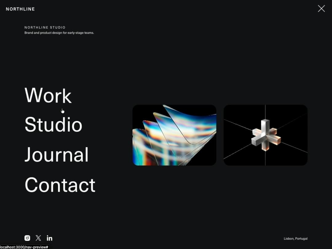
Clip-path powered full-screen nav overlay with animated hamburger, staggered brand/link/image/social reveals, character-split link hover, focus trap, and scrollable overflow on short viewports.
Built with React and Tailwind. Copy the prompt and paste it into Claude Code, Cursor or Lovable: your agent adds Immersive Full Screen Navigation to your project and fits it to your theme.
Code
How Immersive Full Screen Navigation is used: the demo's code. The component's own source comes with a free account.
Usage.tsx
"use client";

import ImmersiveFullscreenNav from "@/components/ui/immersive-full-screen-nav";

export default function ImmersiveFullscreenNavDemo() {
  // w-full + min-w-0: 21st's preview mounts demos inside a centering flex
  // wrapper. Without an explicit width, a block-level root there sizes to
  // its content instead of filling the wrapper — invisible on a light-mode
  // page (same white as the surrounding chrome) but a floating, inset white
  // box against dark mode's black chrome. See the same fix on
  // cards-rotate-slider's demo for the full mechanism.
  return (
    <div className="w-full min-w-0">
      <ImmersiveFullscreenNav
        navConfig={{
          brand: "Northline",
          brandHref: "#",
          overlayBg: "#101014",
          clipOrigin: "left",
        }}
        navContent={{
          agencyName: "Northline Studio",
          tagline: "Brand and product design for early-stage teams.",
          location: "Lisbon, Portugal",
          links: [
            { label: "Work", href: "#" },
            { label: "Studio", href: "#" },
            { label: "Journal", href: "#" },
            { label: "Contact", href: "#" },
          ],
          images: [
            "https://cdn.21st.dev/assets/mirror/ba/baa678cbac1a29e773743a10ff421b226cf0e9b5d786ebf34415063d6dabc02b.jpg",
            "https://cdn.21st.dev/assets/mirror/ef/ef696854debc5d2d40cbe03ea0c3a04e29689529cf2f4bfe90c1c5978f00579a.jpg",
          ],
          socials: [
            { type: "instagram", href: "#" },
            { type: "twitter", href: "#" },
            { type: "linkedin", href: "#" },
          ],
        }}
      />

      <main className="flex h-screen flex-col items-center justify-center gap-4 bg-white px-6 text-center text-black">
        <p className="text-xs uppercase tracking-[0.3em] text-black/40">Navigation</p>
        <h1 className="max-w-2xl text-[7vw] leading-tight max-md:text-[9vw]">Immersive Full Screen Nav</h1>
        <p className="mt-2 max-w-md text-sm leading-relaxed text-black/60">
          Click the menu button — the panel wipes open via clip-path, then the brand block, links, images, and
          socials reveal in sequence.
        </p>
      </main>
    </div>
  );
}
Dependencies
More by Hyperiux Vault
View all

Product Timeline
2.3K
Stack Spread
1.3K
Arrow Fill Button
919
Interactive List Preview
871
Shiny Button
756
Circular Split Roll
645
Zoom Slider
434
Stack Loader
373
More in Navigation
View all

Sidebar
238

Tabs
60
Oversized 404 Numeral
51
Navbar with Theme Toggle
43

Sidebar
341
Numberless Pagination with Text
11

Pagination
88

Navbar
71
