About
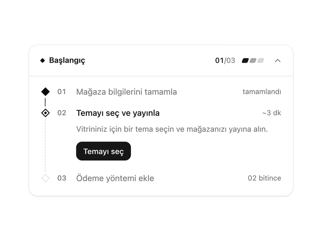
A first-run setup card that walks users through onboarding steps, opening the active step with its actions and automatically advancing once a step is complete.
Built with React and Tailwind. Copy the prompt and paste it into Claude Code, Cursor or Lovable: your agent adds Launchpad Setup Checklist to your project and fits it to your theme.
Code
How Launchpad Setup Checklist is used: the demo's code. The component's own source comes with a free account.
Usage.tsx
"use client";

import * as React from "react";

import Launchpad from "@/components/ui/launchpad";

type Status = "todo" | "done" | "blocked";

export default function LaunchpadDemo() {
  const [steps, setSteps] = React.useState<
    {
      id: string;
      label: string;
      description?: string;
      eta?: string;
      status?: Status;
      requires?: string[];
      actions?: React.ReactNode;
    }[]
  >([
    {
      id: "profile",
      label: "Mağaza bilgilerini tamamla",
      description: "Mağaza adı, logo ve iletişim bilgilerini ekle.",
      eta: "~2 dk",
      status: "done",
    },
    {
      id: "theme",
      label: "Temayı seç ve yayınla",
      description: "Vitrininiz için bir tema seçin ve mağazanızı yayına alın.",
      eta: "~3 dk",
      actions: (
        <button
          type="button"
          onClick={() =>
            setSteps((prev) =>
              prev.map((s) =>
                s.id === "theme" ? { ...s, status: "done" as Status } : s,
              ),
            )
          }
          className="inline-flex h-8 items-center rounded-lg bg-neutral px-3 text-[13px] font-medium text-neutral-foreground"
        >
          Temayı seç
        </button>
      ),
    },
    {
      id: "payment",
      label: "Ödeme yöntemi ekle",
      eta: "~1 dk",
      requires: ["theme"],
    },
  ]);

  return (
    <div className="w-full max-w-md">
      <Launchpad steps={steps} />
    </div>
  );
}
Dependencies
More by ikascom
View all

Animated Number
2