About
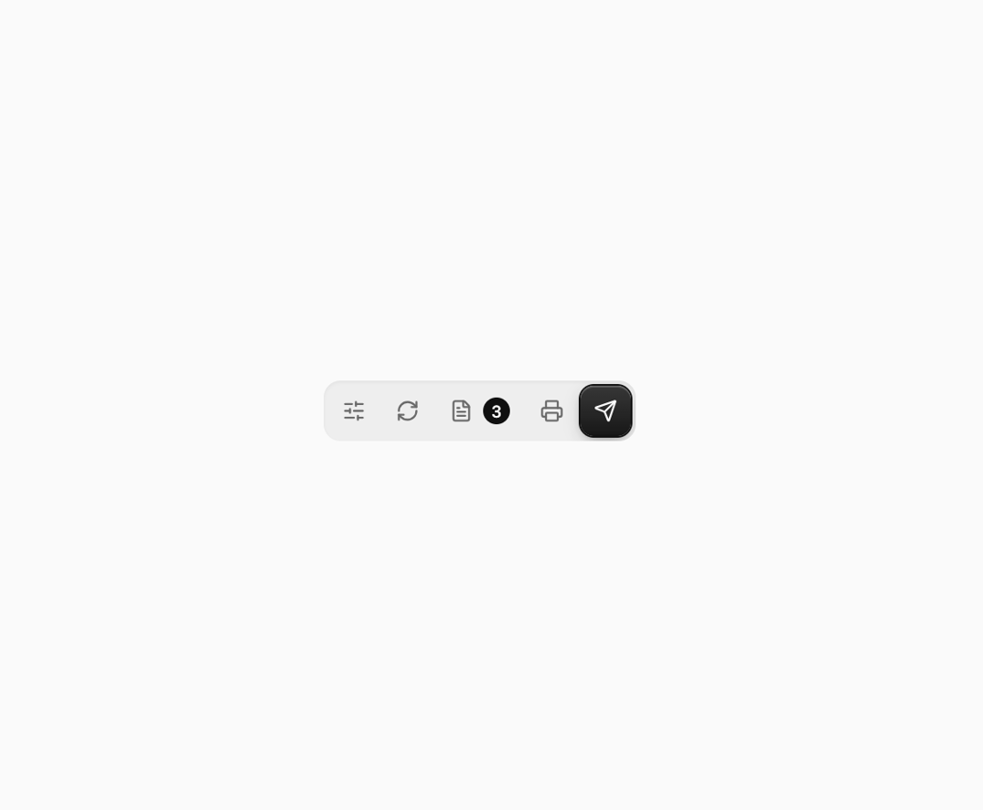
An icon-only toolbar whose action labels expand on hover or keyboard focus, with a sliding highlight pill, useful for packing a few related actions into a dense header or report toolbar.
Built with React and Tailwind. Copy the prompt and paste it into Claude Code, Cursor or Lovable: your agent adds Action Bar to your project and fits it to your theme.
Code
How Action Bar is used: the demo's code. The component's own source comes with a free account.
Usage.tsx
"use client";

import ActionBar from "@/components/ui/action-bar";
import {
  FileTextIcon,
  PrinterIcon,
  RefreshCwIcon,
  SendIcon,
  SlidersHorizontalIcon,
} from "lucide-react";
import { Toaster, toast } from "sonner";

export default function ActionBarDemo() {
  return (
    <div className="flex min-h-[200px] w-full items-center justify-center bg-background p-10">
      <Toaster position="top-center" />
      <ActionBar
        label="Rapor aksiyonları"
        items={[
          {
            id: "params",
            label: "Parametreler",
            icon: <SlidersHorizontalIcon data-anim="pop" />,
            onClick: () => toast("Parametreler açıldı"),
          },
          {
            id: "refresh",
            label: "Yenile",
            icon: <RefreshCwIcon data-anim="spin" />,
            onClick: () => toast("Rapor yenilendi"),
          },
          {
            id: "drafts",
            label: "Taslaklar",
            icon: <FileTextIcon data-anim="wiggle" />,
            badge: 3,
            onClick: () => toast("3 taslak"),
          },
          {
            id: "print",
            label: "Yazdır",
            icon: <PrinterIcon data-anim="drop" />,
            onClick: () => toast("Yazdırılıyor"),
          },
          {
            id: "send",
            label: "Gönder",
            icon: <SendIcon data-anim="lift" />,
            variant: "solid",
            onClick: () => toast.success("Rapor gönderildi"),
          },
        ]}
      />
    </div>
  );
}
Dependencies
More by ikascom
View all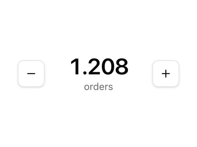

Animated Number
12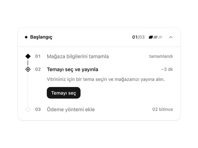
Launchpad Setup Checklist
More in Buttons
View all
Texture Button
108
Button
14

Notification Button
117

HeroUI Button Group
1

Base Button
3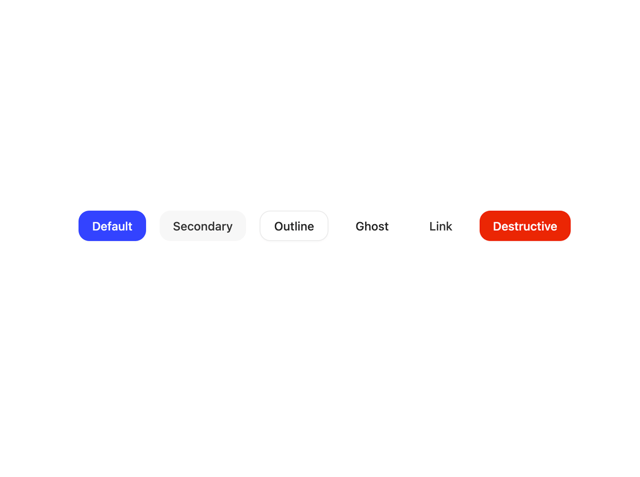

Button
36

App Store Button
484
Button
2

