
About
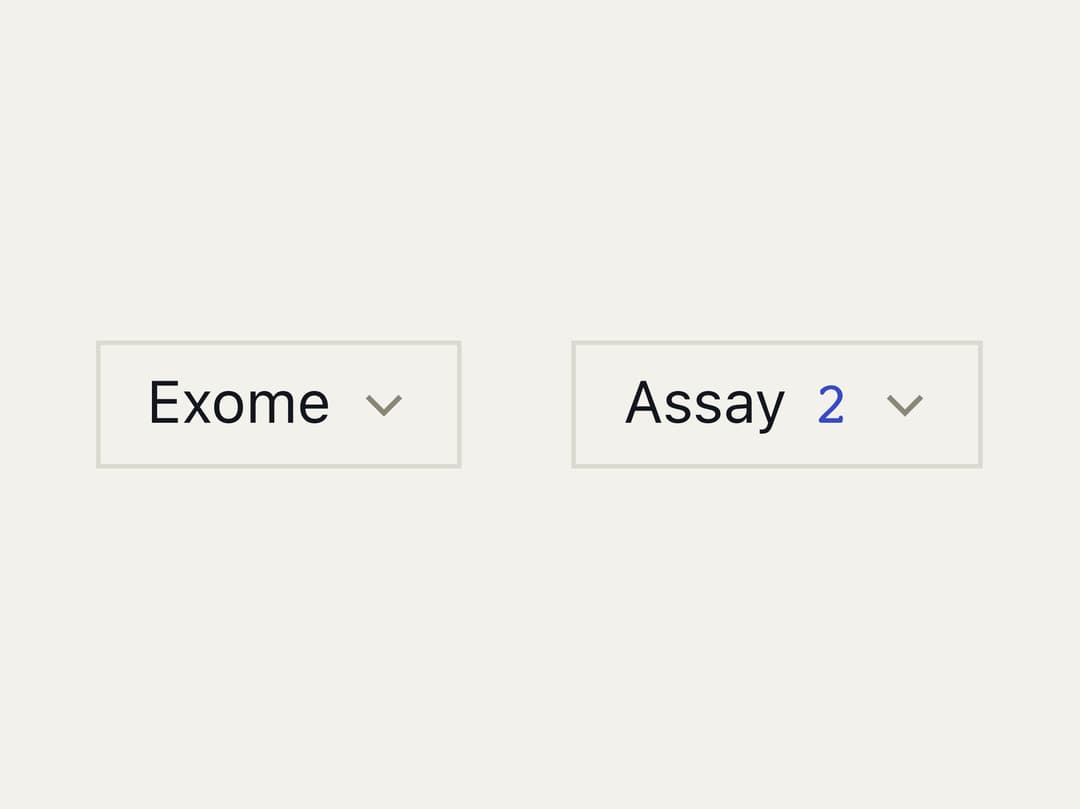
A single or multi-select dropdown built on Ark UI, with keyboard navigation, a highlighted-option indicator, and a checkmark on chosen items.
Built with React and Tailwind. Copy the prompt and paste it into Claude Code, Cursor or Lovable: your agent adds Select to your project and fits it to your theme.
Code
How Select is used: the demo's code. The component's own source comes with a free account.
Usage.tsx
"use client";

import * as React from "react";

import {
  Select,
  SelectContent,
  SelectOption,
  SelectTrigger,
  createListCollection,
} from "@/components/ui/select";

const ASSAYS = ["WGS", "RNA-seq", "ATAC-seq", "Exome", "Methyl", "scRNA"];

export default function SelectDemo() {
  const [one, setOne] = React.useState<string[]>(["Exome"]);
  const [many, setMany] = React.useState<string[]>(["WGS", "Methyl"]);
  const collection = React.useMemo(
    () =>
      createListCollection({
        items: ASSAYS.map((value) => ({ label: value, value })),
      }),
    [],
  );

  return (
    <div className="flex flex-wrap items-start justify-center gap-6 p-10">
      <Select
        collection={collection}
        value={one}
        onValueChange={(details) => setOne(details.value)}
      >
        <SelectTrigger>
          <span className={one.length > 0 ? "text-weft" : "text-weft-dim"}>
            {one[0] ?? "Assay"}
          </span>
        </SelectTrigger>
        <SelectContent>
          {collection.items.map((item) => (
            <SelectOption key={item.value} item={item} />
          ))}
        </SelectContent>
      </Select>

      <Select
        collection={collection}
        multiple
        value={many}
        onValueChange={(details) => setMany(details.value)}
      >
        <SelectTrigger>
          <span className="inline-flex items-baseline gap-1.5">
            <span className={many.length > 0 ? "text-weft" : "text-weft-dim"}>
              Assay
            </span>
            {many.length > 0 && (
              <span className="tnum font-data text-indigo">{many.length}</span>
            )}
          </span>
        </SelectTrigger>
        <SelectContent>
          {collection.items.map((item) => (
            <SelectOption key={item.value} item={item} />
          ))}
        </SelectContent>
      </Select>
    </div>
  );
}
Dependencies
More in Forms
View all

Login 1
64

Premium Auth
571

Contact Card
1.1K

Form
18

Book A Demo 1
91
Authentication Card
52

Card Studio
47

Login Card
35
