
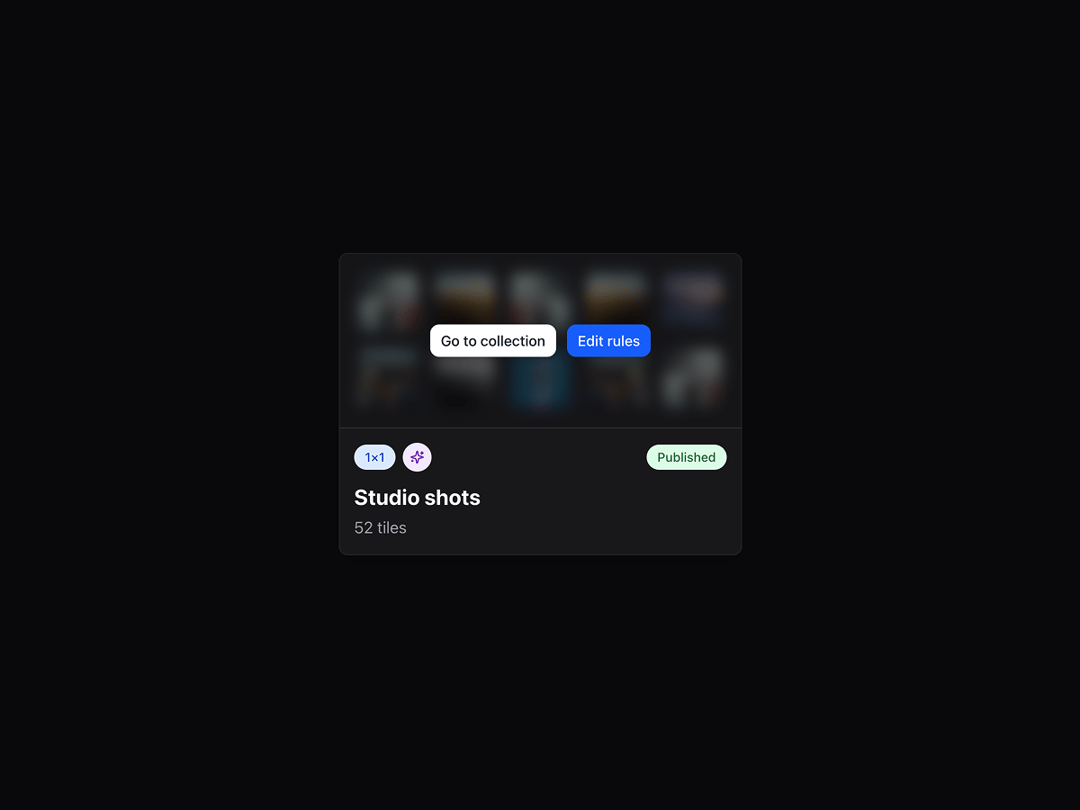
This component is a highly interactive, animated detail card that reveals contextual actions and visual flair when hovered. It displays a grid of images, pills with status and metadata, and animated buttons with customizable styles. Motion effects include staggered entrance, blur transitions, and hover-triggered scaling, powered by framer-motion. Perfect for showcasing media collections, feature tiles, or interactive product summaries where you want hover-based interactivity and polished motion design.
Built with React and Tailwind. Copy the prompt and paste it into Claude Code, Cursor or Lovable: your agent adds Hover Detail Card to your project and fits it to your theme.
Code
How Hover Detail Card is used: the demo's code. The component's own source comes with a free account.
Usage.tsx
"use client";

import { HoverDetailCard } from "@/components/ui/hover-detail-card";

export default function Page() {

  return (
    <div className="min-h-screen p-4 bg-background flex items-center justify-center">
      <HoverDetailCard
        title="Studio shots"
        subtitle="52 tiles"
        primaryButton={{
          text: "Go to collection",
          color: "bg-white/90",
          hoverColor: "hover:bg-white",
          textColor: "text-gray-900"
        }}
        secondaryButton={{
          text: "Edit rules",
          color: "bg-blue-600",
          hoverColor: "hover:bg-blue-700",
          textColor: "text-white"
        }}
        pills={{
          left: {
            text: "1×1",
            color: "bg-blue-100",
            textColor: "text-blue-800"
          },
          sparkle: {
            show: true,
            color: "bg-purple-100 text-purple-800"
          },
          right: {
            text: "Published",
            color: "bg-green-100",
            textColor: "text-green-800"
          }
        }}
        enableAnimations={true}
      />
    </div>
  );
}