
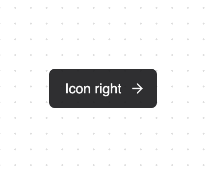
About
An enhanced button component with various animated hover effects and icon support. Features - Multiple animation variants - Icon support (left/right placement) - Gooey effect animations - Ring hover effects - Link hover animations - Expandable icon transitions - Fully customizable styles - Dark mode compatible
Built with React and Tailwind. Copy the prompt and paste it into Claude Code, Cursor or Lovable: your agent adds Button to your project and fits it to your theme.
Code
How Button is used: the demo's code. The component's own source comes with a free account.
Usage.tsx
"use client"

import { ArrowRight } from "lucide-react"
import { Button } from "@/components/ui/button"

function ButtonExpandIconRight() {
  return (
    <Button variant="expandIcon" Icon={() => <ArrowRight className="h-4 w-4" />} iconPlacement="right">
      Icon right
    </Button>
  )
}


export {
  ButtonExpandIconRight
}
Dependencies
More by Jakob Hoeg Mørk
View all
Expandable Chat
737
Message loading
620
Chat Message List
228
Chat Bubble
204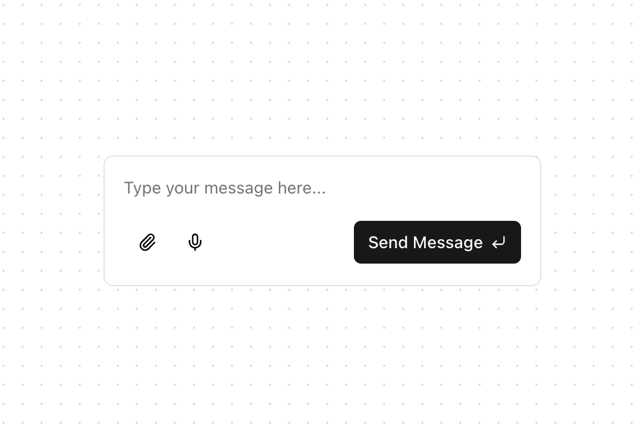
Chat Input
86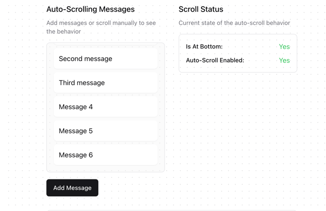
useAutoScroll
45
More in Buttons
View all
Texture Button
106

Notification Button
115

Button
1
Button
12
Base Button
1

HeroUI Button Group


App Store Button
483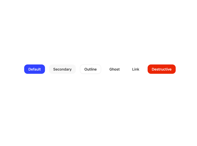

Button
35

