
About
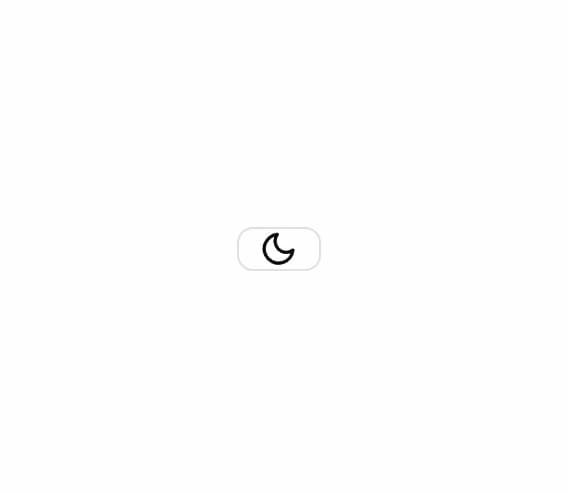
Smooth dark/light mode toggle with sun-to-moon SVG morph animation. Built with Framer Motion and next-themes integration.
Built with React and Tailwind. Copy the prompt and paste it into Claude Code, Cursor or Lovable: your agent adds Animated Theme Toggle to your project and fits it to your theme.
Code
How Animated Theme Toggle is used: the demo's code. The component's own source comes with a free account.
Usage.tsx
import { ThemeProvider } from "next-themes"
import { AnimatedThemeToggle } from "@/components/ui/animated-theme-toggle"

export default function AnimatedThemeToggleDemo() {
  return (
    <ThemeProvider attribute="class" defaultTheme="dark">
      <div className="flex items-center justify-center min-h-screen bg-background p-8">
        <AnimatedThemeToggle />
      </div>
    </ThemeProvider>
  )
}
Dependencies
More by johuniq
View all

Liquid Metal Button
3.3K
Date Wheel Picker
191
AI Prompt Box
158
Joly Button
76
More in Buttons
View all
Texture Button
96

Button
5

Button Group


Eclipse Button
39

App Store Button
458
Button
4

HeroUI Button Group

Base Button
4

