
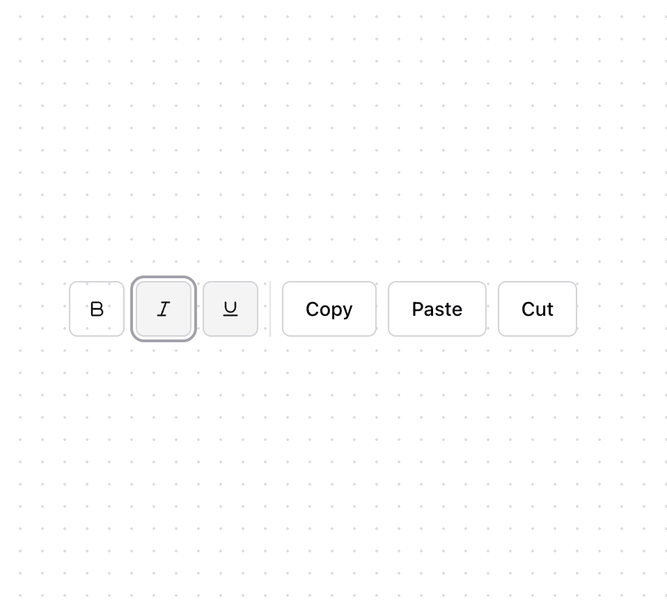
About
A toolbar is a container for a set of interactive controls, such as buttons, dropdown menus, or checkboxes, with arrow key navigation. There is no built-in HTML toolbar element. Toolbar helps achieve accessible toolbars with arrow key navigation that can be styled as needed.
Built with React and Tailwind. Copy the prompt and paste it into Claude Code, Cursor or Lovable: your agent adds Toolbar [react-aria-components] to your project and fits it to your theme.
Code
How Toolbar [react-aria-components] is used: the demo's code. The component's own source comes with a free account.
Usage.tsx
"use client"

import { BoldIcon, ItalicIcon, UnderlineIcon } from "lucide-react"
import { Group } from "react-aria-components"

import { Button } from "@/components/ui/button"
import { Separator } from "@/components/ui/separator"
import { Toggle } from "@/components/ui/toggle"
import { Toolbar } from "@/components/ui/toolbar"

export function ToolbarDemo() {
  return (
    <Toolbar aria-label="Text formatting">
      <Group aria-label="Style" className="space-x-2">
        <Toggle className="w-10" variant="outline" aria-label="Bold">
          <BoldIcon className="size-4" />
        </Toggle>
        <Toggle className="w-10" variant="outline" aria-label="Italic">
          <ItalicIcon className="size-4" />
        </Toggle>
        <Toggle className="w-10" variant="outline" aria-label="Underline">
          <UnderlineIcon className="size-4" />
        </Toggle>
      </Group>
      <Separator orientation="vertical" />
      <Group aria-label="Clipboard" className={"space-x-2"}>
        <Button variant="outline">Copy</Button>
        <Button variant="outline">Paste</Button>
        <Button variant="outline">Cut</Button>
      </Group>
    </Toolbar>
  )
}
Dependencies
More by James Shopland
View all
Tag Group [react-aria-components]
96
Date Range Picker [react-aria-components]
88
Grid List [react-aria-components]
74
Switch [react-aria-components]
70
Select [react-aria-components]
47
Range Calendar [react-aria-components]
39
Menu
36
Popover
35
More in Buttons
View all
Button
10

Button
1
Texture Button
103

Eclipse Button
42
Native Button
12
Button
77
Button


Notification Button
113


