
About
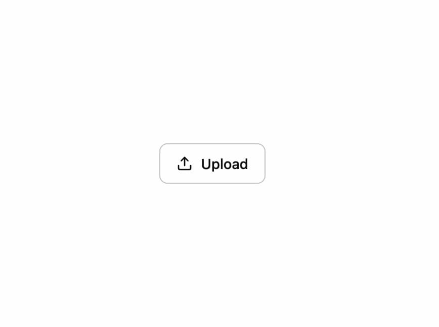
A button that turns into its own progress bar and result state — pressed, it fills with a percentage, morphs its label through working/done/error phases, and returns to idle on its own.
Built with React and Tailwind. Copy the prompt and paste it into Claude Code, Cursor or Lovable: your agent adds Progress Button to your project and fits it to your theme.
Code
How Progress Button is used: the demo's code. The component's own source comes with a free account.
Usage.tsx
"use client";

import * as React from "react";
import * as Icons from "lucide-react";
import ProgressButton, {
  type ProgressButtonState,
} from "@/components/ui/progress-button";

/** A job that fails part way: the button says so, then goes back to itself. */
export default function FailingDemo() {
  const [state, setState] = React.useState<ProgressButtonState>("idle");
  const [progress, setProgress] = React.useState(0);
  const timer = React.useRef<ReturnType<typeof setInterval>>();

  const start = () => {
    setState("working");
    setProgress(0);
    let current = 0;
    timer.current = setInterval(() => {
      current = Math.min(100, current + 9);
      setProgress(current);
      if (current >= 60) {
        clearInterval(timer.current);
        setState("error");
      }
    }, 250);
  };

  React.useEffect(() => () => clearInterval(timer.current), []);

  return (
    <ProgressButton
      state={state}
      onStateChange={setState}
      progress={progress}
      icon={Icons.Upload}
      label="Upload"
      workingLabel="Uploading"
      doneLabel="Uploaded"
      errorLabel="Upload failed"
      onClick={start}
    />
  );
}
Dependencies
More by joseestevez520
View all
Chart
3
Marquee
Day Strip
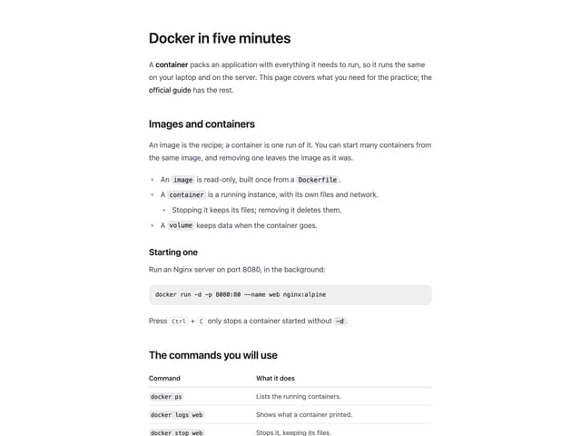
Prose
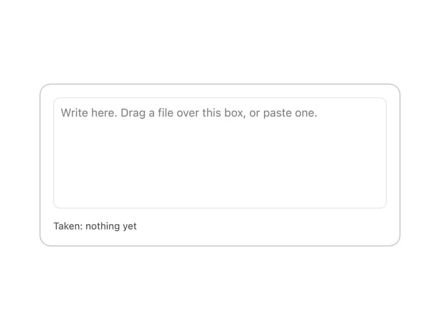
File Drop Zone
More in Buttons
View all
Button
10

Button
1

Eclipse Button
42
Native Button
12
Texture Button
103
Split Button
15
Button

Button
76


