
About
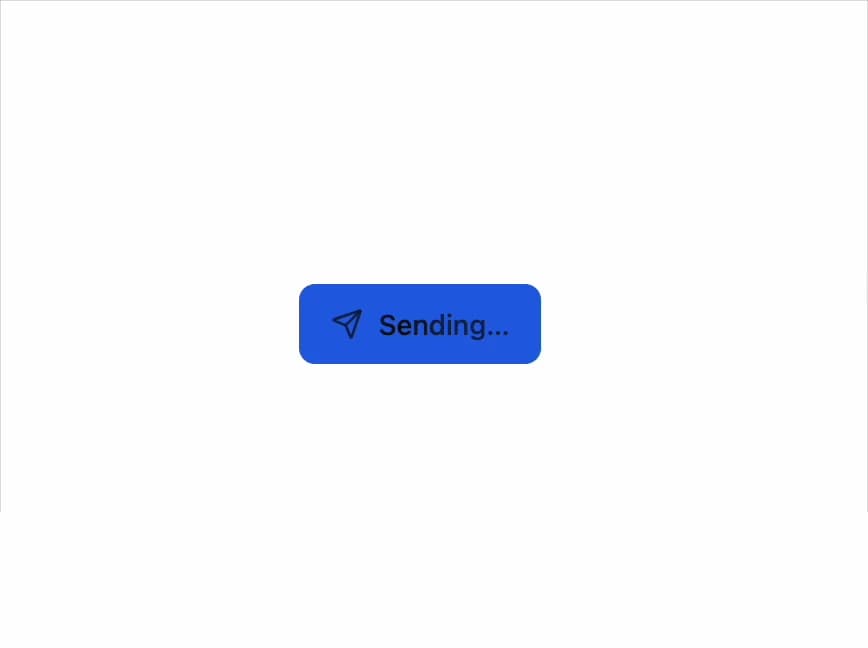
A button that turns into its own progress bar and result state — pressed, it fills with a percentage, morphs its label through working/done/error phases, and returns to idle on its own.
Built with React and Tailwind. Copy the prompt and paste it into Claude Code, Cursor or Lovable: your agent adds Progress Button to your project and fits it to your theme.
Code
How Progress Button is used: the demo's code. The component's own source comes with a free account.
Usage.tsx
"use client";

import * as React from "react";
import * as Icons from "lucide-react";
import ProgressButton, {
  type ProgressButtonState,
} from "@/components/ui/progress-button";

/** No amount to report: the label shimmers while it works. */
export default function WithoutAmountDemo() {
  const [state, setState] = React.useState<ProgressButtonState>("idle");
  const send = () => {
    setState("working");
    setTimeout(() => setState("done"), 1800);
  };
  return (
    <ProgressButton
      state={state}
      onStateChange={setState}
      icon={Icons.Send}
      variant="solid"
      label="Send"
      workingLabel="Sending"
      doneLabel="Sent"
      onClick={send}
    />
  );
}
Dependencies
More by joseestevez520
View all
Chart
3
Marquee
Day Strip
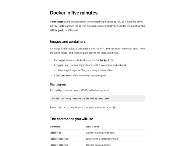
Prose
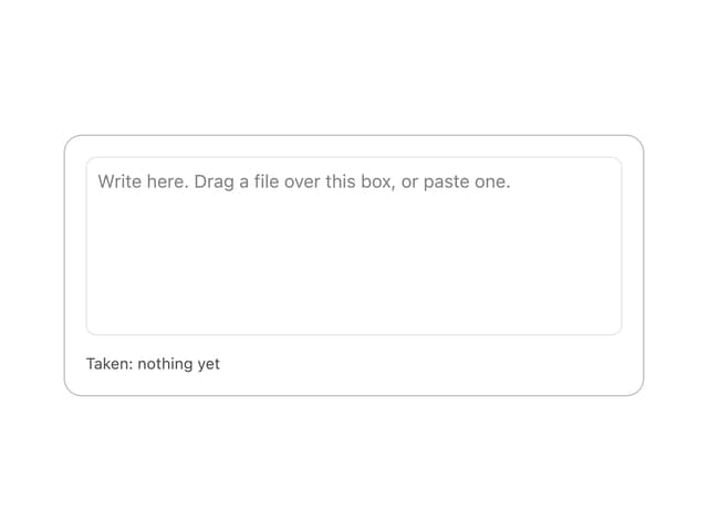
File Drop Zone
More in Buttons
View all
Button
12
Texture Button
105

Astryx Button Group
24

HeroUI Button Group
60

Notification Button
115
Native Button
12
Split Button
15

App Store Button
480


