
About
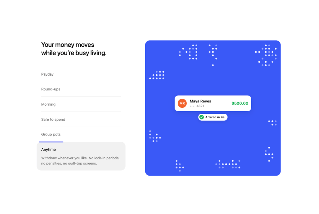
Feature section with an auto-advancing accordion and a colour card whose dot-matrix clusters scatter and re-form around a blurring UI snippet, with cursor, swipe and keyboard control.
Built with React and Tailwind. Copy the prompt and paste it into Claude Code, Cursor or Lovable: your agent adds Dot Matrix Feature Accordion to your project and fits it to your theme.
Code
How Dot Matrix Feature Accordion is used: the demo's code. The component's own source comes with a free account.
Usage.tsx
"use client"

import DotMatrixFeatureAccordion from "@/components/ui/dot-matrix-feature-accordion"

const settings = {
  interval: 1850,
  autoPlay: true,
}

export default function Demo(props: Partial<typeof settings>) {
  const s = { ...settings, ...props }
  return <DotMatrixFeatureAccordion interval={s.interval} autoPlay={s.autoPlay} />
}
More by Kedhareswer Naidu
View all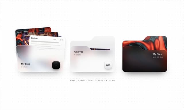

Glassmorphism Folder Cards
5.2K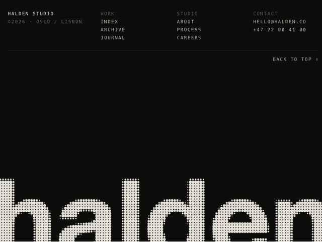
Halftone Wordmark Footer
2.2K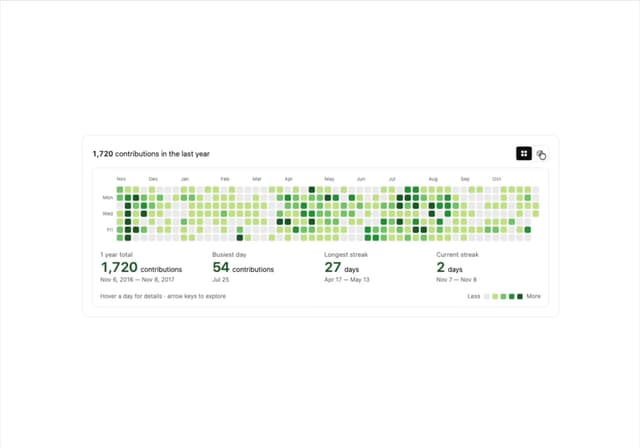
GitHub Contribution Graph 3D Heatmap
2.1K
Morph Gallery
1.9K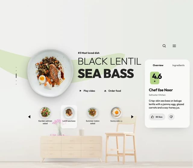
Food Menu Scroll Carousel
1.7K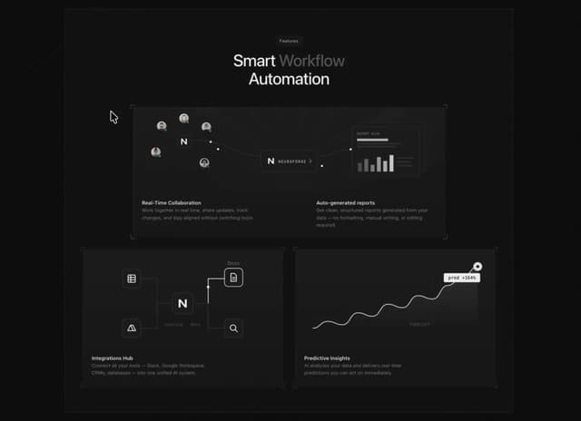
Animated Features Bento with Live Diagrams
1.3K
Hanging Polaroid Image Carousel
1.2K
Flipping Website Screenshot Deck
896
More in Features
View all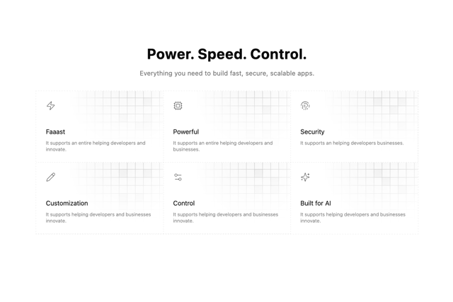

Grid Feature Cards
1.9K

Feature Sections
55

Features 8
3.2K

Tabbed Feature Categories
86
Feature with advantages
299
Features 1
291

Features Grid
91

Feature 1
121
