

About
A features section that swaps a three-column grid of icon, title, and description cards between Collaboration, Automation, and Security tabs.
Built with React and Tailwind. Copy the prompt and paste it into Claude Code, Cursor or Lovable: your agent adds Tabbed Feature Categories to your project and fits it to your theme.
Code
How Tabbed Feature Categories is used: the demo's code. The component's own source comes with a free account.
Usage.tsx
import FeaturesBlock from "@/components/ui/features-4";

export default function FeaturesDemo() {
  return <FeaturesBlock />;
}
More by Oliver
View all
Dismissible Alert Stack
399
Us vs Them Comparison
350
Feature Comparison Table
260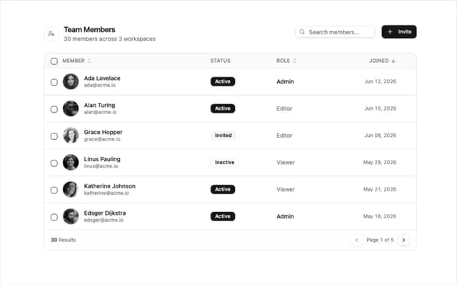
Team Members Data Table
218
How It Works Timeline
211
Alternating Rows With Stats
107
Logo Cloud Marquee
105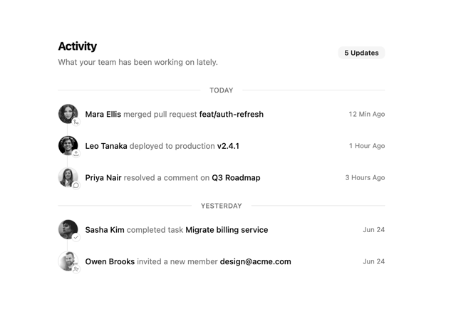
Activity Timeline
89
More in Features
View all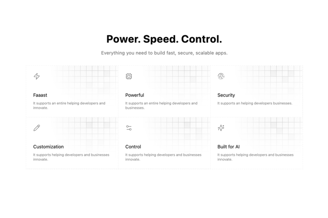

Grid Feature Cards
1.9K

Feature Sections
194

Features Grid
85

Features 8
3.1K
Feature with advantages
287
Features Card
238
Features 4
384
Features 2
334

