
About
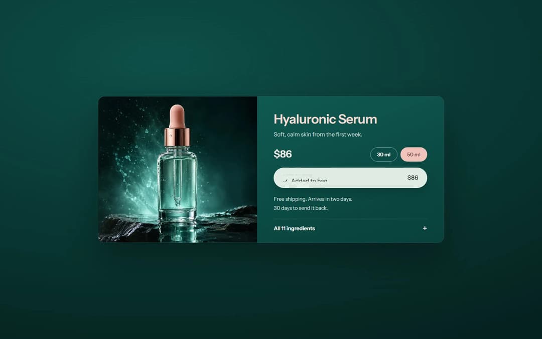
Dark teal single-product buy card: moody product photo, name and promise, price with size pills, an add-to-bag button and an expandable ingredients list. Use it as the buy section of a product page.
Built with React and Tailwind. Copy the prompt and paste it into Claude Code, Cursor or Lovable: your agent adds Serum Product Card to your project and fits it to your theme.
Code
How Serum Product Card is used: the demo's code. The component's own source comes with a free account.
Usage.tsx
"use client"

import SerumProductCard from "@/components/ui/serum-product-card"

export default function Demo() {
  return <SerumProductCard />
}
More by Kedhareswer Naidu
View all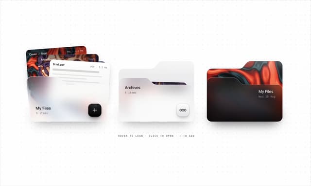

Glassmorphism Folder Cards
5.1K
Halftone Wordmark Footer
2.2K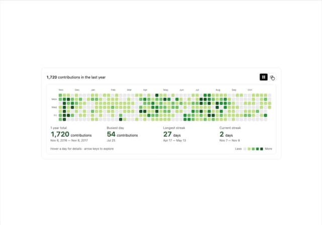
GitHub Contribution Graph 3D Heatmap
2K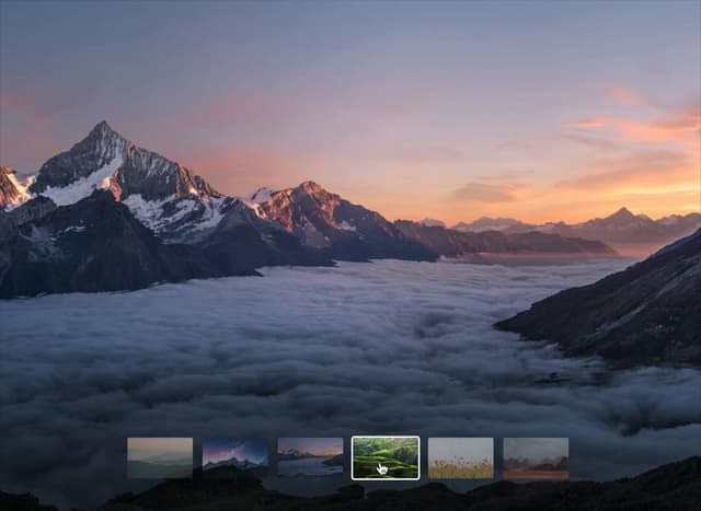
Morph Gallery
1.9K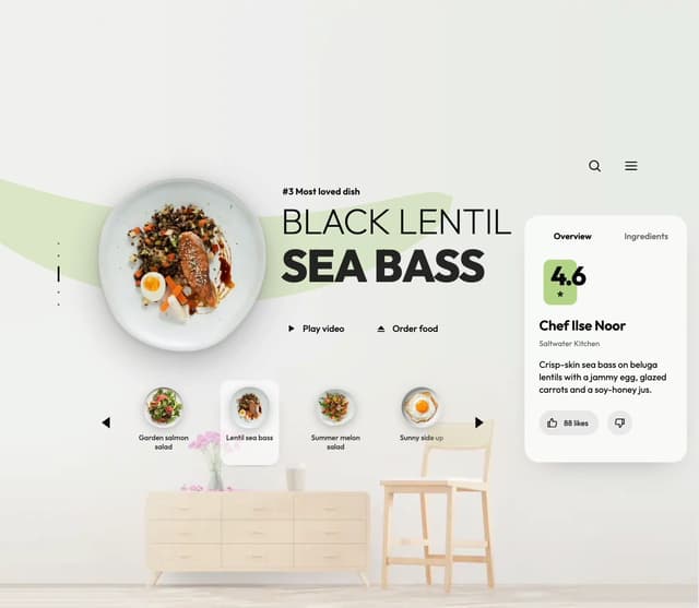
Food Menu Scroll Carousel
1.6K
Animated Features Bento with Live Diagrams
1.3K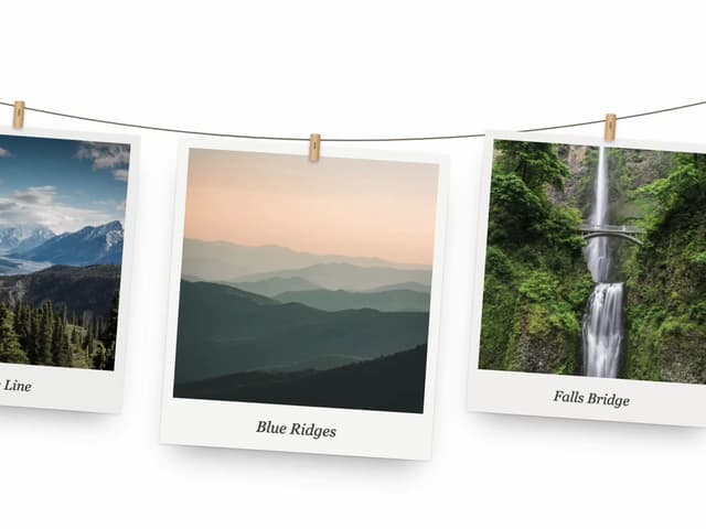
Hanging Polaroid Image Carousel
1.2K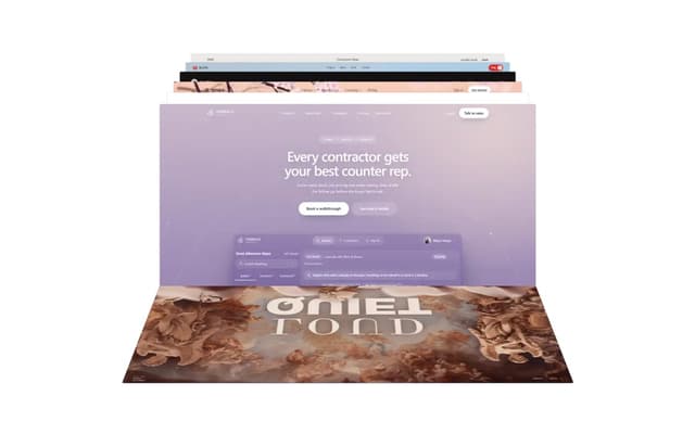
Flipping Website Screenshot Deck
885
More in Cards
View all

Course Design Cards
1.3K

Card Studio
12

Statistics Card 2
305

Interactive Tech Stack Bento Grid with Hover Effects
621

Card
19
Statistics Card 7
327
Card
61
The Item one
4