
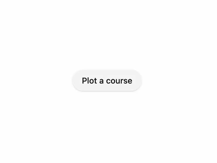
About
A pill-shaped button that trades its solid fill for a marching dashed outline on hover and keyboard focus.
Built with React and Tailwind. Copy the prompt and paste it into Claude Code, Cursor or Lovable: your agent adds Dash Button to your project and fits it to your theme.
Code
How Dash Button is used: the demo's code. The component's own source comes with a free account.
Usage.tsx
import { DashButton } from "@/components/ui/dash-button";

export default function DashButtonDemo() {
  return (
    <div className="flex min-h-[200px] w-full items-center justify-center">
      <DashButton>Plot a course</DashButton>
    </div>
  );
}
Dependencies
More by kevingirelli
View all
QR Code
126
Aurora
118
FAQ Section
75
Animated Border
71
Warp Gradient
59
Corner Frame
58
Wave Text
53
Spotlight
42
More in Buttons
View all
Button
12
Texture Button
105

HeroUI Button Group
60

Notification Button
115

Astryx Button Group
24
Split Button
15
Native Button
12

App Store Button
481


