
About
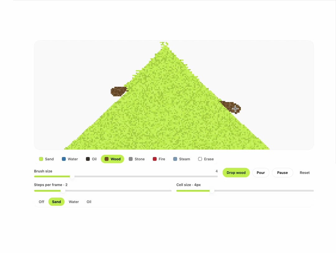
An interactive falling-sand cellular automaton where sand, water, oil, wood, stone, fire, smoke and steam fall, pile and react on a canvas grid that a user can paint, pour or drop material into.
Built with React and Tailwind. Copy the prompt and paste it into Claude Code, Cursor or Lovable: your agent adds Falling Sand to your project and fits it to your theme.
Code
How Falling Sand is used: the demo's code. The component's own source comes with a free account.
Usage.tsx
"use client";

import { FallingSand } from "@/components/ui/klyv-falling-sand";
import type {
  FallingSandHandle,
  FallingSandMaterial,
} from "@/components/ui/klyv-falling-sand";
import { useRef, useState } from "react";
import { SegmentedControl } from "@/components/ui/klyv-falling-sand-utils/segmented-control";
import { Slider } from "@/components/ui/klyv-falling-sand-utils/slider";

const POUR_OPTIONS: { value: "off" | FallingSandMaterial; label: string }[] = [
  { value: "off", label: "Off" },
  { value: "sand", label: "Sand" },
  { value: "water", label: "Water" },
  { value: "oil", label: "Oil" },
];

export default function FallingSandPlaygroundDemo() {
  const sand = useRef<FallingSandHandle>(null);
  const [pour, setPour] = useState<"off" | FallingSandMaterial>("sand");
  const [speed, setSpeed] = useState(2);
  const [cellSize, setCellSize] = useState(4);

  return (
    <div className="flex w-full flex-col gap-4 p-6">
      <FallingSand
        ref={sand}
        pour={pour === "off" ? false : pour}
        speed={speed}
        cellSize={cellSize}
        defaultBrush="wood"
        label="Falling sand playground"
        className="h-[460px]"
      />
      <div className="grid grid-cols-1 gap-4 sm:grid-cols-2">
        <label className="flex flex-col gap-2">
          <span className="text-[12px] font-semibold text-ink-soft">
            Steps per frame · {speed}
          </span>
          <Slider
            min={1}
            max={6}
            value={speed}
            onChange={(event) => setSpeed(Number(event.target.value))}
          />
        </label>
        <label className="flex flex-col gap-2">
          <span className="text-[12px] font-semibold text-ink-soft">
            Cell size · {cellSize}px
          </span>
          <Slider
            min={2}
            max={10}
            value={cellSize}
            onChange={(event) => setCellSize(Number(event.target.value))}
          />
        </label>
      </div>
      <SegmentedControl
        label="Pour from the top"
        size="sm"
        value={pour}
        onValueChange={setPour}
        options={POUR_OPTIONS}
      />
    </div>
  );
}
More by klyv-ui
View all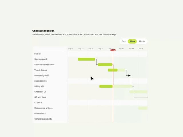
Gantt Chart
92
Shader Canvas
61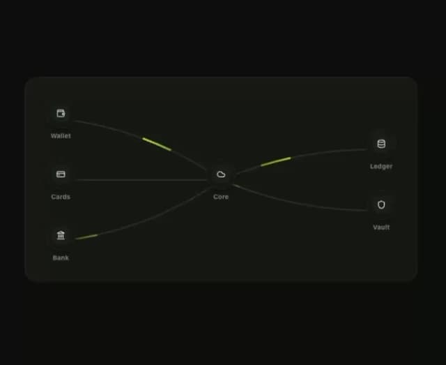
Klyv Animated Beam
59
Pareto Chart
55
Fluid Canvas
38
Sunburst Chart
30
Gooey Loader
28
Morphing Text
27