
About
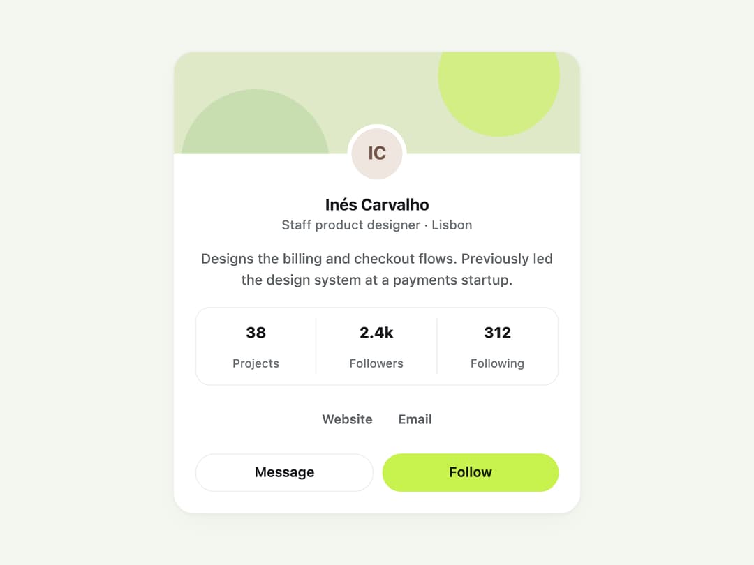
A card that summarises a person — avatar, name, role, bio, stats and links — with a compact single-row variant for member lists and directories.
Built with React and Tailwind. Copy the prompt and paste it into Claude Code, Cursor or Lovable: your agent adds Profile Card to your project and fits it to your theme.
Code
How Profile Card is used: the demo's code. The component's own source comes with a free account.
Usage.tsx
import { ProfileCard } from "@/components/ui/profile-card";

const coverSrc =
  "data:image/svg+xml;utf8,%3Csvg%20xmlns%3D'http%3A%2F%2Fwww.w3.org%2F2000%2Fsvg'%20viewBox%3D'0%200%20600%20160'%20preserveAspectRatio%3D'xMidYMid%20slice'%3E%3Crect%20width%3D'600'%20height%3D'160'%20fill%3D'%23dfe9c8'%2F%3E%3Ccircle%20cx%3D'480'%20cy%3D'40'%20r%3D'90'%20fill%3D'%23c8f24e'%20opacity%3D'.55'%2F%3E%3Ccircle%20cx%3D'120'%20cy%3D'170'%20r%3D'110'%20fill%3D'%23b8d6a0'%20opacity%3D'.6'%2F%3E%3C%2Fsvg%3E";

export default function ProfileCardDemo() {
  return (
    <div className="flex min-h-screen w-full items-center justify-center bg-[var(--color-canvas)] p-6">
      <div className="w-full max-w-sm">
        <ProfileCard
          name="Inés Carvalho"
          role="Staff product designer · Lisbon"
          coverSrc={coverSrc}
          bio="Designs the billing and checkout flows. Previously led the design system at a payments startup."
          stats={[
            { label: "Projects", value: 38 },
            { label: "Followers", value: "2.4k" },
            { label: "Following", value: 312 },
          ]}
          links={[
            { label: "Website", href: "https://example.com/" },
            { label: "Email", href: "mailto:ines@example.com" },
          ]}
          secondaryAction={
            <button
              type="button"
              className="inline-flex h-9 flex-1 items-center justify-center rounded-full border border-[var(--color-line)] bg-[var(--color-surface)] px-4 text-[13px] font-semibold text-[var(--color-ink)] transition-colors hover:border-[var(--color-line-strong)]"
            >
              Message
            </button>
          }
          primaryAction={
            <button
              type="button"
              className="inline-flex h-9 flex-1 items-center justify-center rounded-full bg-[var(--color-accent)] px-4 text-[13px] font-semibold text-[var(--color-accent-ink)] transition-colors hover:bg-[var(--color-accent-strong)]"
            >
              Follow
            </button>
          }
        />
      </div>
    </div>
  );
}
More by klyv-ui
View all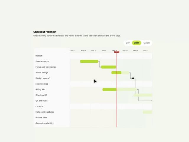
Gantt Chart
89
Shader Canvas
60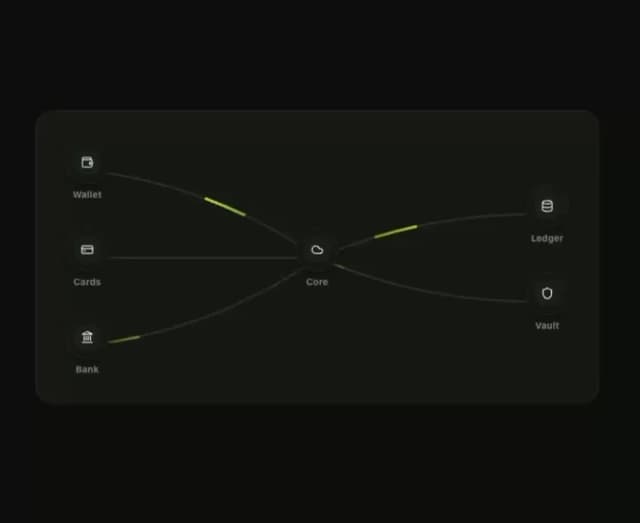
Klyv Animated Beam
59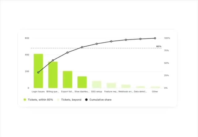
Pareto Chart
53
Fluid Canvas
37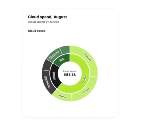
Sunburst Chart
30
Gooey Loader
28
Morphing Text
27