
About
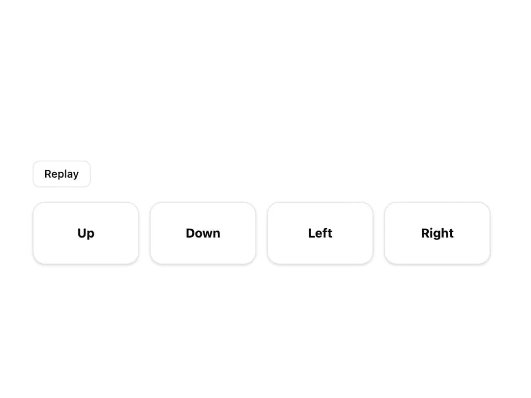
A wrapper that fades and slides its children into view once they scroll into the viewport, respecting prefers-reduced-motion.
Built with React and Tailwind. Copy the prompt and paste it into Claude Code, Cursor or Lovable: your agent adds Reveal to your project and fits it to your theme.
Code
How Reveal is used: the demo's code. The component's own source comes with a free account.
Usage.tsx
"use client";

import Reveal from "@/components/ui/reveal";
import { useState } from "react";

export default function RevealDemo() {
  const [key, setKey] = useState(0);

  return (
    <div className="flex w-full max-w-xl flex-col items-start gap-4 bg-background p-8 text-foreground">
      <button
        type="button"
        onClick={() => setKey((value) => value + 1)}
        className="rounded-md border border-border bg-card px-3 py-1.5 text-xs font-medium text-card-foreground transition-colors hover:bg-accent hover:text-accent-foreground"
      >
        Replay
      </button>

      <div key={key} className="grid w-full gap-3 sm:grid-cols-4">
        {(["up", "down", "left", "right"] as const).map((direction) => (
          <Reveal key={direction} direction={direction}>
            <div className="flex flex-col items-center justify-center gap-1 rounded-xl border border-border bg-card p-6 text-card-foreground shadow-sm">
              <span className="text-sm font-bold capitalize">{direction}</span>
            </div>
          </Reveal>
        ))}
      </div>
    </div>
  );
}
Dependencies
More by klyv-ui
View all
Gantt Chart
67
Klyv Animated Beam
54
Shader Canvas
52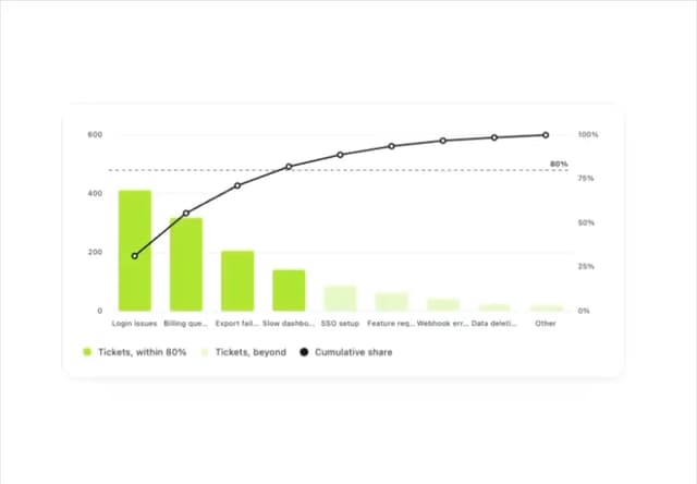
Pareto Chart
47
Sunburst Chart
27
Gooey Loader
25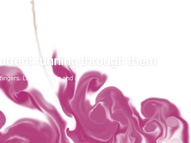
Fluid Canvas
25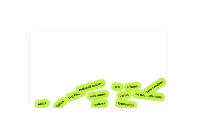
Gravity Tags
22