
About
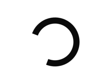
A small inline busy indicator that spins to show a control or region is loading, inheriting the surrounding text color so it reads correctly on any background.
Built with React and Tailwind. Copy the prompt and paste it into Claude Code, Cursor or Lovable: your agent adds Spinner to your project and fits it to your theme.
Code
How Spinner is used: the demo's code. The component's own source comes with a free account.
Usage.tsx
import { Spinner } from "@/components/ui/spinner";

export default function SpinnerDemo() {
  return (
    <div className="flex min-h-[200px] w-full items-center justify-center text-foreground">
      <Spinner />
    </div>
  );
}
More by klyv-ui
View all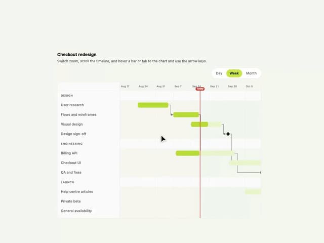
Gantt Chart
97
Shader Canvas
63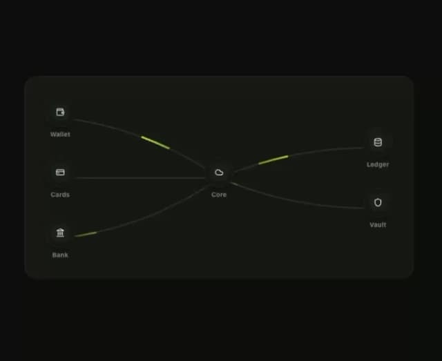
Klyv Animated Beam
62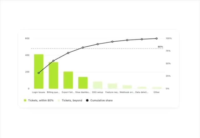
Pareto Chart
58
Fluid Canvas
42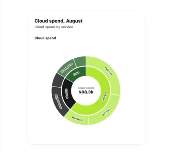
Sunburst Chart
34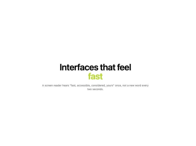
Morphing Text
30
Gooey Loader
29