
About
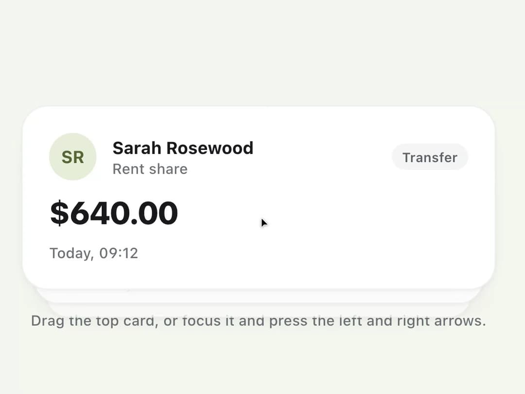
A stack of cards where the top card is dragged left or right to decide on it, like approving or declining an item, with full keyboard arrow-key support as a fallback.
Built with React and Tailwind. Copy the prompt and paste it into Claude Code, Cursor or Lovable: your agent adds Swipe Deck to your project and fits it to your theme.
Code
How Swipe Deck is used: the demo's code. The component's own source comes with a free account.
Usage.tsx
"use client";

import SwipeDeck from "@/components/ui/swipe-deck";
import { useState } from "react";
import { Avatar, Button, Surface, Tag, Text } from "klyvui";
import "klyvui/styles.css";
import { Check, X } from "lucide-react";

interface Approval {
  id: string;
  name: string;
  merchant: string;
  amount: number;
  category: string;
  when: string;
}

const APPROVALS: Approval[] = [
  {
    id: "1",
    name: "Sarah Rosewood",
    merchant: "Rent share",
    amount: 640,
    category: "Transfer",
    when: "Today, 09:12",
  },
  {
    id: "2",
    name: "GumZone",
    merchant: "Monthly plan",
    amount: 35,
    category: "Subscription",
    when: "Today, 08:40",
  },
  {
    id: "3",
    name: "Northwind Energy",
    merchant: "October bill",
    amount: 128.4,
    category: "Bill",
    when: "Yesterday",
  },
  {
    id: "4",
    name: "Halo Fitness",
    merchant: "Annual renewal",
    amount: 219,
    category: "Subscription",
    when: "Yesterday",
  },
  {
    id: "5",
    name: "Kestrel Books",
    merchant: "Order 88213",
    amount: 42.1,
    category: "Card",
    when: "2 days ago",
  },
];

export default function SwipeDeckExample() {
  const [decided, setDecided] = useState<{
    approved: number;
    declined: number;
  }>({
    approved: 0,
    declined: 0,
  });
  const [round, setRound] = useState(0);

  return (
    <div className="flex w-full flex-col items-center gap-4">
      <SwipeDeck
        key={round}
        items={APPROVALS}
        itemId={(item) => item.id}
        label="Payments awaiting approval"
        className="w-full max-w-[360px]"
        hints={{
          left: (
            <span className="inline-flex items-center gap-1 rounded-full bg-danger px-2.5 py-1 text-[11px] font-bold text-white">
              <X size={12} strokeWidth={3} aria-hidden="true" /> Decline
            </span>
          ),
          right: (
            <span className="inline-flex items-center gap-1 rounded-full bg-success px-2.5 py-1 text-[11px] font-bold text-white">
              <Check size={12} strokeWidth={3} aria-hidden="true" /> Approve
            </span>
          ),
        }}
        onSwipe={(_item, direction) =>
          setDecided((previous) => ({
            approved: previous.approved + (direction === "right" ? 1 : 0),
            declined: previous.declined + (direction === "left" ? 1 : 0),
          }))
        }
        empty={
          <Surface
            variant="card"
            padding="lg"
            className="w-full max-w-[360px] items-center gap-3"
          >
            <Text size="heading">All caught up</Text>
            <Text size="caption" tone="soft">
              {decided.approved} approved, {decided.declined} declined.
            </Text>
            <Button
              size="sm"
              variant="outline"
              onClick={() => {
                setDecided({ approved: 0, declined: 0 });
                setRound((value) => value + 1);
              }}
            >
              Reset
            </Button>
          </Surface>
        }
        renderItem={(item) => (
          <Surface variant="card" padding="lg" className="gap-3">
            <div className="flex items-center gap-3">
              <Avatar name={item.name} />
              <div className="flex min-w-0 flex-1 flex-col">
                <Text size="body" truncate>
                  {item.name}
                </Text>
                <Text size="caption" tone="faint" truncate>
                  {item.merchant}
                </Text>
              </div>
              <Tag size="sm">{item.category}</Tag>
            </div>
            <Text size="title" tabular>
              ${item.amount.toFixed(2)}
            </Text>
            <Text size="caption" tone="faint">
              {item.when}
            </Text>
          </Surface>
        )}
      />
      <Text size="caption" tone="faint">
        Drag the top card, or focus it and press the left and right arrows.
      </Text>
    </div>
  );
}
Dependencies
More by klyv-ui
View all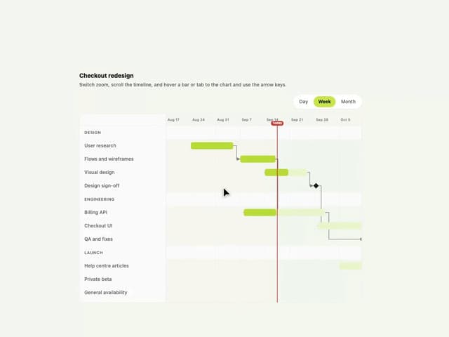
Gantt Chart
68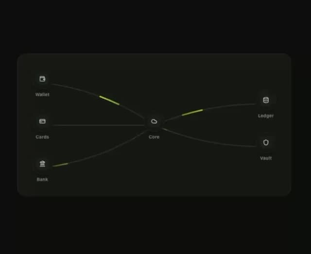
Klyv Animated Beam
55
Shader Canvas
54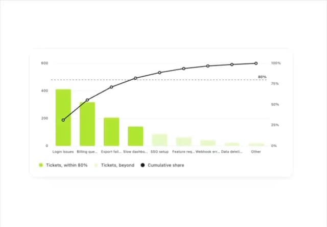
Pareto Chart
48
Sunburst Chart
28
Gooey Loader
26
Fluid Canvas
26
Morphing Text
23