
About
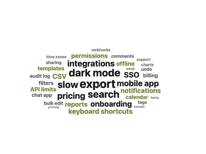
An SVG word cloud that sizes and packs words along a spiral by weight so nothing overlaps, with a hover/keyboard tooltip and an accessible weight-ordered list fallback, for visualizing feedback themes, search terms or tags.
Built with React and Tailwind. Copy the prompt and paste it into Claude Code, Cursor or Lovable: your agent adds Word Cloud to your project and fits it to your theme.
Code
How Word Cloud is used: the demo's code. The component's own source comes with a free account.
Usage.tsx
import { WordCloud } from "@/components/ui/word-cloud";

const words = [
  { text: "export", weight: 184 },
  { text: "dark mode", weight: 142 },
  { text: "search", weight: 131 },
  { text: "slow", weight: 118 },
  { text: "pricing", weight: 96 },
  { text: "integrations", weight: 92 },
  { text: "mobile app", weight: 88 },
  { text: "onboarding", weight: 74 },
  { text: "SSO", weight: 71 },
  { text: "keyboard shortcuts", weight: 64 },
  { text: "notifications", weight: 60 },
  { text: "CSV", weight: 58 },
  { text: "reports", weight: 55 },
  { text: "permissions", weight: 52 },
  { text: "offline", weight: 47 },
  { text: "API limits", weight: 44 },
  { text: "templates", weight: 41 },
  { text: "calendar", weight: 38 },
  { text: "filters", weight: 36 },
  { text: "billing", weight: 34 },
  { text: "audit log", weight: 31 },
  { text: "chat app", weight: 30 },
  { text: "bulk edit", weight: 28 },
  { text: "comments", weight: 26 },
  { text: "undo", weight: 24 },
  { text: "tags", weight: 22 },
  { text: "sharing", weight: 21 },
  { text: "charts", weight: 19 },
  { text: "time zones", weight: 18 },
  { text: "webhooks", weight: 17 },
  { text: "support", weight: 16 },
  { text: "emoji", weight: 12 },
  { text: "fonts", weight: 11 },
  { text: "sounds", weight: 9 },
  { text: "printing", weight: 8 },
];

export default function WordCloudDemo() {
  return (
    <div className="flex w-full items-center justify-center bg-[var(--color-surface)] p-8">
      <div className="w-full max-w-2xl">
        <WordCloud
          words={words}
          label="Feature request themes"
          valueLabel="Mentions"
        />
      </div>
    </div>
  );
}
More by klyv-ui
View all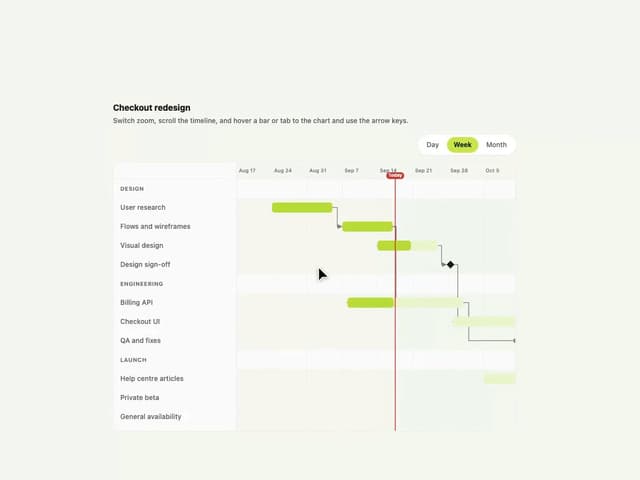
Gantt Chart
68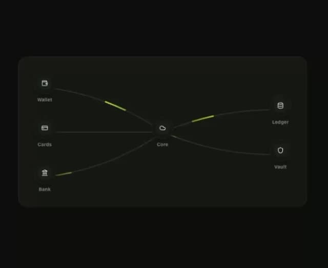
Klyv Animated Beam
55
Shader Canvas
54
Pareto Chart
49
Sunburst Chart
28
Fluid Canvas
27
Gooey Loader
26
Morphing Text
23