
About
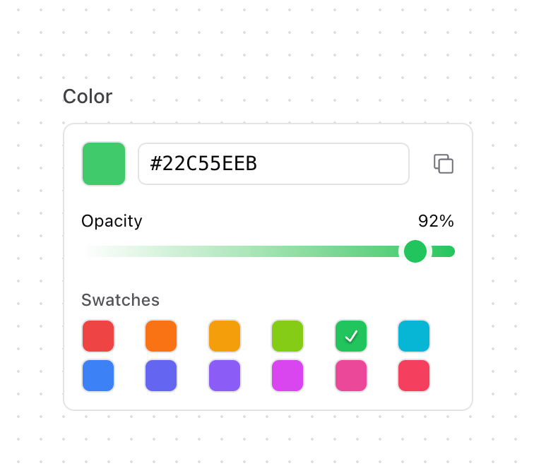
A sophisticated color input component with opacity control, color swatches, and clipboard integration. Features - Color Management - HEX color input - Visual color preview - One-click copy to clipboard - Color swatches for quick selection - Opacity Control - Smooth slider control (0-100%) - Visual gradient feedback - Custom styled thumb matching selected color - Real-time color preview
Built with React and Tailwind. Copy the prompt and paste it into Claude Code, Cursor or Lovable: your agent adds Color Input to your project and fits it to your theme.
Code
How Color Input is used: the demo's code. The component's own source comes with a free account.
Usage.tsx
import { ColorInput } from "@/components/ui/color-input";

function ColorInputDemo() {
  return (
    <div className="block">
      <ColorInput />
    </div>
  );
}

export { ColorInputDemo };
Dependencies
More by Kokonut UI
View all

Background Paths
5.7K
Shape Landing Hero
3.6K
Beams Background
2.8K
Bento Grid
2.2K
v0 AI Chat
2.1K
AI Voice Input
1.7K
Hand Writing Text
1.3K
Action Search Bar
1.3K