
About
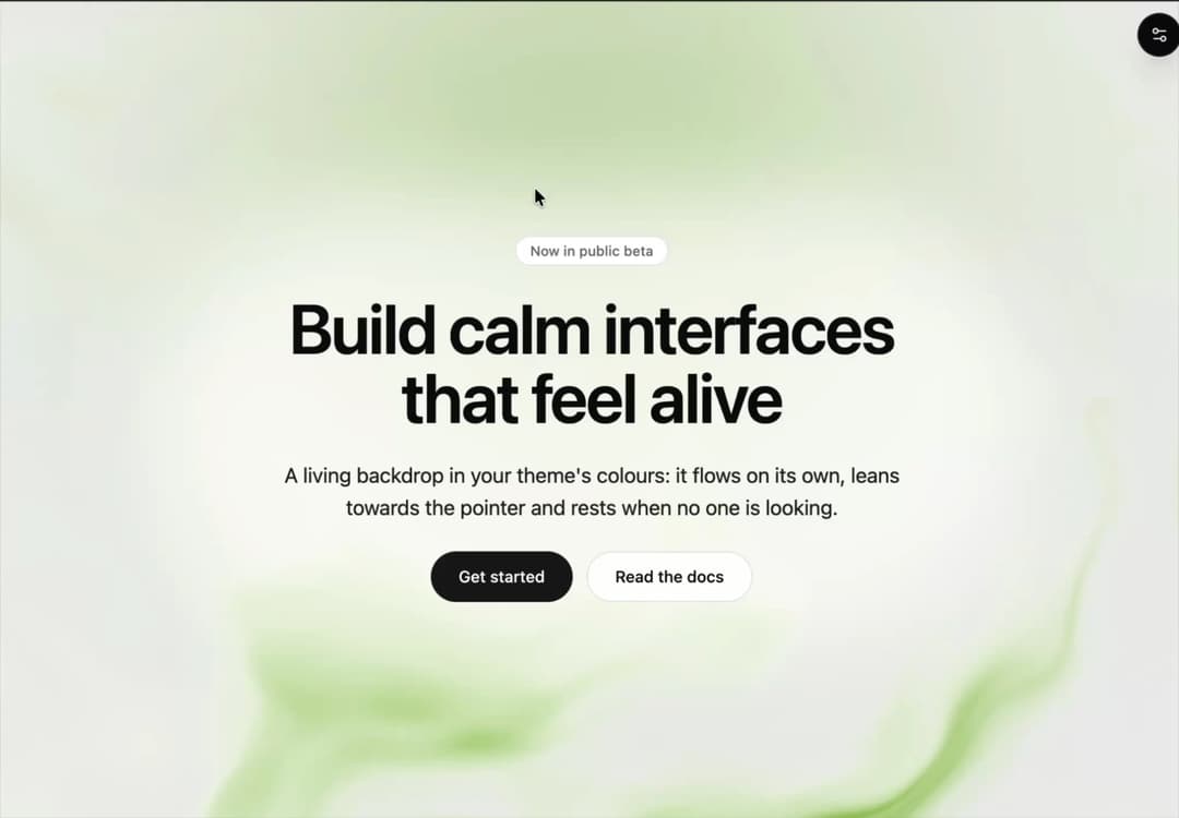
Animated WebGL backdrop in your theme's colours: a slow, domain-warped liquid field with a soft accent glow that leans towards the pointer, with content on top. Rests off screen, in hidden tabs and under reduced motion; a CSS gradient without WebGL.
Built with React and Tailwind. Copy the prompt and paste it into Claude Code, Cursor or Lovable: your agent adds Shader Art to your project and fits it to your theme.
Code
How Shader Art is used: the demo's code. The component's own source comes with a free account.
Usage.tsx
"use client";

import { ShaderArt } from "@/components/ui/shader-art";

const settings = {
  /** The glow: "lime", "violet" or "sky" from the Tailwind palette, or "theme" for --primary. */
  accent: "lime",
  /** Strength of the accent glow, 0 to 1. */
  intensity: 0.85,
  /** The field leans towards the pointer. */
  interactive: true,
  /** Holds the current frame. */
  paused: false,
  /** Size of the shapes, 0.25 to 4. */
  scale: 1,
  /** How fast the field flows, 0 to 4. */
  speed: 1,
};

/**
 * A palette accent reaches the field as the root's text colour (`currentColor`): calm in the
 * light theme, bright in the dark one. Static class names, so Tailwind generates them; the words
 * on top keep the theme's own colours.
 */
const ACCENTS: Readonly<Record<string, string>> = {
  lime: "text-lime-600 dark:text-lime-300",
  sky: "text-sky-600 dark:text-sky-400",
  theme: "",
  violet: "text-violet-600 dark:text-violet-400",
};

const ACTION =
  "inline-flex h-11 items-center justify-center rounded-full px-6 font-medium text-sm outline-none transition-colors focus-visible:ring-2 focus-visible:ring-ring focus-visible:ring-offset-2 focus-visible:ring-offset-background";

/** A landing hero over the field: a headline, a line of copy and two actions. */
export default function Demo(props: Partial<typeof settings>) {
  const { accent, intensity, interactive, paused, scale, speed } = {
    ...settings,
    ...props,
  };
  // An accent the demo does not know falls back to the default.
  const palette =
    (Object.hasOwn(ACCENTS, accent) ? ACCENTS[accent] : ACCENTS.lime) ?? "";
  return (
    <ShaderArt
      className={`flex min-h-svh w-full items-center justify-center px-6 py-20 ${palette}`}
      colors={palette ? { accent: "currentColor" } : undefined}
      intensity={intensity}
      interactive={interactive}
      paused={paused}
      scale={scale}
      speed={speed}
    >
      <div className="relative isolate flex max-w-2xl flex-col items-center gap-6 text-center text-foreground">
        {/* A soft pool of the background under the words keeps them readable on any frame. */}
        <div
          aria-hidden="true"
          className="absolute -inset-x-12 -inset-y-10 -z-10 rounded-full bg-background/70 blur-2xl"
        />
        <span className="rounded-full border border-border bg-background px-3 py-1 font-medium text-muted-foreground text-xs backdrop-blur">
          Now in public beta
        </span>
        <h1 className="text-balance font-semibold text-4xl text-foreground tracking-tight sm:text-6xl">
          Build calm interfaces that feel alive
        </h1>
        <p className="max-w-xl text-pretty text-base text-foreground/90 sm:text-lg">
          A living backdrop in your theme's colours: it flows on its own, leans
          towards the pointer and rests when no one is looking.
        </p>
        <div className="flex flex-wrap items-center justify-center gap-3">
          <a
            className={`${ACTION} bg-primary text-primary-foreground hover:bg-primary/90`}
            href="#get-started"
          >
            Get started
          </a>
          <a
            className={`${ACTION} border border-border bg-background/80 text-foreground backdrop-blur hover:bg-background`}
            href="#docs"
          >
            Read the docs
          </a>
        </div>
      </div>
    </ShaderArt>
  );
}
More by OSAGI
View all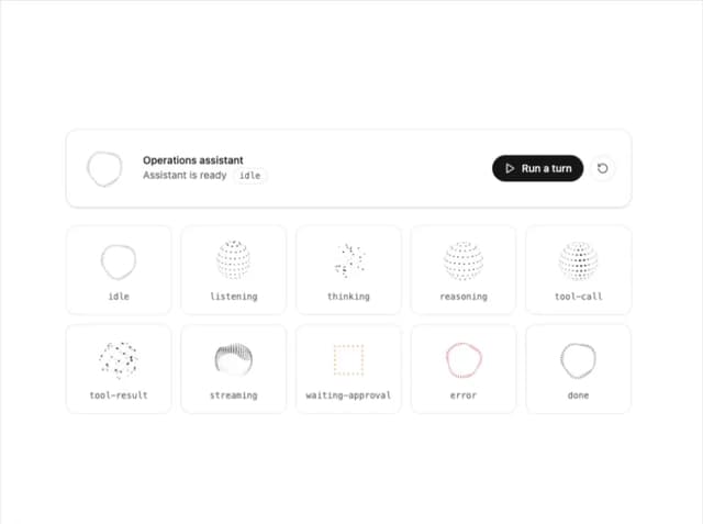
AI Orb
163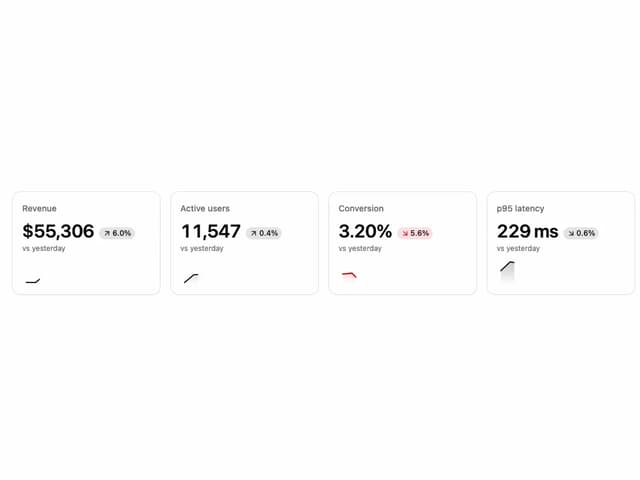
KPI Tile
56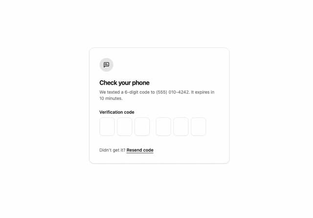
OTP Input
18
Reasoning Thread
16
Assistant Composer
8
Stat Card
1
Release Notes
Docs TOC
More in Heroes
View all

Responsive Hero Banner
2.1K

SaaS Template
2.6K

Hero
1.3K
Centered Hero with Image Fan
1K
Editorial Collage Hero
485

Hero 03
358

Aero Hero-3
607

Minimalist Hero Fashion
309