
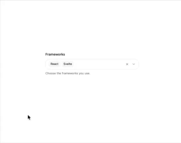
About
A dropdown field that lets a user pick several values at once, showing them as removable chips with an overflow count.
Built with React and Tailwind. Copy the prompt and paste it into Claude Code, Cursor or Lovable: your agent adds Multi Select to your project and fits it to your theme.
Code
How Multi Select is used: the demo's code. The component's own source comes with a free account.
Usage.tsx
import { MultiSelect } from "@/components/ui/multi-select";

export default function MultiSelectDemo() {
  return (
    <div className="flex min-h-screen w-full items-center justify-center bg-[var(--background)] p-8">
      <div className="w-full max-w-sm">
        <MultiSelect
          label="Frameworks"
          placeholder="Select frameworks"
          description="Choose the frameworks you use."
          options={[
            { value: "react", label: "React" },
            { value: "vue", label: "Vue" },
            { value: "svelte", label: "Svelte" },
            { value: "solid", label: "Solid" },
            { value: "angular", label: "Angular" },
            { value: "astro", label: "Astro" },
          ]}
          defaultValue={["react", "svelte"]}
        />
      </div>
    </div>
  );
}
Dependencies
More by kuratlielia
View all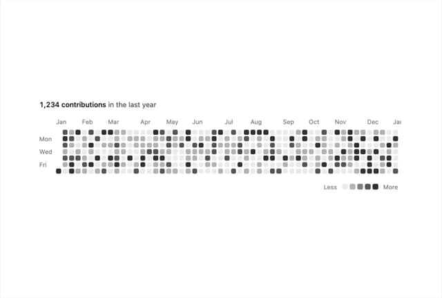
Activity Heatmap
329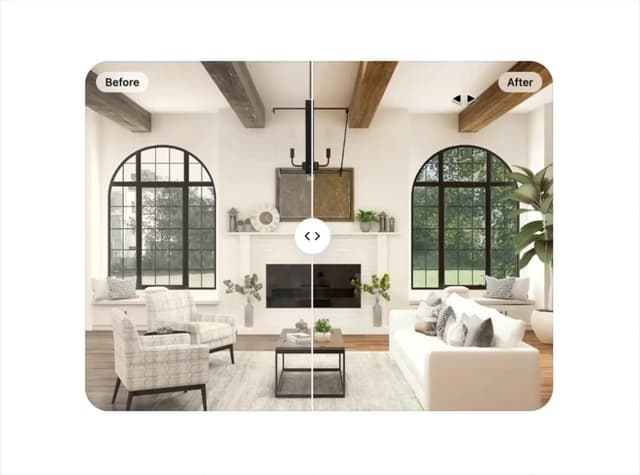
Image Compare
103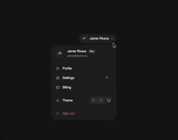
User Menu
93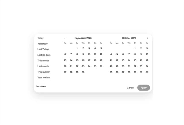
Date Range Picker
62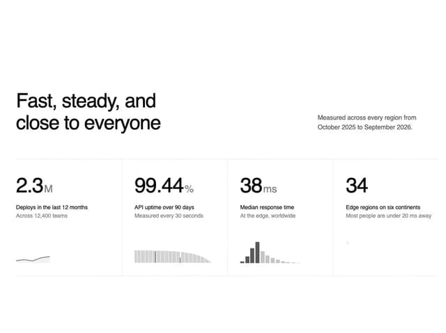
Stats Band
51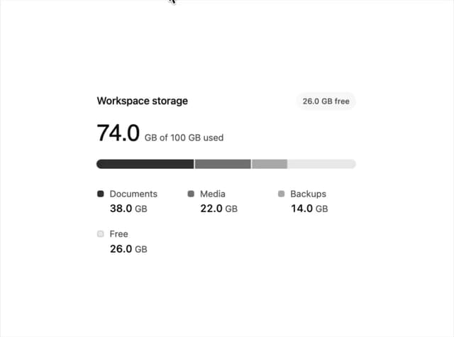
Usage Meter
45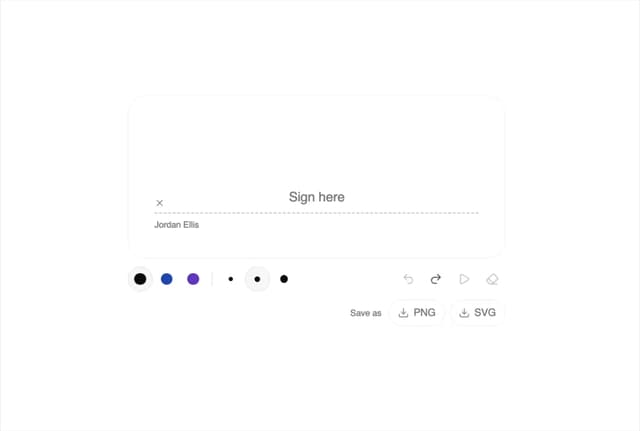
Signature Pad
36
Timeline
33
More in Forms
View all

Premium Auth
495
Authentication Card
44

Login 1
52

Login 2
7

Form
31

Card Studio
41

Login Card
32

Form
136
