
About
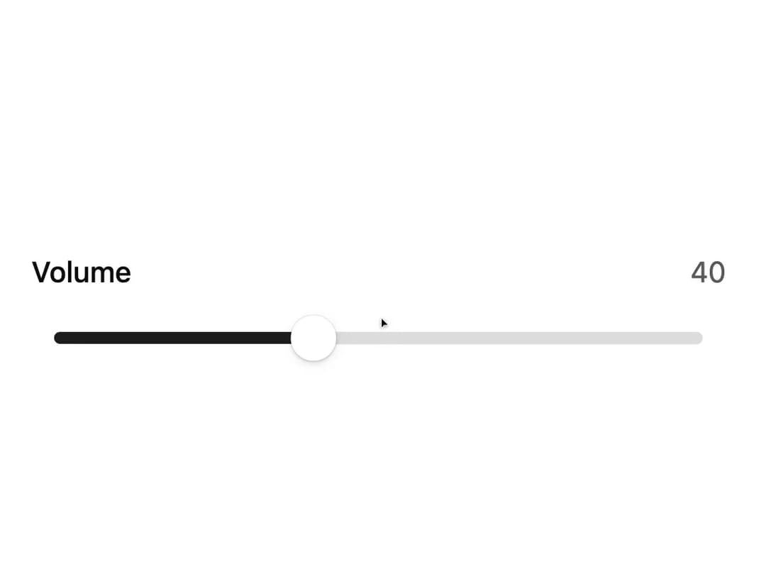
A draggable range/value slider input with a rolling-number value bubble, rubber-band drag resistance, marks, and keyboard support.
Built with React and Tailwind. Copy the prompt and paste it into Claude Code, Cursor or Lovable: your agent adds Slider to your project and fits it to your theme.
Code
How Slider is used: the demo's code. The component's own source comes with a free account.
Usage.tsx
"use client";

import Slider from "@/components/ui/slider";

export default function SliderDemo() {
  return (
    <div className="flex w-full max-w-sm items-center justify-center p-6">
      <Slider label="Volume" defaultValue={40} />
    </div>
  );
}
Dependencies
More by kuratlielia
View all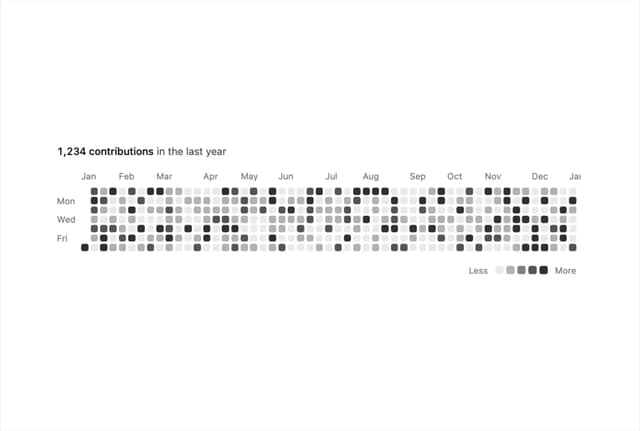
Activity Heatmap
503
Image Compare
171
User Menu
109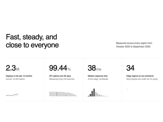
Stats Band
100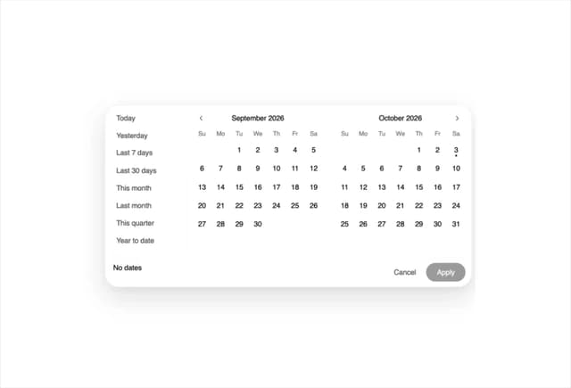
Date Range Picker
86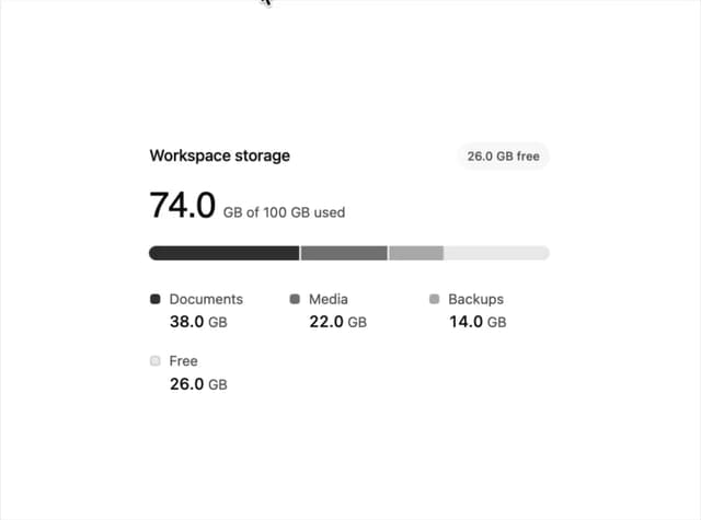
Usage Meter
66
Timeline
48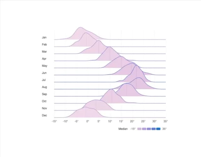
Ridgeline Chart
45
More in Forms
View all

Premium Auth
552

Book A Demo 1
86

Login 1
60

Contact Card
1.1K
Authentication Card
50

Form
137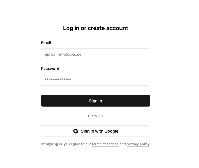

Login 2
10

Form
16
