
About
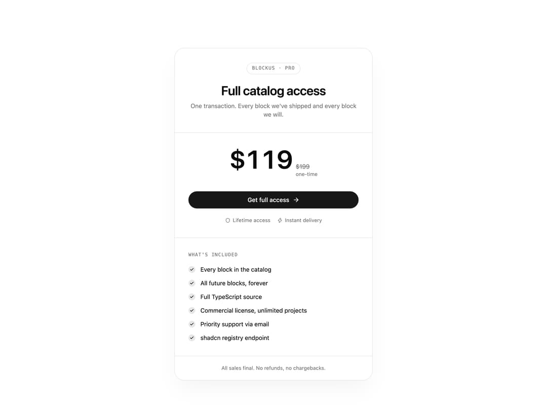
A centered pricing card for a single product or plan, showing a strikethrough compare-at price, a feature checklist, trust badges, and a call-to-action button.
Built with React and Tailwind. Copy the prompt and paste it into Claude Code, Cursor or Lovable: your agent adds Single Plan Pricing Card to your project and fits it to your theme.
Code
How Single Plan Pricing Card is used: the demo's code. The component's own source comes with a free account.
Usage.tsx
import Pricing17 from "@/components/ui/pricing-17";

export default function Pricing17Demo() {
  return <Pricing17 />;
}
Dependencies
More by LN
View all
Pricing Interaction
1.4K
Dorpdown Navigation
1.3K
Visualize Booking
639
Assisted Password Confirmation
603
Tags Selector
575
Mega Menu
404
Feedback Slider
332
FlipButton
296
More in Pricing
View all

Pricing Section
190
Pricing Section
654

Pricing Card
382

Boxly Pricing-1
94

Pricing Cards
17

RuixenPricing05
112
Bento Pricing Component
14
pricing section
167


