
About
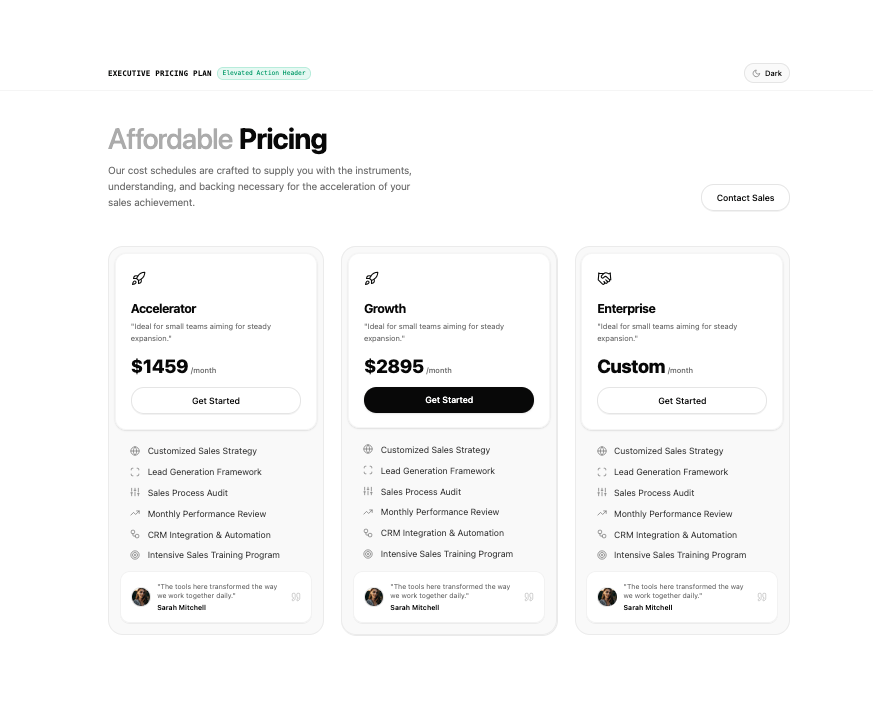
Three-tier pricing table featuring elevated action header boxes and embedded customer quote cards.
Built with React and Tailwind. Copy the prompt and paste it into Claude Code, Cursor or Lovable: your agent adds Executive Pricing Plan to your project and fits it to your theme.
Code
How Executive Pricing Plan is used: the demo's code. The component's own source comes with a free account.
Usage.tsx
import { useState, useEffect } from "react";
import ExecutivePricingPlan from "@/components/ui/executive-pricing-plan";
import { Sun, Moon } from "lucide-react";

export default function ExecutivePricingPlanDemo() {
  const [isDark, setIsDark] = useState<boolean>(() => {
    if (typeof window !== "undefined") {
      const params = new URLSearchParams(window.location.search);
      const themeParam = params.get("theme");
      if (themeParam === "dark") return true;
      if (themeParam === "light") return false;
      return document.documentElement.classList.contains("dark");
    }
    return false;
  });

  useEffect(() => {
    if (typeof document !== "undefined") {
      if (isDark) {
        document.documentElement.classList.add("dark");
      } else {
        document.documentElement.classList.remove("dark");
      }
    }
  }, [isDark]);

  const toggleTheme = () => {
    setIsDark((prev) => !prev);
  };

  return (
    <div className="relative min-h-screen w-full bg-background text-foreground transition-colors duration-200">
      <header className="sticky top-0 z-30 w-full border-b border-border/40 bg-background/80 backdrop-blur-md">
        <div className="mx-auto flex max-w-6xl items-center justify-between px-4 py-3 sm:px-6 lg:px-8">
          <div className="flex items-center gap-2">
            <span className="text-xs font-semibold tracking-wide text-foreground uppercase font-mono">
              Executive Pricing Plan
            </span>
            <span className="rounded-full bg-emerald-500/10 text-emerald-600 dark:text-emerald-400 border border-emerald-500/20 px-2 py-0.5 text-[10px] font-mono font-medium">
              Elevated Action Header
            </span>
          </div>

          <button
            type="button"
            onClick={toggleTheme}
            className="inline-flex h-8 items-center gap-1.5 rounded-full border border-border bg-muted/50 px-3 text-xs font-medium text-foreground transition-colors hover:bg-muted"
            aria-label={`Switch to ${isDark ? "light" : "dark"} mode`}
          >
            {isDark ? (
              <>
                <Sun className="h-3.5 w-3.5 text-amber-400" />
                <span>Light</span>
              </>
            ) : (
              <>
                <Moon className="h-3.5 w-3.5 text-muted-foreground" />
                <span>Dark</span>
              </>
            )}
          </button>
        </div>
      </header>

      <main className="w-full pb-16">
        <ExecutivePricingPlan
          onContactClick={() => alert("Contact Sales clicked")}
        />
      </main>
    </div>
  );
}
Dependencies
More by WRAPCODERS
View all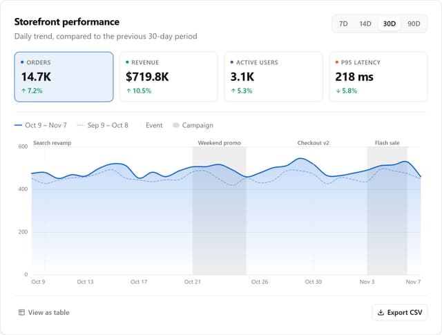

Metric Trend Chart
31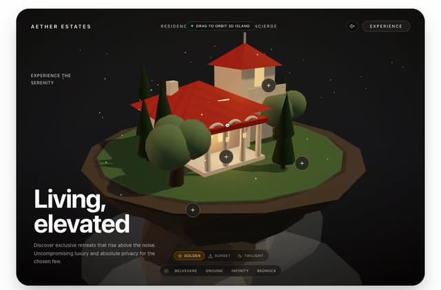
Real Estate 3D Hero
29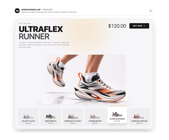
Product Hover Showcase
6
Portfolio Projects Showcase
5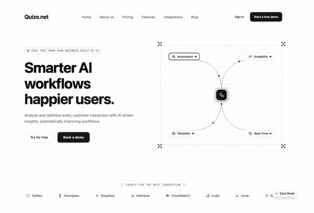
AI SaaS Workflow Hero
3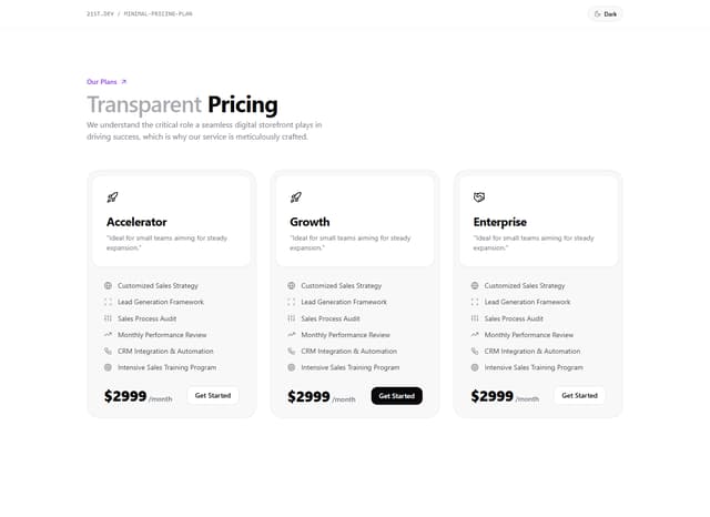
Minimal Pricing Plan
2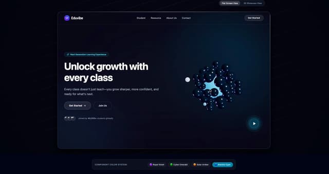
Interactive 3D Hero Header
2
App Integration Celestial Hero
1
More in Pricing
View all
Pricing Section
693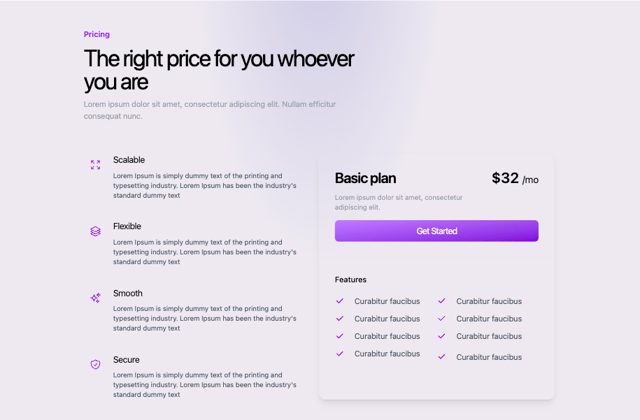
Colorful-Pricing
93

Toggleable Add-on Pricing
206
Toggle Pricing Cards
93
pricing section
175

Pricing Section
201

Pricing Card
391
Volume Pricing Card
41


