"use client";

import * as React from "react";
import { ThemeToggle, applyTheme, type ThemeMode } from "@/components/ui/theme-toggle";

/**
 * The toggle is controlled: the app owns the mode. applyTheme runs the organic page reveal and sets
 * data-mode on <html>; the observer below mirrors it onto the shadcn `dark` class.
 */
/** The demo brings its own 000h canvas, so it looks right on any host page (the component package sets nothing global). */
function DemoSurface({ children }: { children: import("react").ReactNode }) {
  return <div className="grid min-h-screen w-full place-items-center bg-[var(--v-canvas)] p-4 font-[family-name:var(--font-text)] text-[length:var(--fs-body)] leading-[var(--lh-body)] text-[var(--v-text)]">{children}</div>;
}

export default function Demo() {
  const [mode, setMode] = React.useState<ThemeMode>("light");
  React.useEffect(() => {
    const root = document.documentElement;
    const sync = () => {
      const dark = root.dataset.mode ? root.dataset.mode === "dark" : root.classList.contains("dark");
      root.classList.toggle("dark", dark);
      setMode(dark ? "dark" : "light");
    };
    sync();
    const observer = new MutationObserver(sync);
    observer.observe(root, { attributes: true, attributeFilter: ["data-mode"] });
    return () => observer.disconnect();
  }, []);
  return (
    <DemoSurface>
      <div className="mx-auto flex min-h-[420px] w-full max-w-xl flex-col items-center justify-center gap-6 p-8 text-center">
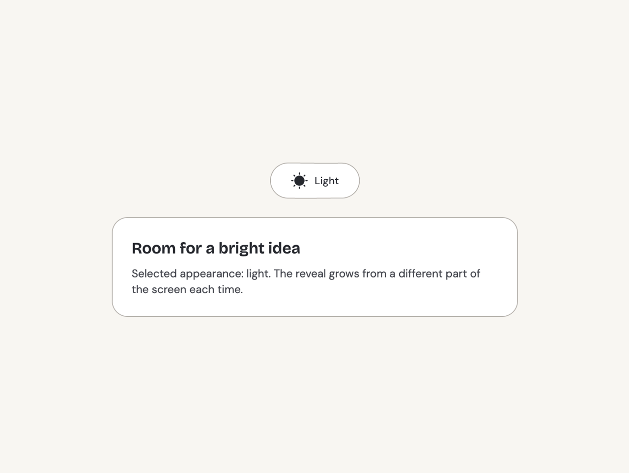
        <ThemeToggle mode={mode} onModeChange={(next, details) => applyTheme(next, false, undefined, { origin: details?.origin })} />
        <div className="w-full rounded-[var(--r-card)] border border-[var(--v-border)] bg-[var(--v-paper)] p-6 text-left">
          <h3 className="font-[family-name:var(--font-display)] text-xl font-semibold text-[var(--v-text)]">
            {mode === "dark" ? "A quieter evening" : "Room for a bright idea"}
          </h3>
          <p className="mt-2 text-sm text-[var(--v-text-2)]">Selected appearance: {mode}. The reveal grows from a different part of the screen each time.</p>
        </div>
      </div>
    </DemoSurface>
  );
}