"use client";

import * as React from "react";
import { HeroButton, heroButtonAppearances, type HeroButtonAppearance } from "@/components/ui/hero-button";

const concepts: Record<HeroButtonAppearance, { label: string; cue: string }> = {
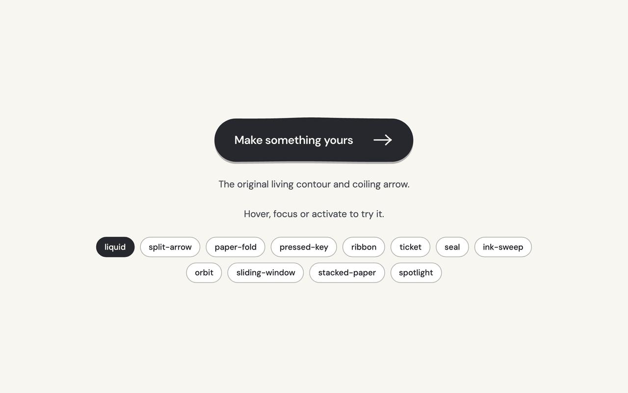
  liquid: { label: "Make something yours", cue: "The original living contour and coiling arrow." },
  "split-arrow": { label: "Start something", cue: "The arrow has its own sliding tab." },
  "paper-fold": { label: "Open a new chapter", cue: "A folded corner lifts from the paper." },
  "pressed-key": { label: "Make it happen", cue: "A raised key settles under your pointer." },
  ribbon: { label: "Follow your curiosity", cue: "A directional ribbon pulls its trailing stripes." },
  ticket: { label: "Keep my place", cue: "A perforated admission ticket with a moving stub." },
  seal: { label: "Made for you", cue: "An organic seal turns its inner rim." },
  "ink-sweep": { label: "Leave your mark", cue: "A stroke of ink grows behind the words." },
  orbit: { label: "Explore an idea", cue: "A small satellite follows the arrow's orbit." },
  "sliding-window": { label: "A fresh perspective", cue: "The words roll through a clipped window." },
  "stacked-paper": { label: "Start a collection", cue: "Two offset sheets fan beneath the top page." },
  spotlight: { label: "Find your focus", cue: "A quiet pool of light follows the pointer." },
};

/** The demo brings its own 000h canvas, so it looks right on any host page (the component package sets nothing global). */
function DemoSurface({ children }: { children: import("react").ReactNode }) {
  return <div className="grid min-h-screen w-full place-items-center bg-[var(--v-canvas)] p-4 font-[family-name:var(--font-text)] text-[length:var(--fs-body)] leading-[var(--lh-body)] text-[var(--v-text)]">{children}</div>;
}

export default function Demo() {
  const [appearance, setAppearance] = React.useState<HeroButtonAppearance>("liquid");
  const [count, setCount] = React.useState(0);
  const concept = concepts[appearance];
  return (
    <DemoSurface>
      <div className="mx-auto flex min-h-[420px] w-full max-w-3xl flex-col items-center justify-center gap-6 p-8 text-center">
        <HeroButton key={appearance} appearance={appearance} onClick={() => setCount((value) => value + 1)}>
          {concept.label}
        </HeroButton>
        <p className="text-sm text-[var(--v-text-2)]">{concept.cue}</p>
        <p role="status" aria-live="polite" className="text-sm text-[var(--v-text-2)]">
          {count ? `${count} ${count === 1 ? "local action" : "local actions"}.` : "Hover, focus or activate to try it."}
        </p>
        <div role="group" aria-label="Appearance" className="flex flex-wrap justify-center gap-2">
          {heroButtonAppearances.map((option) => (
            <button
              key={option}
              type="button"
              aria-pressed={appearance === option}
              onClick={() => setAppearance(option)}
              className="rounded-full border border-[var(--v-border)] bg-[var(--v-paper)] px-3 py-1.5 text-xs font-medium text-[var(--v-text)] transition-colors hover:bg-[var(--v-beige)] aria-pressed:border-[var(--v-ink)] aria-pressed:bg-[var(--v-ink)] aria-pressed:text-[var(--v-on-ink)]"
            >
              {option}
            </button>
          ))}
        </div>
      </div>
    </DemoSurface>
  );
}